
[Frontend] TIL Frontend project - CSS Properties part 3

FASTCAMPUS Frontend Project
CSS Properties part 3
패스트캠퍼스 - 프론트엔드 웹 개발의 모든 것 초격차 패키지 Online 과정
🧩 What I Should Learn?
- CSS Layout - part 2
- CSS Layout - part 3
- Flex Container - part 1
- Flex Container - part 2
- Flex items
🎯 What I learned today
CSS Layout - part 2
position value (continue)
fixed
The position value fixed is used when the element is removed from the normal document flow, and no space is created for the element in the page layout.
The element will position relative to its initial containing block, which is the viewport in the case of visual media.
We previously saw the example of the absolute where if it can’t find the positioned ancestor, the element positions relative to the viewport.
That is not the best use case of absolute, whereas the fixed is built to position relative to the viewport.
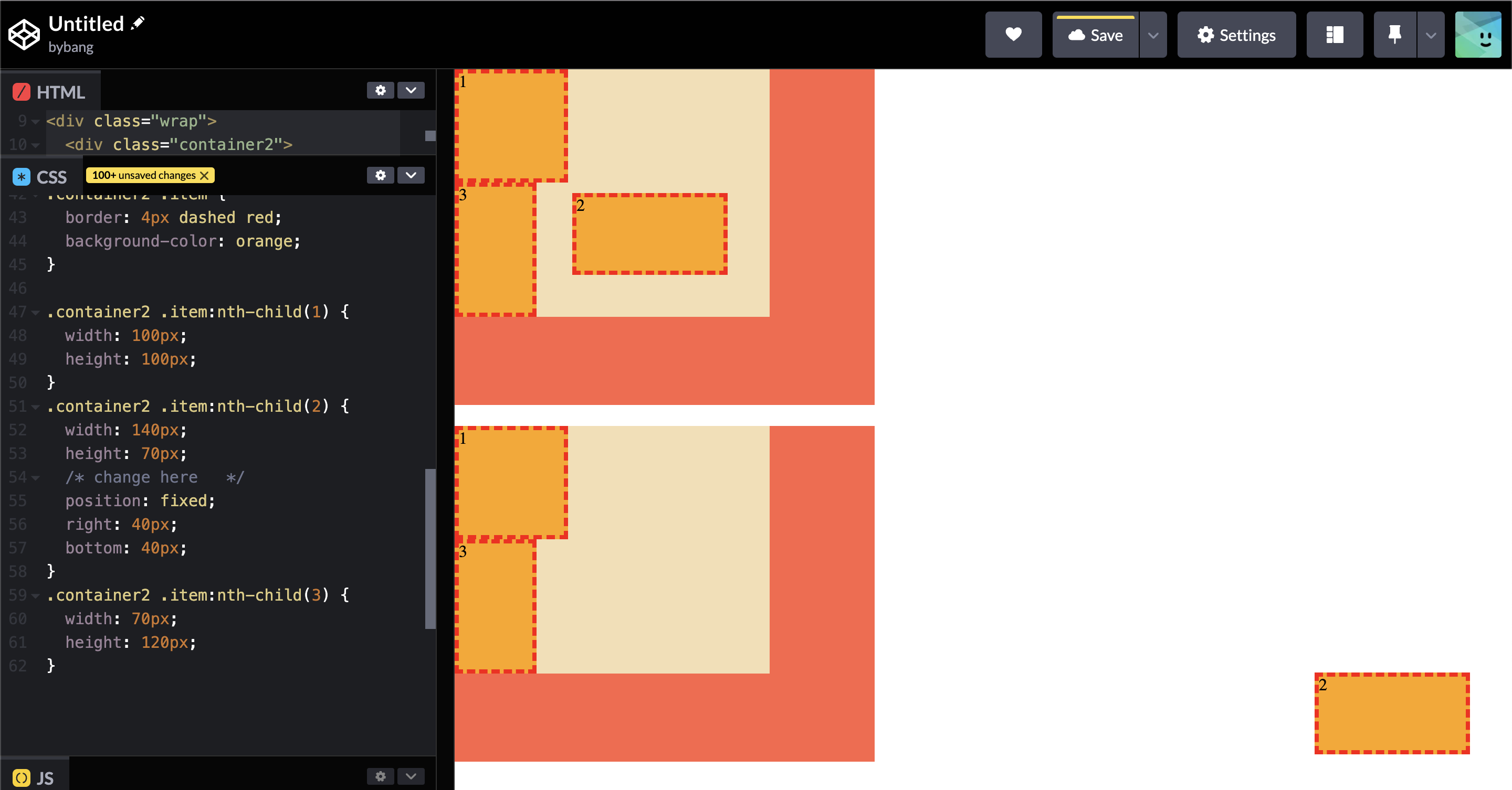
Suppose we bring the previous example and set two container CSS identical. Then, by changing the position value from absolute to fixed, we can see that the box 2 pops out from its ancestors.
The most use case of the fixed value would be like this:
Notice the element is fixed to the viewport, and when we scroll down, the element follows the viewport.
If we think about the website experience, the banner or ads are normally followed when we scroll down.
Stacking Context
Stacking context is a three-dimensional conceptualization of HTML elements along an imaginary z-axis relative to the user, who is assumed to be facing the viewport or the webpage.
HTML elements occupy this space in priority order based on element attributes.
When the z-index property is not specified on any element, elements are stacked in the following order (from bottom to top):
- The background and borders of the root element.
- Descendant non-positioned elements, in order of appearance in the HTML.
- Descendant positioned elements in order of appearance in the HTML.
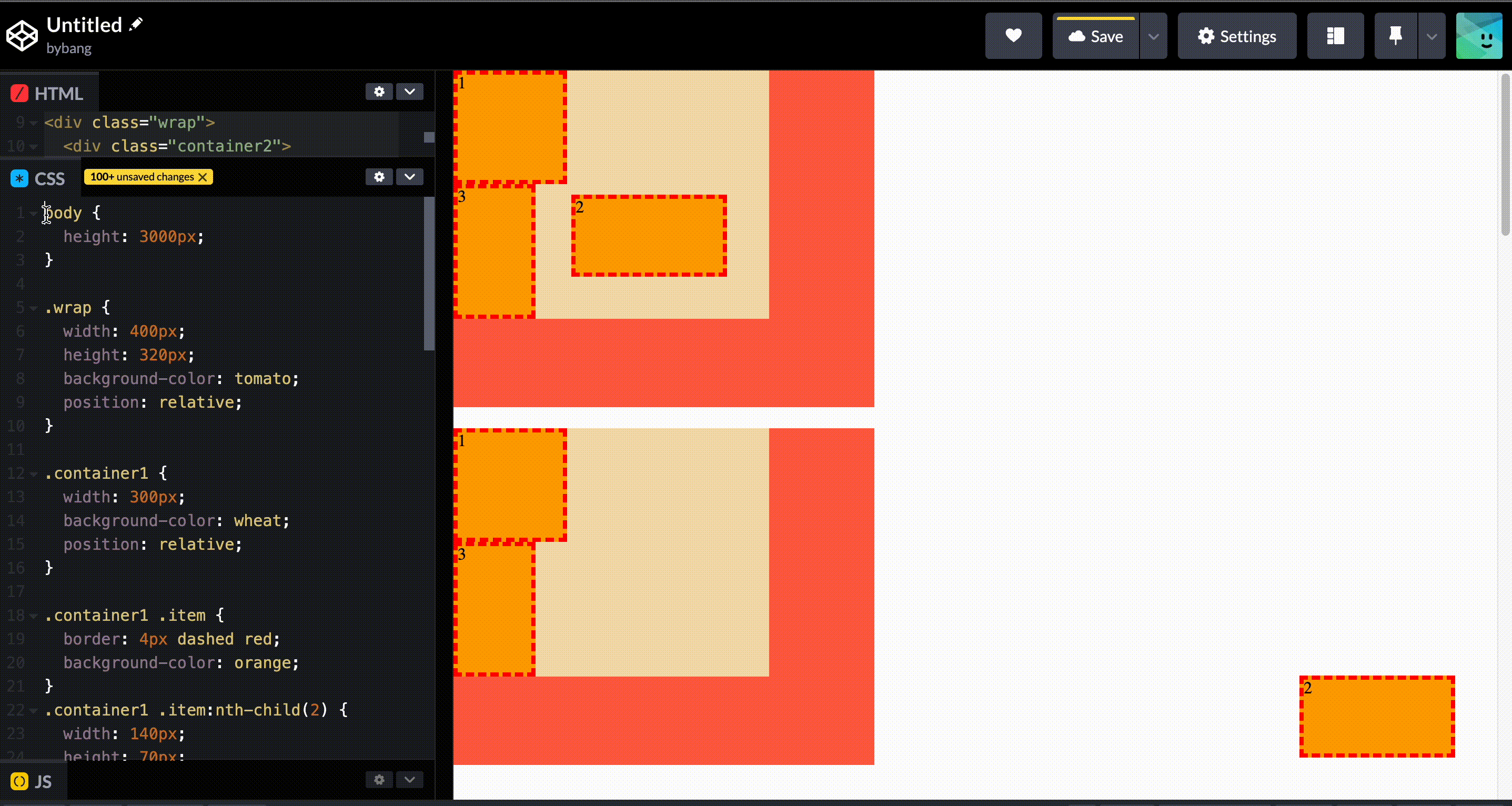
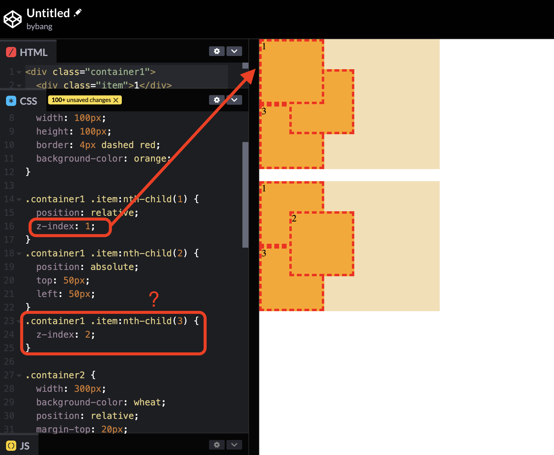
Notice the above picture has three boxes, the first one being the original state and the second having the stacked elements. The box 1 has the position value, but the position is not changed since there is no direction value like the top, right, or ``bottom`.
We placed the box 2, 50px from the top and 50px from the left. It has the position value absolute.
Now, if we look back at the stack order conditions, the first box and the second boxes are the positioned elements. The third box has no CSS properties in the picture.
Compared to the third box, the second box indeed should be the top of it because the third box is a non-positioned element.
Then, if we compare the first and second boxes, the second box is still on the top of every element.
That’s because of the first condition in stacking order. If we open and see the HTML structure, it looks like this:
<div class="container1">
  <div class="item">1</div>
  <div class="item">2</div>
  <div class="item">3</div>
</div>
Notice the box 2 div element placed below the box 1 div element, or the box 2 element appears later in the HTML structure.
Hence, box 2 is on top of box 1; technically speaking, box 3 will be the bottommost of the stacked elements because box 3 is the non-positioned element.
Using z-index
If we want to create a custom stacking order, we can use the z-index property on a positioned element.
Imagine the page as a stack of layers, each with a number. Layers are rendered numerically, with large numbers above smaller ones.
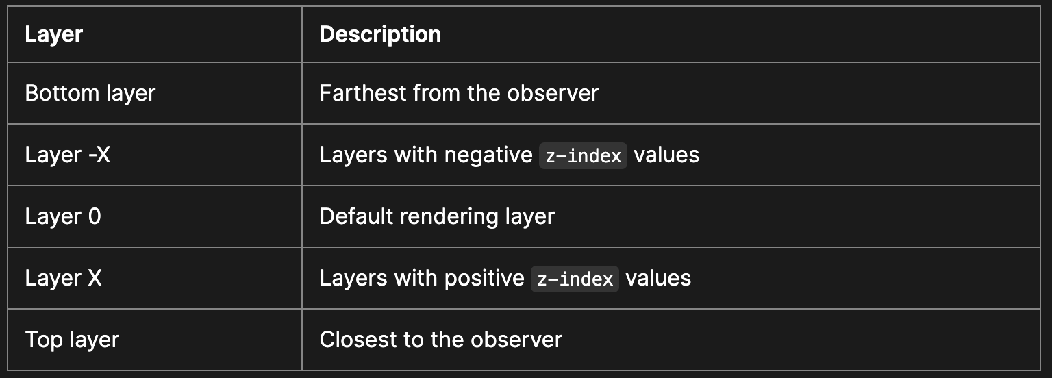
When no z-index value is specified, elements are rendered on the default rendering layer (Layer 0).
If several elements share the same z-index value, stacking rules follow the above rules (Stacking without the z-index property).
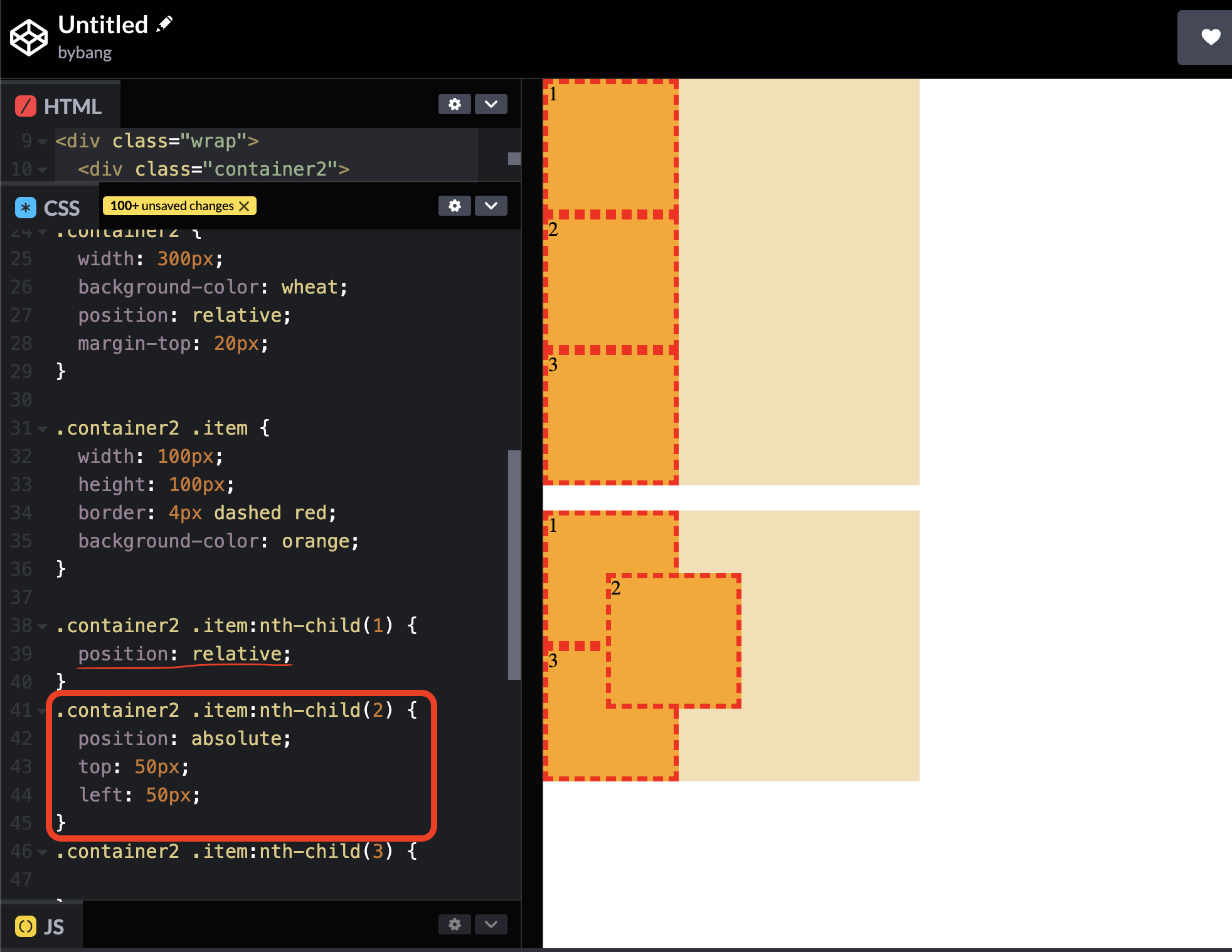
Now, we make the CSS the same as the above and change the original box to have the same value as the second one.
Notice now that box 1 is on the top of the stacked elements because box 2 doesn’t have the z-index value or the omitted z-index value is 0.
Another interesting point is the box 3, which has the highest z-index value, but the value is not applied to the element.
That’s because the box 3 is not a positioned element. In other words, the box 3 has a position: static property value, and we learned that if the static value is set, the position properties have no effect.
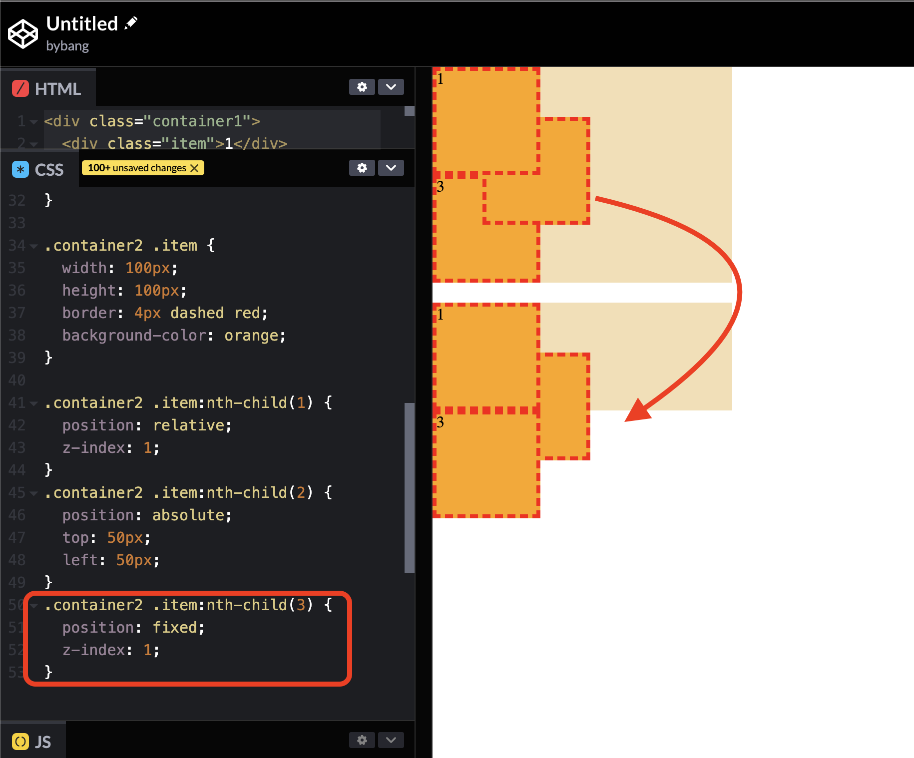
If we want to bring the box 3 on the top of the stacked elements, we can add the position value to the element as in the picture above.
Notice we change the z-index value to be the same as the box 1 to compare the order of the stacked elements.
We can’t see it visually that the box 3 is on the top, but we know that the box 3 element appears below the box 1 element. Therefore, the box 3 is on the top, box 2 is in the middle, and so forth.
CSS Layout - part 3
z-index
The z-index CSS property sets the z-order of a positioned element and its descendants or flex and grid items. Overlapping elements with a larger z-index value cover those with a smaller one.
The z-index property can be specified with an integer value (positive, zero, or negative), representing the element’s position along an imaginary z-axis.
The initial value of z-index is auto, meaning the box does not establish a new local stacking context. The stack level of the generated box in the current stacking order is 0, and this zero is the default value of z-index.
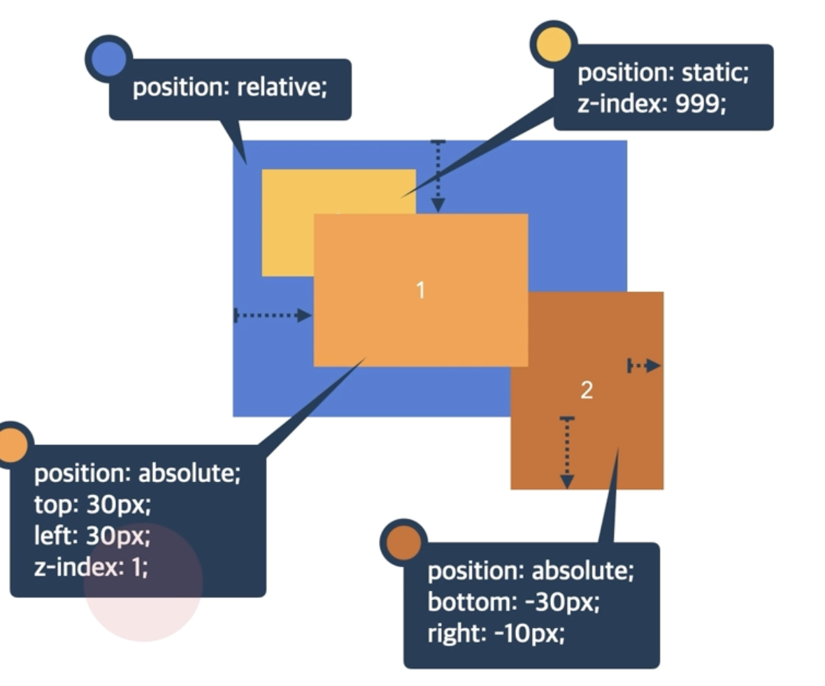
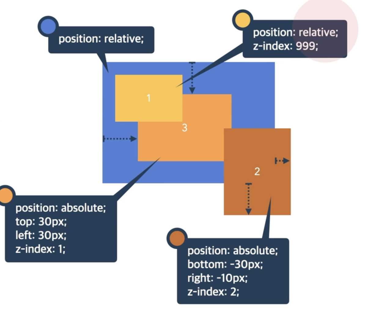
Let’s see the above example to review the z-index. The yellow box has the largest z-index value, but it is the last element in the stacking order because it is a non-positioned element.
The yellow box is on the top compared to the brown box because the yellow box has the z-index value.
Technically speaking, the brown box has the z-index value of auto or 0, which means it has the same stacking order as the current stacking context.
The above boxes are positioned elements, so we must compare the z-index value.
Indeed, we can see the yellow box is on top of the stacked elements because it has the largest value.
An important reminder is that we should avoid using the largest value like the one above without thinking of it because it is easy to stack on top of everything.
The largest value is easy to modify initially, but when the HTML and CSS get complicated, it takes time to manage the stacking context.
Block formatting context
A block formatting context is a part of a visual CSS rendering of a webpage. It’s the region in which the layout of block boxes occurs, and floats interact with other elements.
It is a large amount to cover this definition, and we will scratch the surface of the absolutely positioned element part. More details are available on the MDN website.
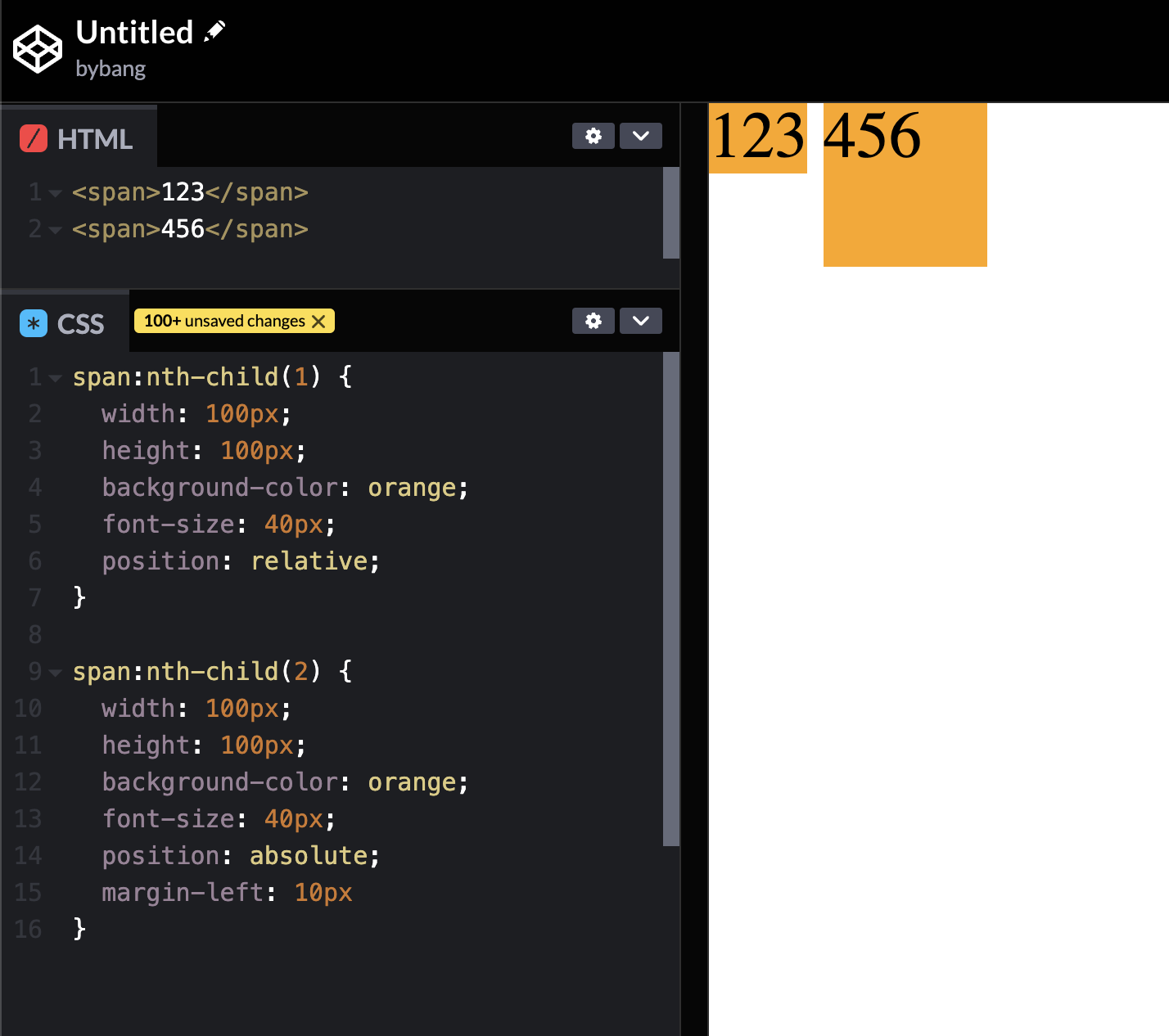
Notice there are two inline elements in the webpage. By default, the inline element is not a block-level element, which can’t use the width and height properties.
However, the second span element uses the width and height property because it is an absolutely positioned element.
An
absolutelypositioned element is an element whose computedpositionvalue isabsoluteorfixed. Thetop,right,bottom, andleftproperties specify offsets from the edges of the element’s containing block.
The containing block is the ancestor relative to which the element is positioned. If the element has margins, they are added to the offset. The element establishes a new block formatting context for its contents.
The definition shows that the first element is not absolutely positioned, although it is a positioned element.
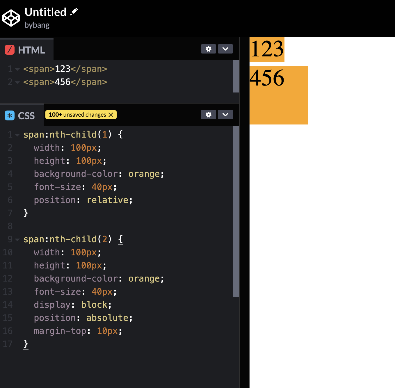
Therefore, if we see an element like the above - an inline element uses a block formatting context or is absolutely positioned as an inline element - we assume that there is a display: block; property value is omitted.
CSS Flex Container - part 1
flex
The flex is a new value added to the CSS display property. For a long time, the only reliable cross-browser compatible tools available for creating CSS layouts were features like positioning and floats. In some ways, they are frustrating and also limiting.
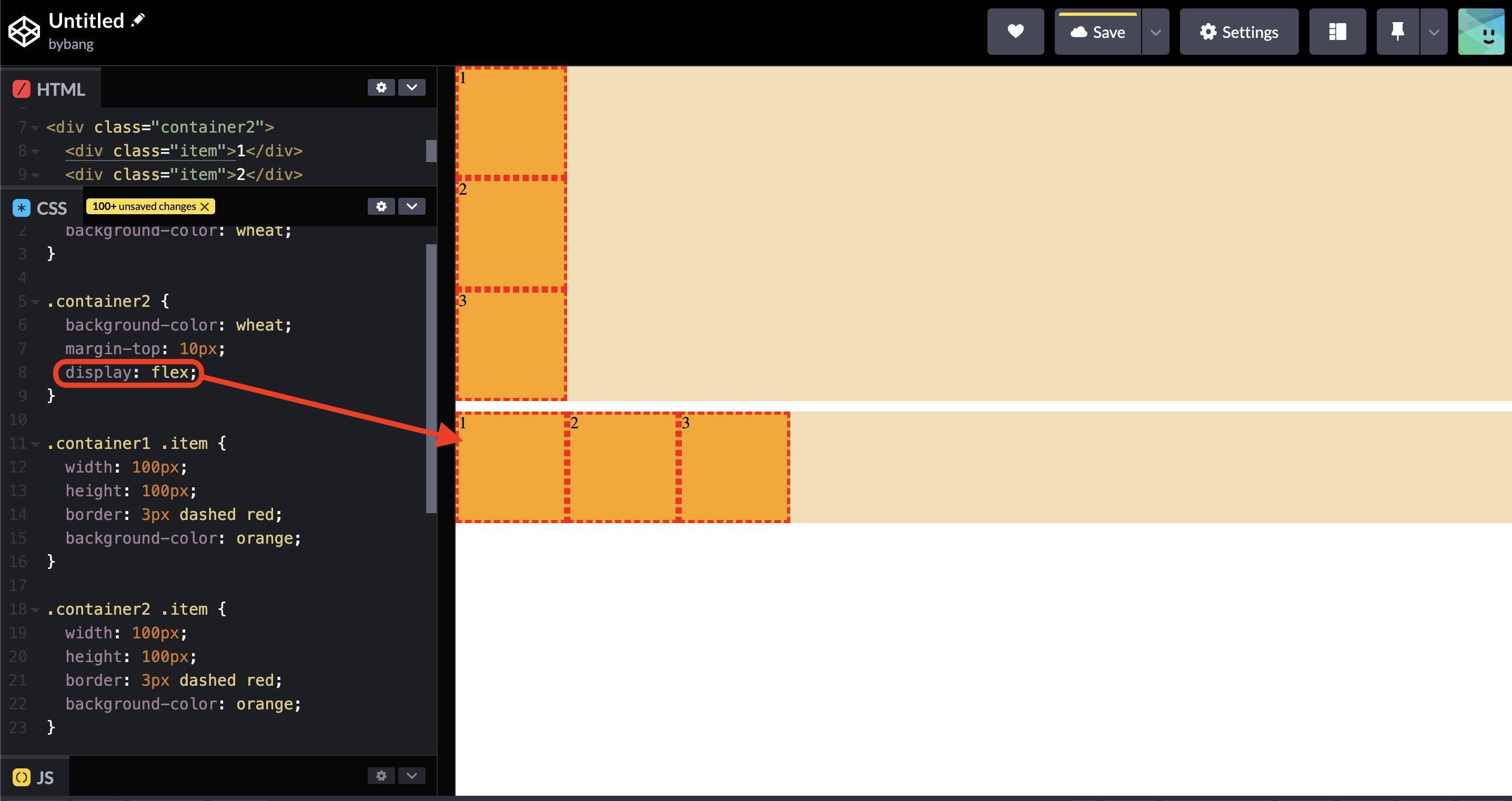
Notice we have familiar box layers in the above picture. In the second box, we add the display: flex property value and see that the container’s items are horizontally aligned.
Basic concept of Flexbox
The flexible box layout module, usually referred to as flexbox, was designed as a one-dimensional layout model and as a method that could offer space distribution between the items in an interface and powerful alignment capabilities.
When we describe flexbox as being one-dimensional, we are describing the fact that flexbox deals with layout in one dimension at a time - either as a row or a column.
The two axes of flexbox
When working with flexbox, we must consider two axes - the main axis and the cross axis.
The main axis is defined by the flex-direction property, and the cross axis runs perpendicular to it.
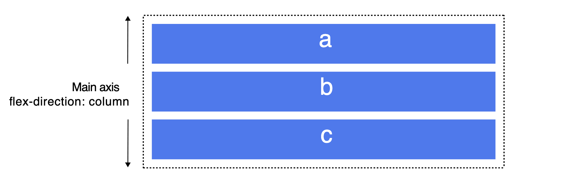
The main axis
The main axis has four possible values: row, row-reverse, column, and column-reverse.
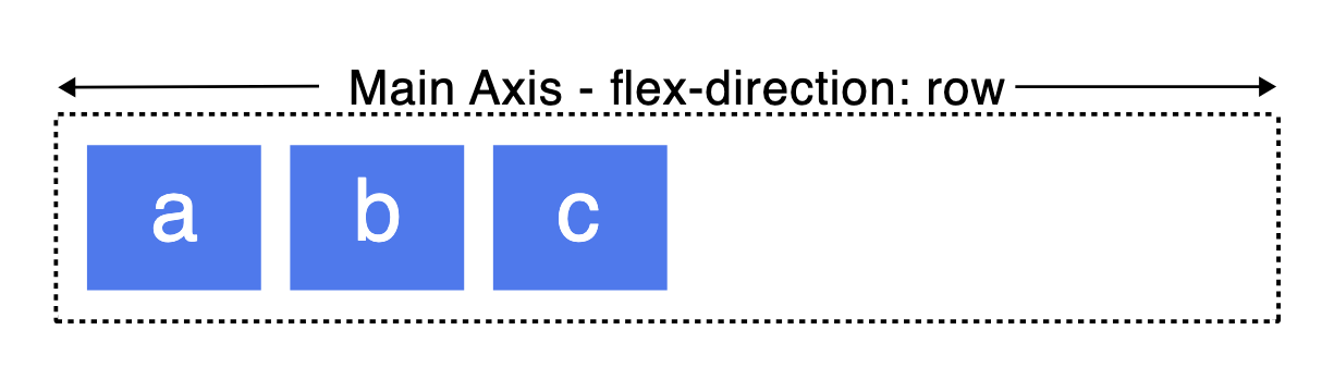
If we choose row or row-reverse, our main axis will run along the row in the inline direction.
Choose column or column-reverse, and our main axis will run from the top of the page to the bottom in the block direction.
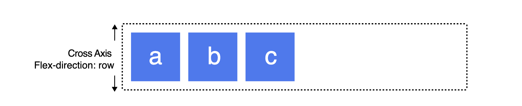
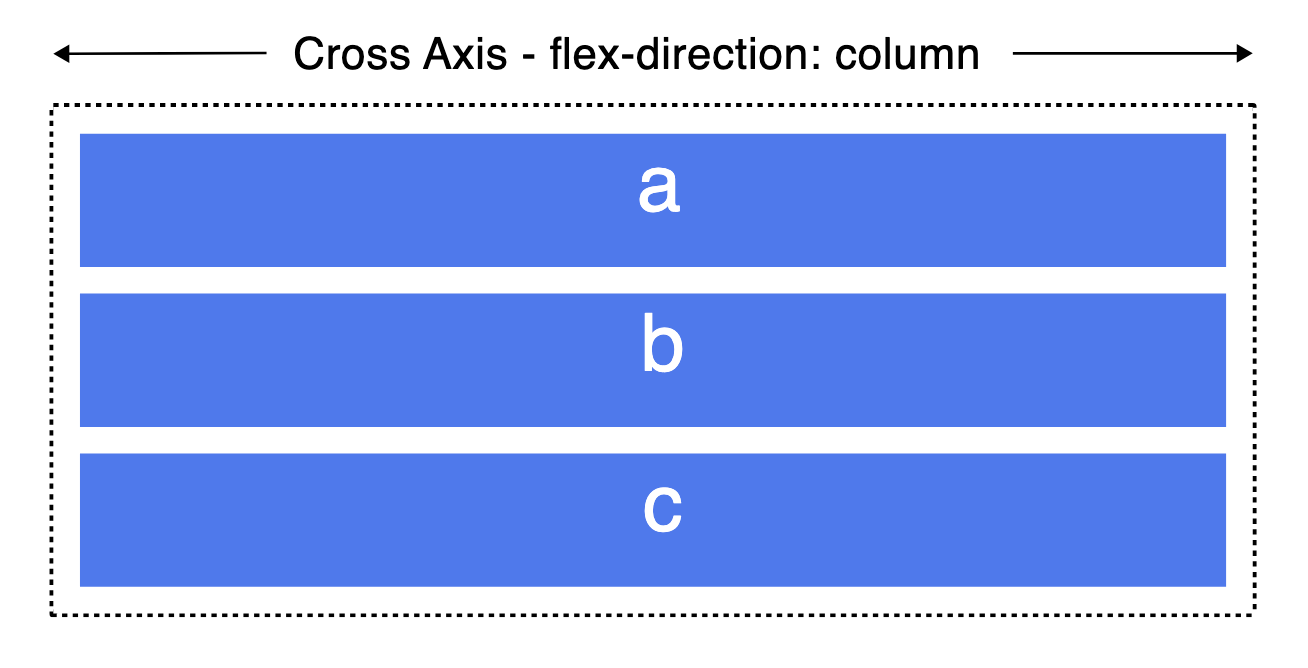
The cross-axis
The cross axis runs perpendicular to the main axis; therefore, if our flex-direction (main axis) is set to row or row-reverse, the cross axis runs down the columns.
The cross axis runs along the rows if the main axis is column or column-reverse.
Start and end lines
Another vital area that we should know is how flexbox makes no assumptions about the writing mode of the document. In the past, CSS was heavily weighted towards horizontal and left-to-right writing modes.
With modern layout methods, we no longer assume that a line of text will start at the top left of a document.
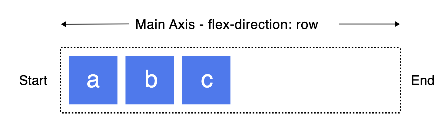
If the flex-direction is row, then the start edge of the main axis will be on the left, and the end edge will be on the right. Some exceptions depend on the languages, but we will not cover that here.
The flex container
An area of a document that is laid out using a flexbox is called a flex container. To create a flex container, we set the area’s display property to flex.
When we set the display property to flex, the direct children of that container become flex items.
A value of flex causes the element to become a block-level flex container, and inline-flex causes the element to become an inline-level flex container.
The flex container uses the above values, and we will cover that in the following chapters.
The flex item
The children of a flex container become flex items. The following picture shows the flex item values.
display: flex
Along with the display: flex property, we deal with the elements as block-level elements.
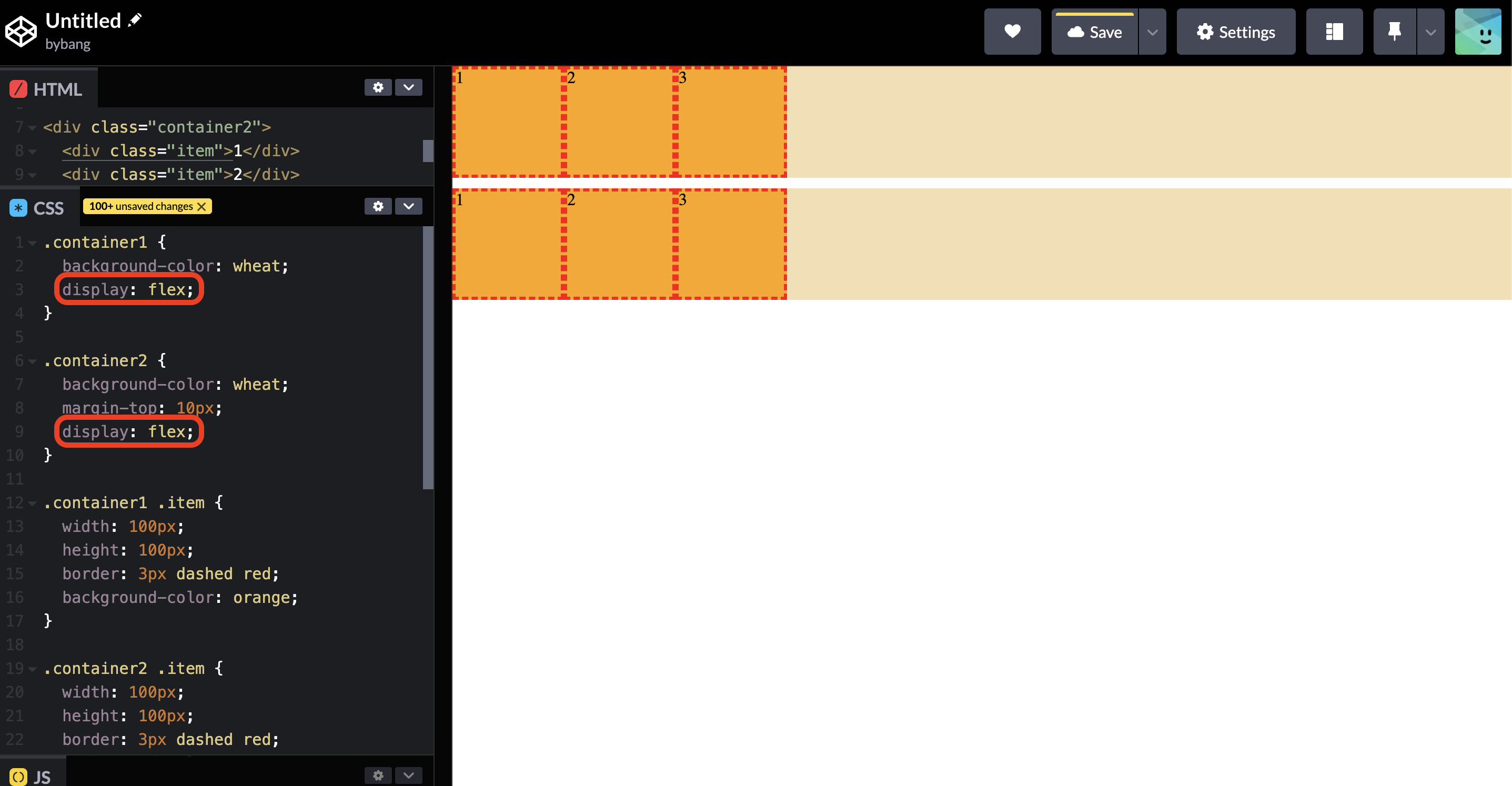
Notice two containers don’t have the width property, but their width is set to the viewport. Here, the containers are the flex container, and the orange boxes are the flex items.
We learned that if we make an element to the block level element, the width is auto, and it calculates to the viewport width as the block element tends to expand to its parent container size.
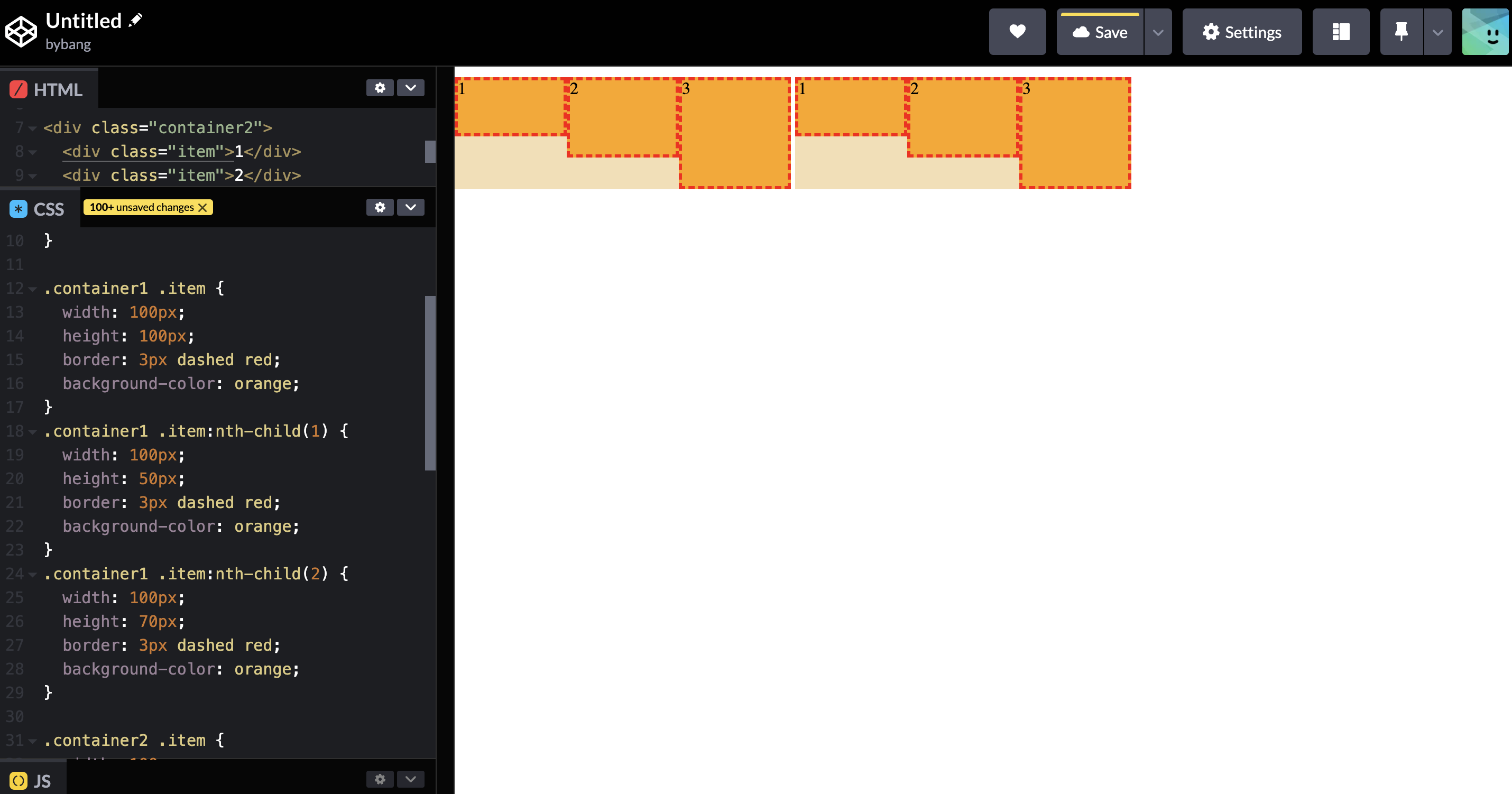
Notice we changed the orange box height accordingly to see the container. Also, we changed the display value to inline-flex.
Now, the containers are treated as the inline-level element. Therefore, the containers are stacked in one line from left to right.
We should distinguish the container and boxes in which the container indicates flex container and the boxes indicate flex item.
flex-direction
The flex-direction CSS property sets how flex items are placed in the flex container, defining the main axis and the direction.
The initial value of flex-direction is row, as we see the above main axis section.
If the flex-direction is row, the flex container’s main axis is defined to be the same as the text direction. The main-start and main-end points are the same as the content direction.
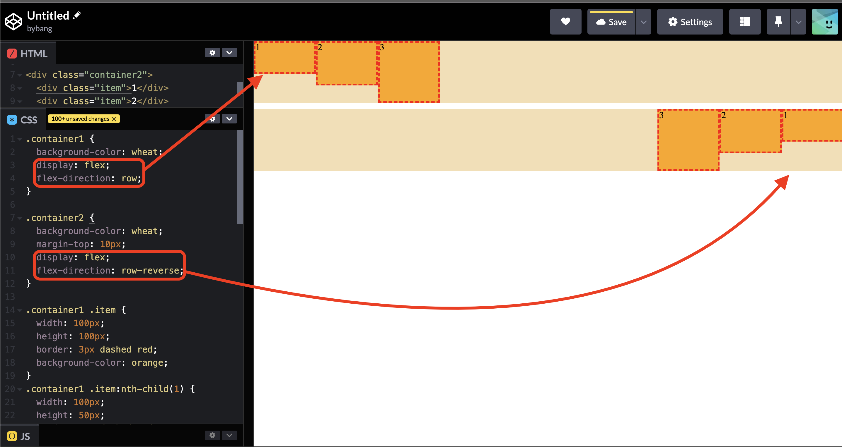
Notice the two flex containers have different flex-direction values. The first container has the row, the initial value we regularly see on the elements.
The second container has the flex-direction: row-reverse property value, which means the main axis and cross axis are the same, but the start and end points are changed.
If we bring back the image from above, the picture shows the typical start and endpoints. Now, if we go back to check the orange boxes, the second container’s main-start and main-end points are flipped compared to the first container.
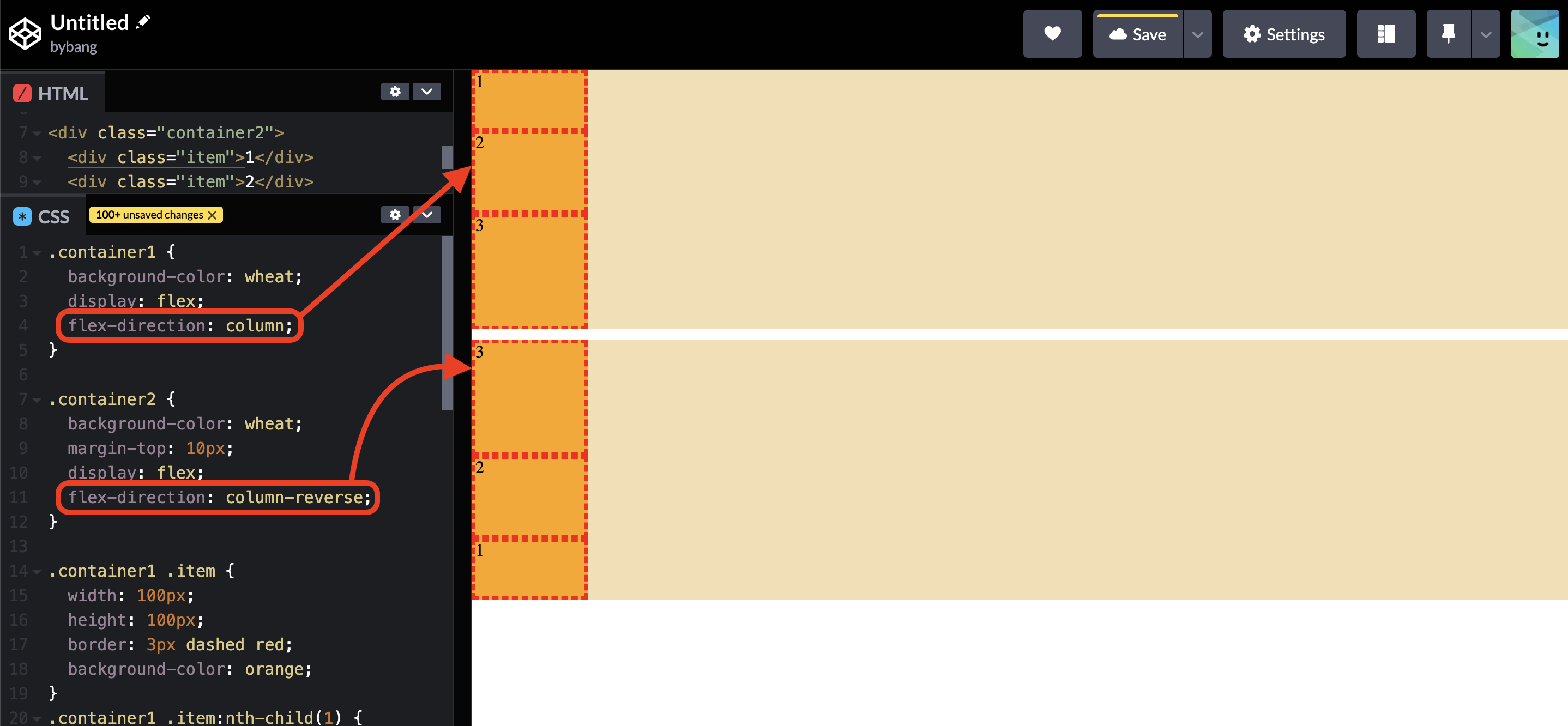
On the other hand, if we set the flex-direction value to column or column-reverse, we can see that the main axis changes to the column and is stacked from top to bottom. The cross-axis also changes accordingly.
The main-start and main-end points are the same as the block direction, top to bottom. If the value is column-reverse, it flips the other way around.
CSS Flex Container - part 2
flex-wrap
The flex-wrap CSS property sets whether flex items are forced onto one line or can wrap onto multiple lines. If wrapping is allowed, it sets the direction in which the lines are stacked.
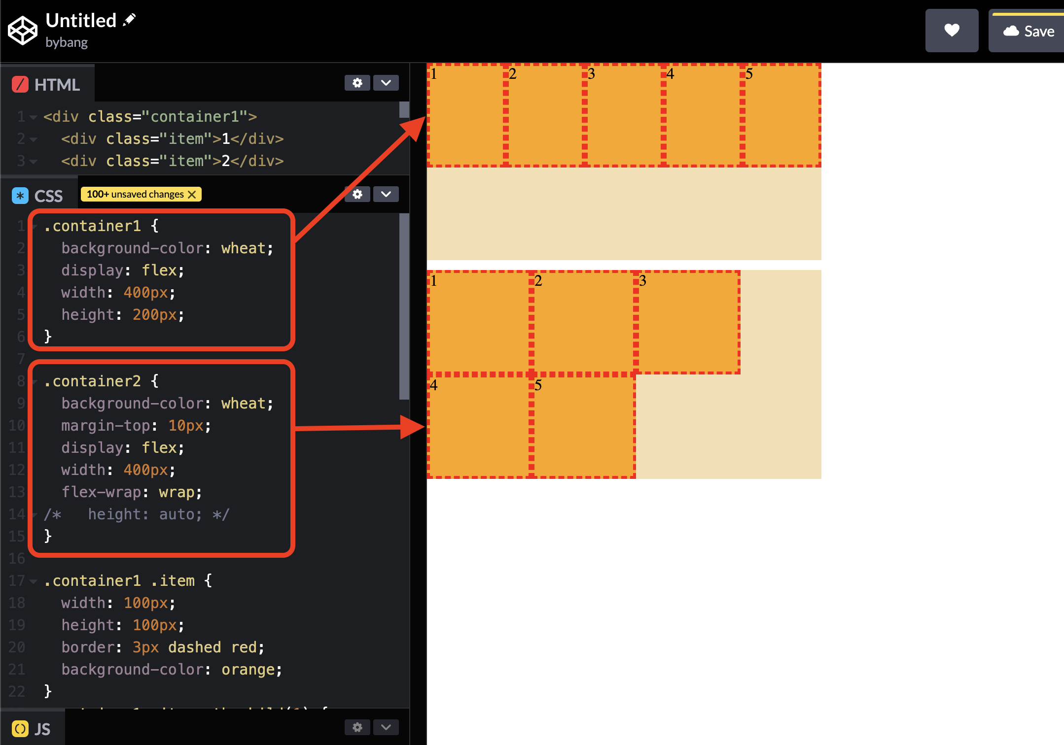
Notice that the first container boxes are shrunk to fit the boxes in one line. Meanwhile, the second container has a flex-wrap: wrap property value, and the boxes inside the second container maintain the original size.
That’s because the flex-wrap property allows to wrap the content in multiple lines. We removed the height property and automatically set the height to be auto to expand the container height to fit the wrapped item size.
The initial value of flex-wrap is nowrap; if we don’t set the flex-wrap property to wrap, the items in the container always try to shrink from displaying every element in one line.
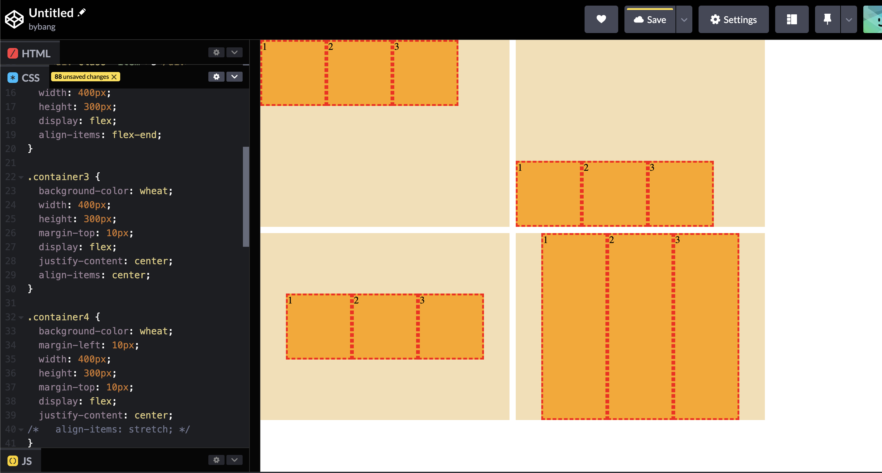
justify-content
The CSS justify-content property defines how the browser distributes space between and around content items along the main-axis of a flex container and the line axis of a grid container.
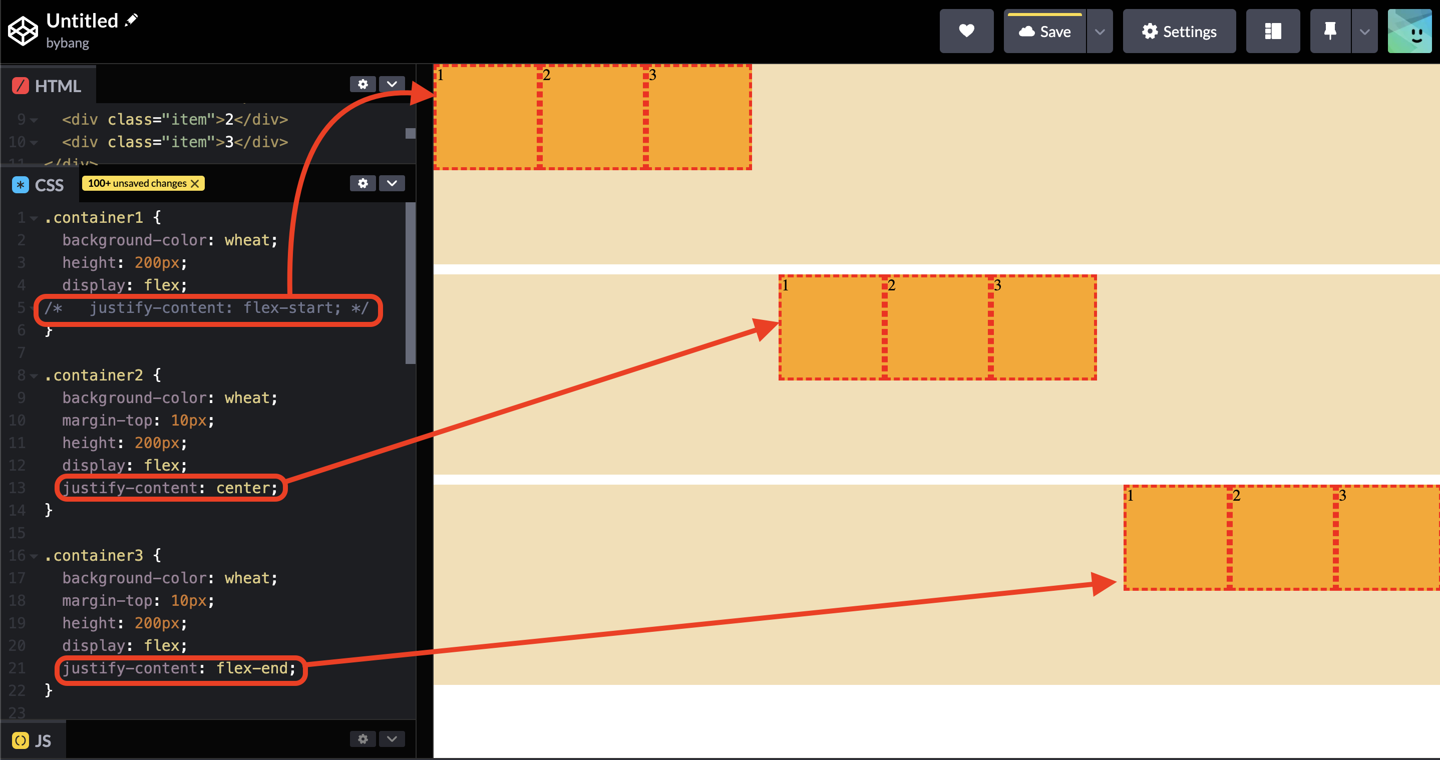
Notice the three most used values are aligned in order. Three containers are the flex container, and the items are aligned accordingly.
The flex-start aligns the items toward the edge of the alignment container depending on the flex container’s main-start side.
The center aligns the items toward the center of the alignment container along the main axis.
The flex-end aligns the items toward the edge of the alignment container depending on the flex container’s main-end side. Notice that the flex items order is unchanged because the main axis direction is unchanged.
align-content
The CSS align-content property sets the space distribution between and around content items along a fclexbox’s cross-axis or grid’s block axis.
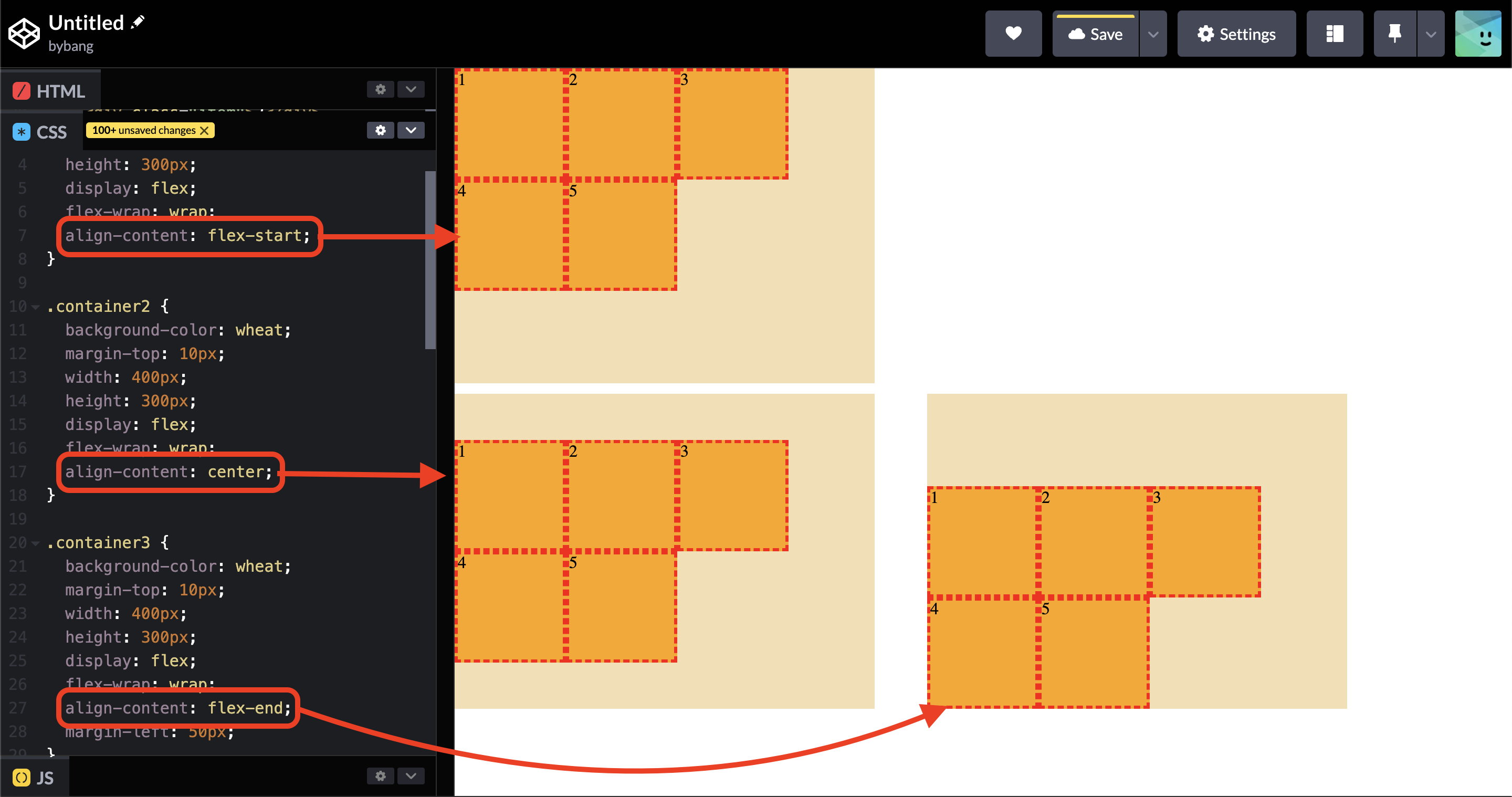
Notice the flex items align vertically or along the cross-axis. The biggest difference between the align-items is that the align-content has no effect on single line flex containers (i.e. ones with flex-wrap: nowrap).
Due to its limitations, the align-content property is not commonly used.
align-items
The CSS align-items property sets the align-self value on all direct children as a group. In flexbox, it controls the alignment of items on the cross axis. In grid layout, it controls the alignment of items on the block axis within their grid area.
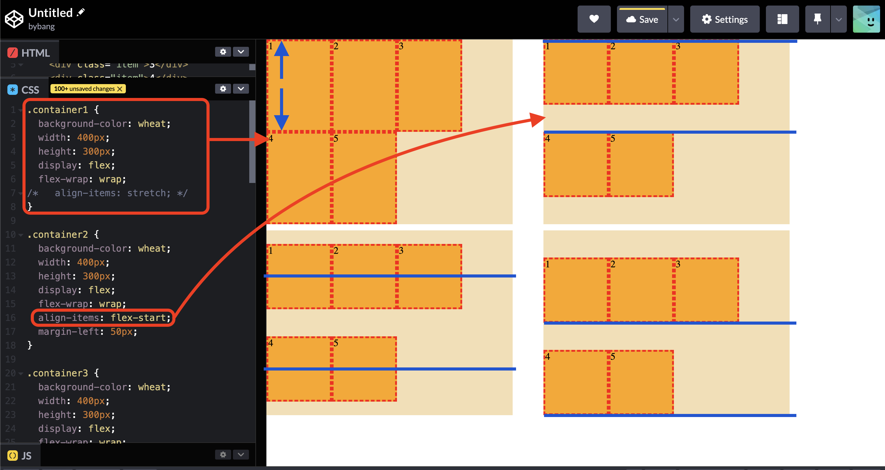
Notice that the flex items are multiple lines because of the flex-wrap property, which is distributed into two lines and aligns flex items with each line start and line end.
The blue lines indicate each line’s main-start and main-end. The first box has the initial value of align-items, the stretch by default.
The stretch auto-sizes items equally enlarges to fill the container, respecting the items’ width and height limits.
However, the above case differs from a typical use case for aligning multiple-line contents. We learned that to align multiple-line content simultaneously, we use the align-content property.
The above picture shows a more general usage of the align-items property. When the flex items are the single line without the flex-wrap property, it aligns flex items vertically.
The first container shows normal behavior when we don’t set the align-items property. Meanwhile, the fourth container shows that the flex items are stretched.
That’s because we explicitly set the flex items’ height to auto or removed the height property. Therefore, the flex items are stretched, albeit we do not set the align-items: stretch property value.
The most common case is the third container, which we will be using when we want to align flex items in flex containers in the center of the element.
Remember that if we want to centralize the flex items, we need to set the align-items: center and the justify-content: center property values.
CSS Flex items
order
The order CSS property sets the order to lay out an item in a flex or grid container. Items in a container are stored by ascending order value and then by their source code order. Items not given an explicit order value are assigned the default value of 0.
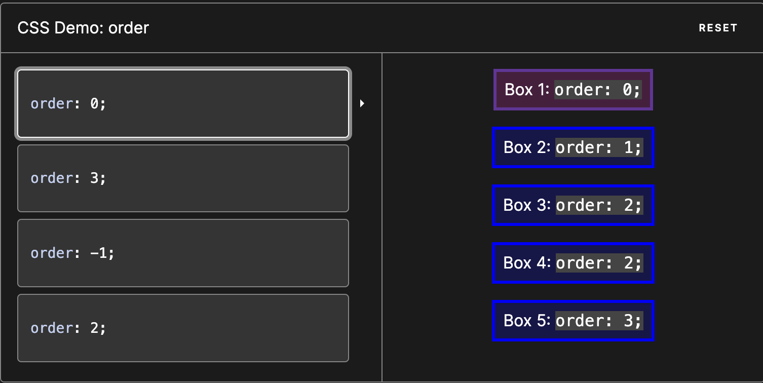
Notice that the above is the demo model from the MDN website, indicating the initial value of order, which is 0.
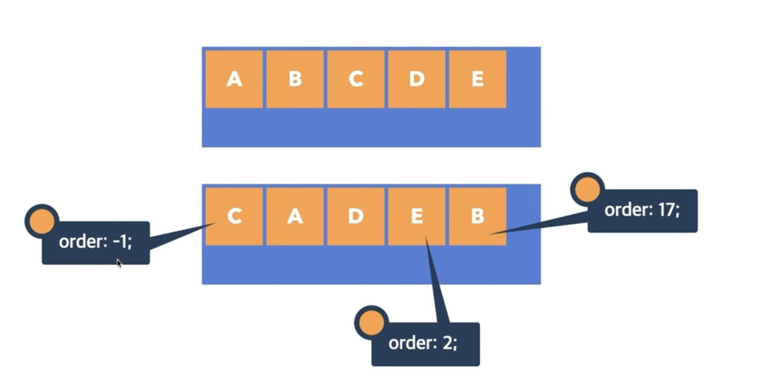
Suppose we have a model like the above picture. The box A and D have the initial order value 0. If we want to place beyond every box, we can set the order value to -1. If we want to stack the box at the end of the line, we can set the largest order value.
The benefit of the order property is that it allows the modification of the elements’ order without modifying or editing the HTML structure.
flex-grow
The flex-grow CSS property sets the flex grow factor, which specifies how much of the flex container’s remaining space should be assigned to the flex item’s main size.
Let’s see the example below to understand flex-grow. We are setting the flex-grow property to the flex items.
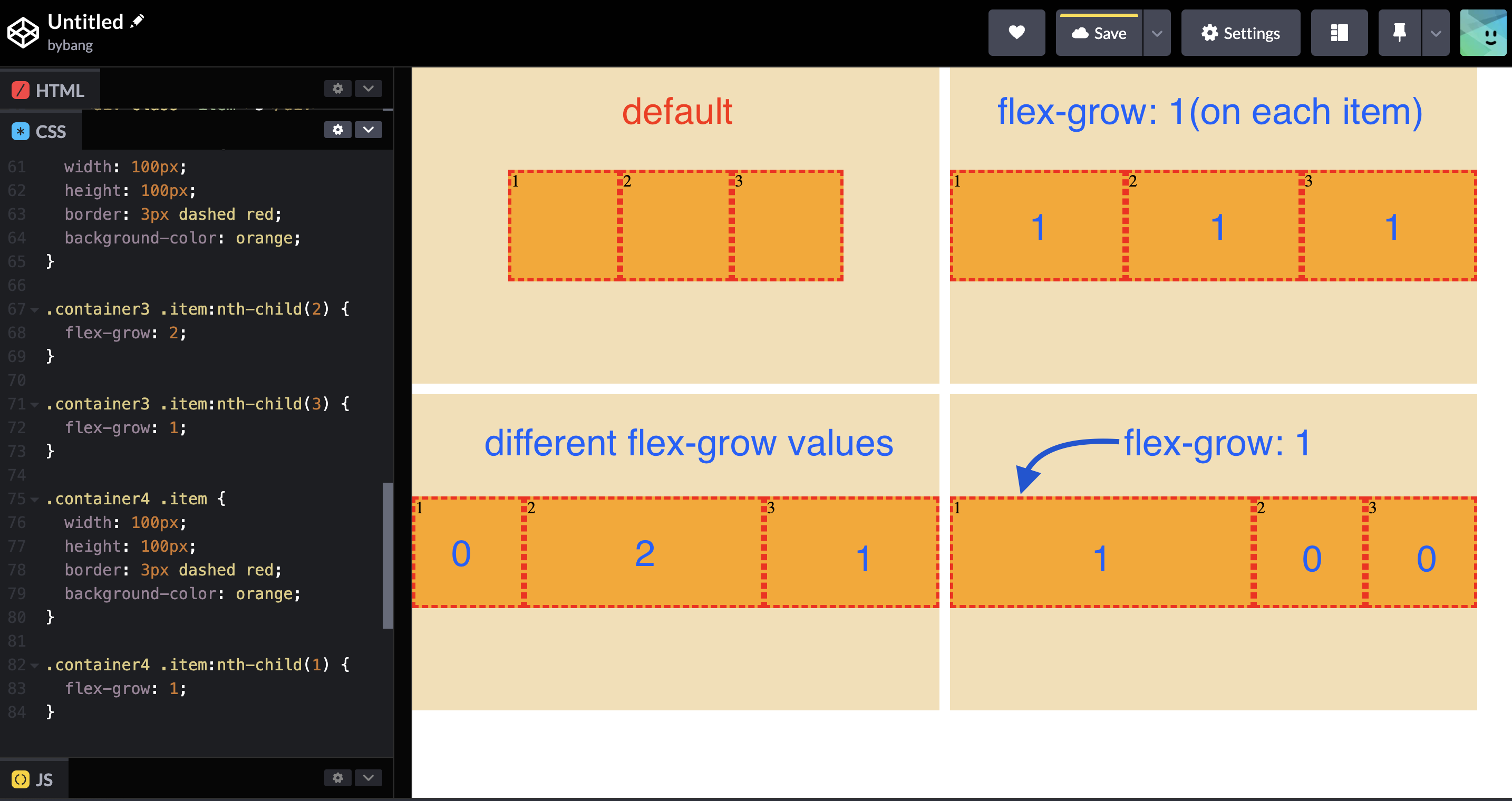
Notice if we set flex-grow: 1 on each item, the box grows proportionally to fill the parent container.
The initial value of flex-grow is 0, the default state in the first container indicating it.
When the value is set to 0, it behaves like the normal box that has the width and height.
But, if we see the third and fourth containers, they don’t seem proportional to their parent containers.
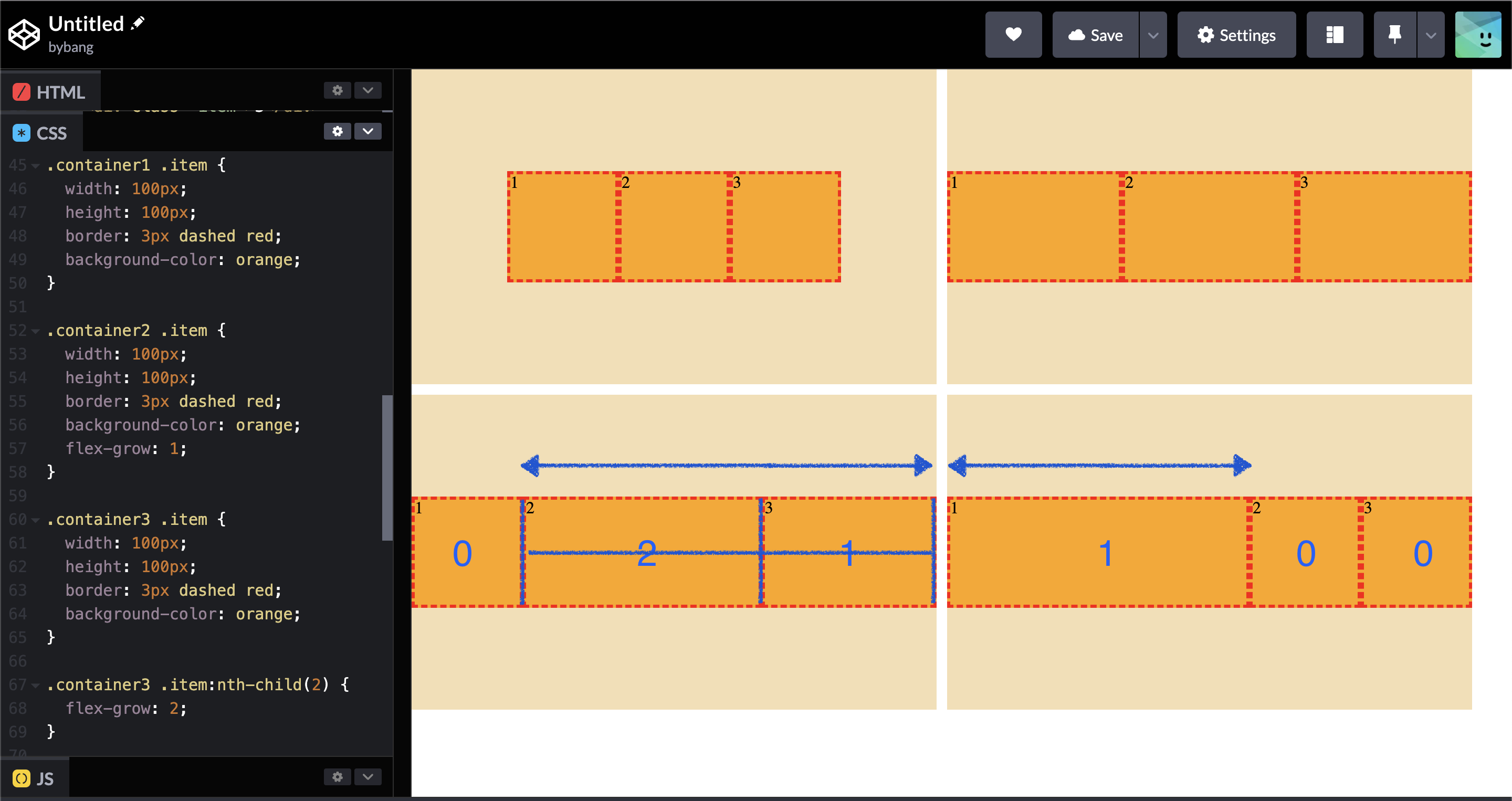
That’s because the flex-grow uses the flex container’s remaining space to calculate how much the items can grow.
The third container has the space with the blue arrow in two pieces, and the flex-grow property divides the remaining space proportionally.
The fourth container has the space with the blue arrow, and only one box has the flex-grow property. Hence, the box with the flex-grow property occupies the whole remaining space.
flex-shrink
The flex-shrink CSS property sets the flex shrink factor of a flex item. If all flex items are larger than the flex container, items shrink to fit according to flex-shrink.
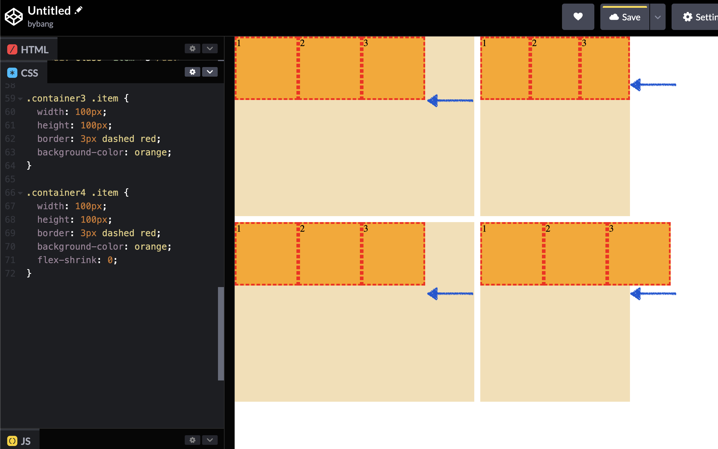
We have seen that if we reduce the flex container width, the flex items shrink proportionally to display all flex items in one line.
That was the default behavior or because of the initial value of the flex-shirnk. The initial value is 1, which means it shrinks each item proportional to its value (1:1:1).
If we don’t want to shrink the flex items in the container, we can set the flex-shrink value to 0.
flex-basis
The flex-basis CSS property sets the initial main size of flex items. It sets the size of the content box unless otherwise set with the box-sizing property.
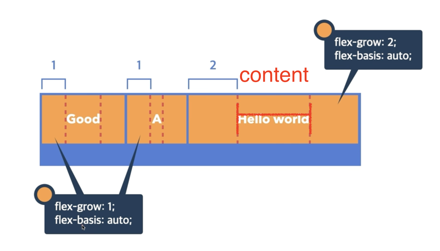
Notice that the initial value of flex-basis is auto, and it calculates the content area. Then it divides the remaining space proportionally (1:1:2) because of the flex-grow property.
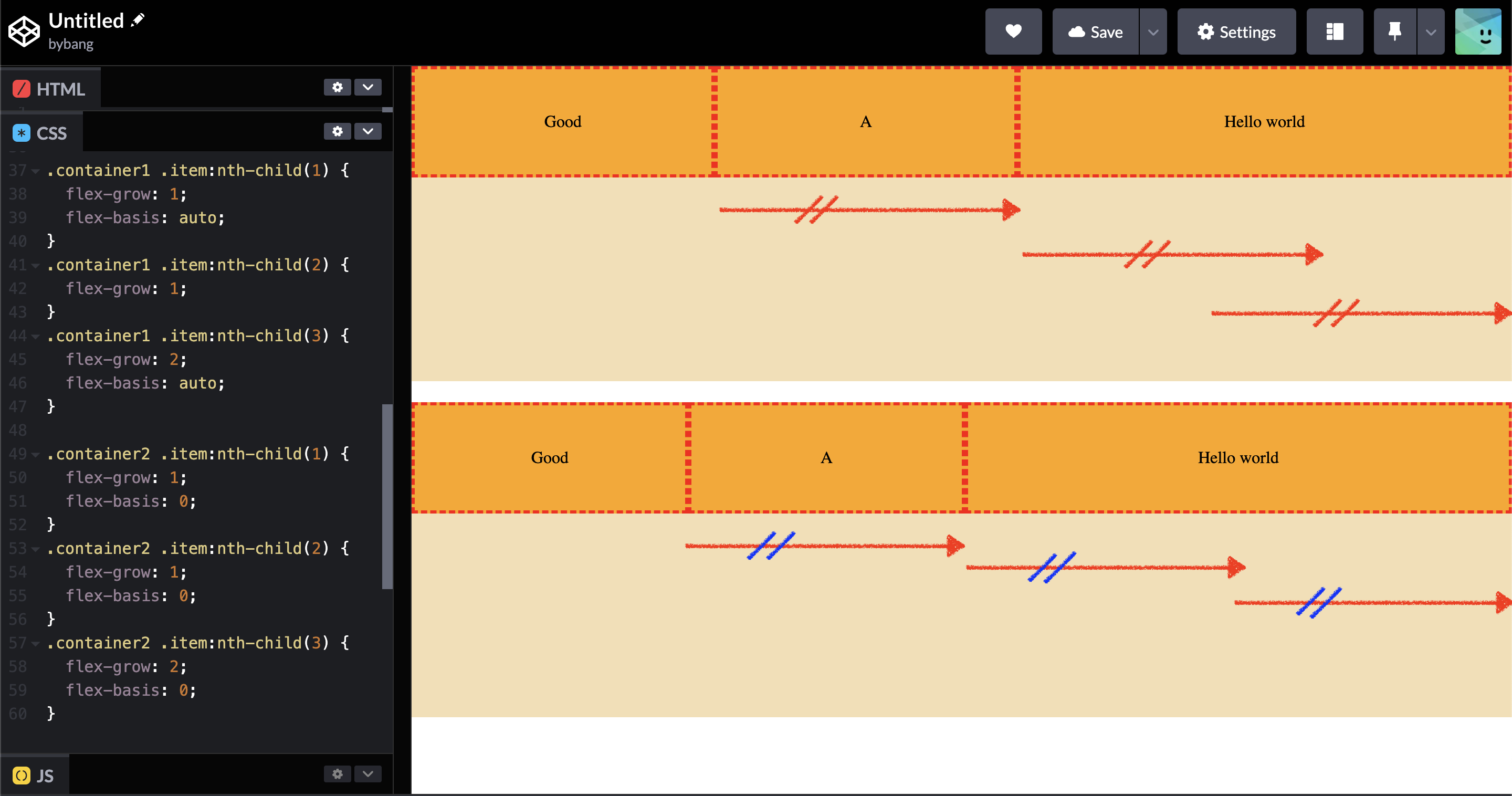
The most common use case will be the flex-basis: 0 to set the content area to 0 or make the flex items not consider the content area.
The first container in the above picture is not perfectly proportional, but the second container’s flex items are exactly proportional (1:1:2).
We can also set the flex-basis area with the <length> value to have an absolute area value.
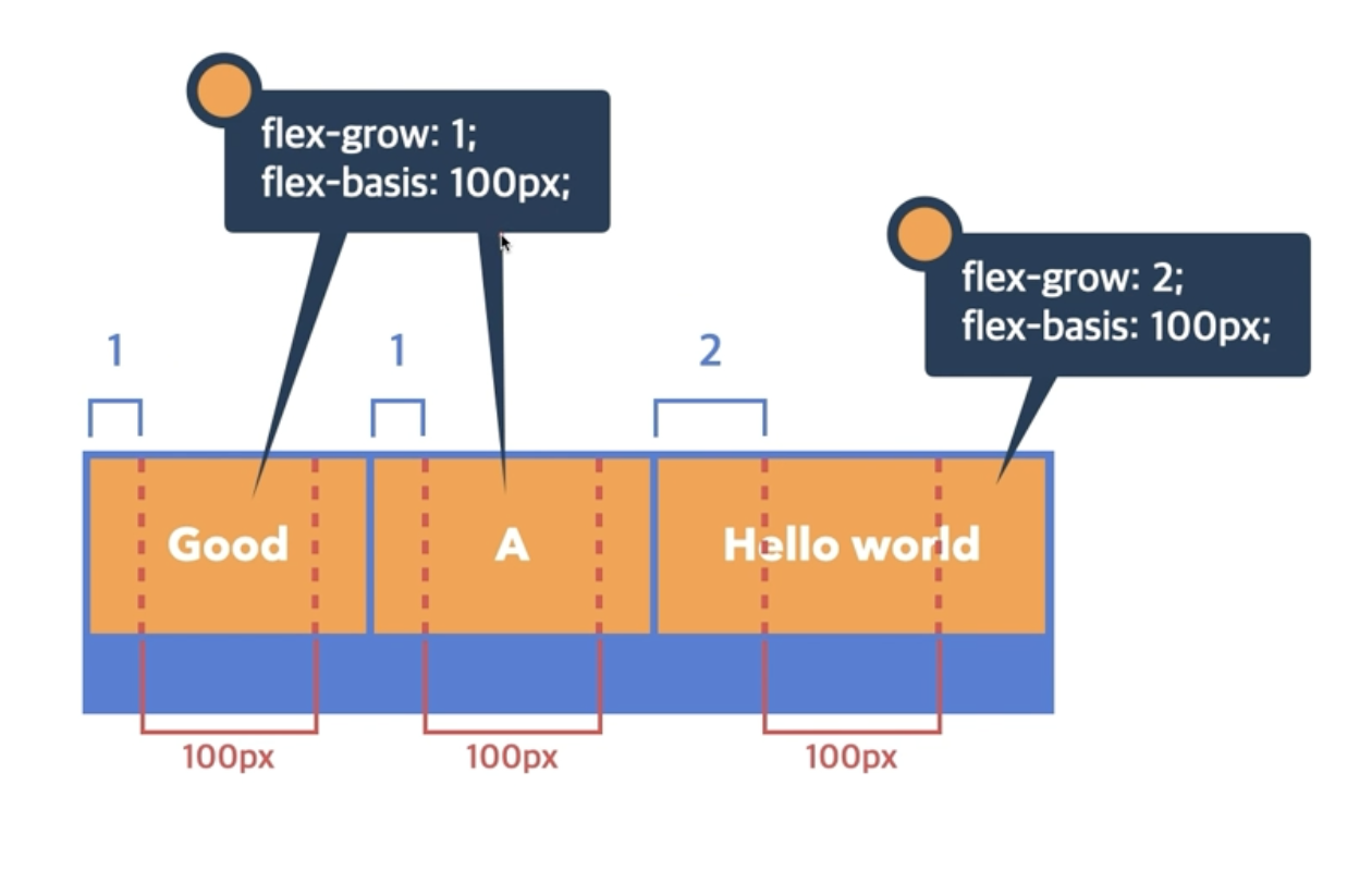
Notice the content area is now 100px because of the flex-basis property. Then, the remaining area is calculated and divided by the flex-grow property.
📌 Takeaway
- The
absolutevalue positions relative to the viewport when it can’t find thepositionedancestor, albeit it is not the best use case. - Whereas the
fixedvalue is designed for positioning the element relative to the viewport. - When the
position: fixedproperty value is set, the element will fix to the viewport and will follow the viewport when we scroll down the website. - Stacking context is a three-dimensional concept of HTML elements along an imaginary
z-axisrelative to the user. - There are multiple factors to calculate stacking order when
z-indexis not specified. They stack in the following orders:- The background and borders of the root element.
- Descendant
non-positionedelements in order of appearance in the HTML document. - Descendant
positionedelements in order of appearance in the HTML.
- The
z-indexproperty sets the z-order of a positioned element and its descendants or flex and grid items. - The largest value like
9999should be avoided as az-indexvalue because when the code gets complex, the stacking order will not work as expected if the rough value is used. - The
absolutelypositioned element is an element that has thepositionvalueabsoluteorfixed. - An inline element uses a block formatting context, or an
absolutelypositioned element has the defaultdisplay: blockproperty. - The flexbox is a new value added to the CSS
displayproperty to solve the frustration and limit features withpositioningandfloats. - The flexible box layout module is usually referred to as a flexbox.
- The flexbox is designed as a one-dimensional layout model with powerful alignment capabilities.
- The main axis has four possible
row,row-reverse,column, andcolumn-reversevalues. - The
rowwill make the main axis run along the row in the inline direction, and thecolumnwill make the main axis run from the top to bottom in the block direction. - A flex container is an area of a document laid out using a flexbox.
- When the
display: flexproperty value is set to an element, the direct children of that flex container become flex items. - A
flexvalue makes a block-level flex container, and aninline-flexvalue makes an inline-level flex container. - The
flex-directionproperty defines the main axis and sets how the flex items are placed in the flex container. - The
flex-directionproperty defines the main-start and main-end points and changes if theflex-directionchanges. - The
flex-wrapproperty determines how the flex items are displayed, either forced onto a single line or wrapped onto multiple lines. - If the
flex-wrap: wrapproperty is not set, the flex container’s flex items always shrink and try to display all elements in one line. That is the default behavior in regular websites. - The
align-contentproperty sets the space distribution between and around content items along a flexbox’s cross-axis. - The
align-contentproperty does not affect single-line flex containers. This property usually works with theflex-wrap: wrap. - The
align-itemsproperty controls the alignment of flex items on the cross-axis. - The
orderproperty sets the order to lay out an item in a flex or grid container. It allows the elements’ order to be changed without modifying or editing the HTML structure. - The
flex-growproperty specifies how much of the flex container’s remaining space should be assigned to the flex item’s main size. - The
flex-growproperty uses the flex container’s remaining space to calculate how much items can grow. - The initial value of the
flex-shrinkproperty is1, which explains why the elements shrink proportionally when the flex container shrinks. - The
flex-basisproperty sets the initial main size of the flex items. - By setting the
flex-basis: 0property value, the content area becomes zero, and theflex-growproperty can perfectly divide the container with its value.
💻 Solution
- None
🔖 Review
- We use the
z-indexto create a custom stacking order. - The initial value of
z-indexisauto, but this is considered as a0because it doesn’t create a new stacking context and shares the same level with the parent by default. - In simple terms, if the element is a
positioned elementwith anabsoluteorfixedvalue, then we assume thatdisplay: blockis omitted. - The cross-axis runs perpendicular to the main axis.
- If the
flex-directionisrow, then the start edge of the main axis will be on the left, and the end edge will be on the right. - The
justify-contentproperty defines how the browser distributes space between and around content items along the main axis of a flex container. - By reducing a flex container that contains flex items, we can see that the items shrink proportionally to display all items in one line.
- If we don’t want to shrink the flex items, we use the
flex-shrink: 0property value.
Comments