
[Frontend] TIL Frontend project - CSS Properties part 1

FASTCAMPUS Frontend Project
CSS Properties part 1
패스트캠퍼스 - 프론트엔드 웹 개발의 모든 것 초격차 패키지 Online 과정
🧩 What I Should Learn?
- CSS Property Overview
- Width and Height
- CSS units
- CSS Margin
- CSS Padding
- Border and Color Representation
- Border radius
- Box sizing
- CSS overflow
- CSS display
🎯 What I learned today
CSS Property Overview
CSS Properties
In this chapter, we will briefly skim through the most used CSS properties among many properties. We will delve into the CSS properties in each section in the following chapters later in this part.
Box model
The CSS box model as a whole applies to block boxes and defines how the different parts of a box work together to create a box that we can see on the webpage.
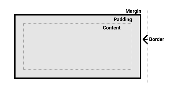
The box model creates a basic structure of HTML elements with properties like width and height. Basically, the HTML elements are made with all sorts of boxes.
Font and text
The font CSS property sets all the different properties of an element’s font. Alternatively, it sets an element’s font to a system font.
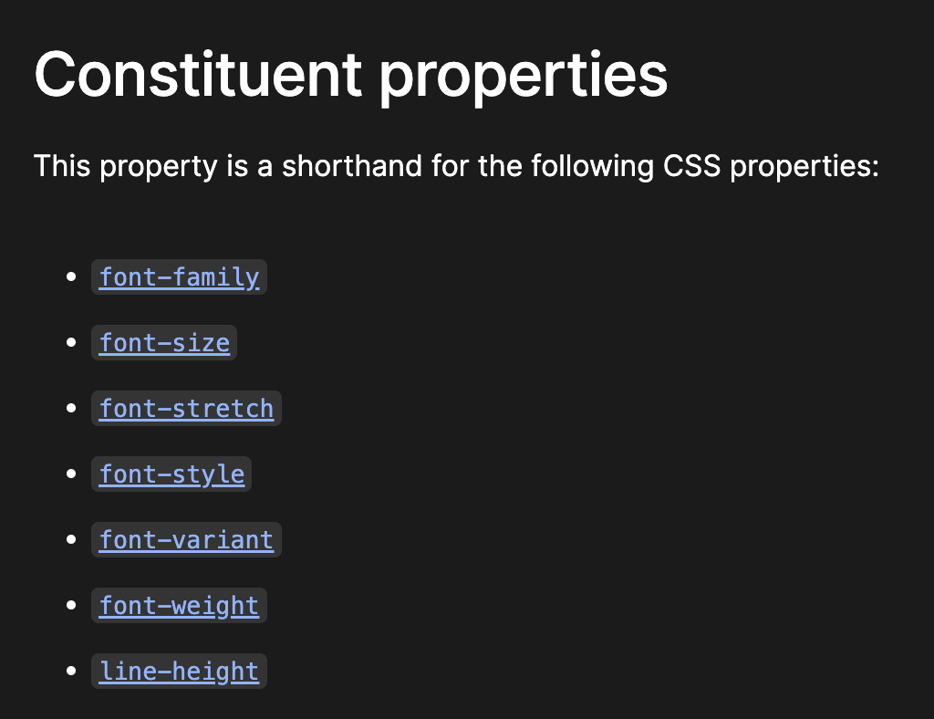
The font properties usually come in the form of font-*, and the following values determine which part of a font is adjusted.
Similar to the font, we can modify the words in elements with text-* properties.
The text properties mainly adjust the alignment or decorations of the words in the elements.
Background
The background-* CSS property sets all background style properties at once, such as color, image, and size or repeat method.
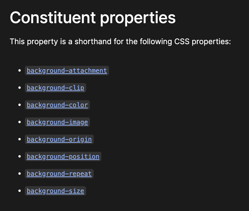
The elements are boxes, and we can put the image or color in those box areas. With the properties above, we can modify the elements’ background style.
Positioning
Positioning allows one to move an element from where it would otherwise be placed in normal flow over to another location.
With the position property, we can place the elements or the project details as we want.
Flexbox
Flexbox is the short name for the Flexible Box Layout CSS module, designed to make it easy for us to lay things out in one dimension - either as a row or column.
As in the picture, we can use the flex for any horizontal alignment in modern web design without using float or positioning.
Transition
The transition-* CSS property is the property for changing property values smoothly over a given duration.
The transition property is difficult to check with the picture, but we have seen this effect when learning :hover.
Check out the previous lecture’s :hover part or the MDN transition in the Try it part’s example.
Transform
The transform-* CSS property lets us rotate, scale or translate an element. It modifies the coordinate space of CSS and uses multi-dimensional positions to rotate the element.
Note that only transformable elements can be transformed. This means the layout of the elements using the CSS box model is transformable, but the inline and table-level elements are not.
Float
The float CSS property places an element on its container’s left or right side, allowing text and inline elements to wrap around it. The element is removed from the normal flow of the page, though it still remains a part of the flow.
Notice that we can see the same structure in the newspaper, where it was used as a main horizontal alignment property before the flexbox was developed.
The float property creates a floating element, and when the element is floated, it is taken out of the document’s normal flow. The box is shifted to the left until it touches the edge of its containing box or another floated element. The text will flow alongside the floating element.
Animation
The animation CSS property applies an animation between styles.
Check out the animation properties from MDN.
The difference with the transition property is that transitions enable one to define the transition between two states of an element. Meanwhile, the animation property enables complex animations and can apply more than two states.
Grid
The CSS grid layout module introduces a two-dimensional grid system to CSS. The grid can be used to lay out major page areas or small user interface elements.
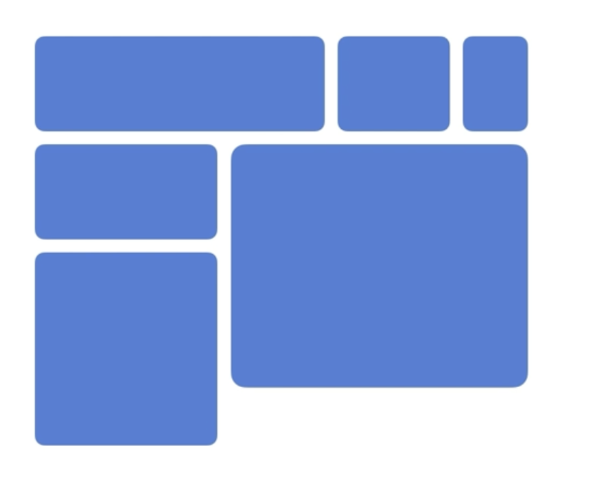
A grid is a set of intersecting horizontal and vertical lines defining rows and columns. It has many benefits, such as flexible track size, alignment control, etc.
Multi-column layout
The CSS multi-column layout module, usually referred to as multicol layout, lets us divide content across multiple columns.
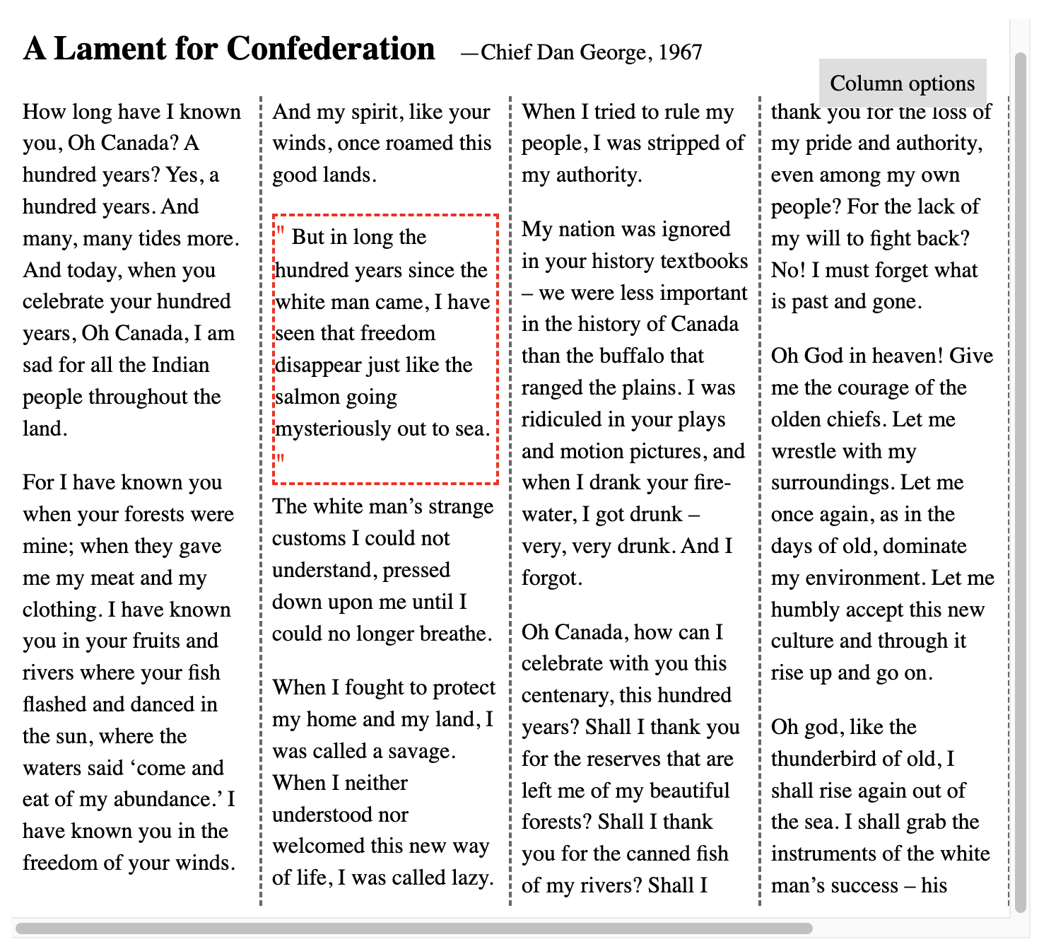
The example is displayed across multiple columns, similar to how articles are displayed in printed newspapers.
Filter
The filter CSS property applies graphical effects like blur or color shift to an element.
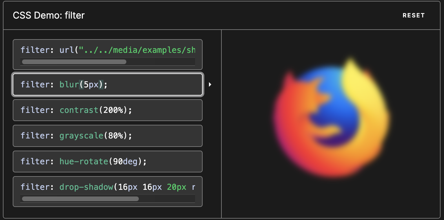
Filters are commonly used to adjust the rendering of images, backgrounds, and borders.
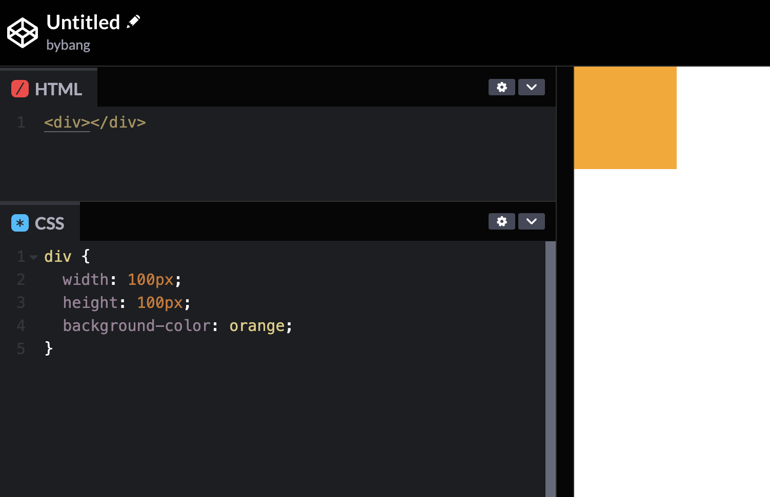
Width and Height
width and height
The width CSS property sets an element’s width. By default, it sets the width of the content area, but if box-sizing is set to border-box, it sets the width of the border area.
We have a regular box model in the picture above. And if we comment out either width or height, the results are like the following:
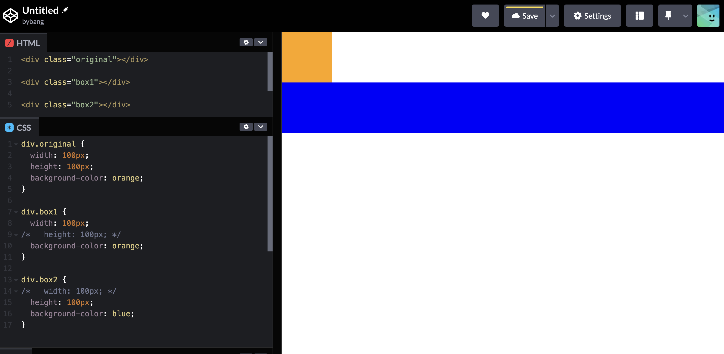
Notice the first box is the original box, and the second box (.box1) is not displayed on the screen. The third box has a different color, and it only has a height.
Initial Value
The initial value will explain the above example. The initial value of the CSS property is its default value, as listed in its definition table in the specification.
The width and height property’s initial value is auto, which automatically calculates an element’s value.
Recall that the span element tends to shrink horizontally and vertically to its content size as an inline element. The div element tends to expand horizontally to its parent element size and shrink vertically to its content size.
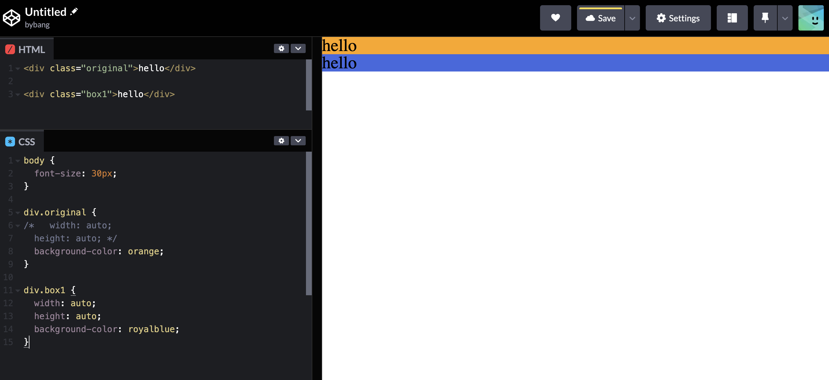
As we can see, the div element is automatically calculated without the property-value pair, in which the width expanded to its parent body, and the height shrunk to its content, the text hello in the div.
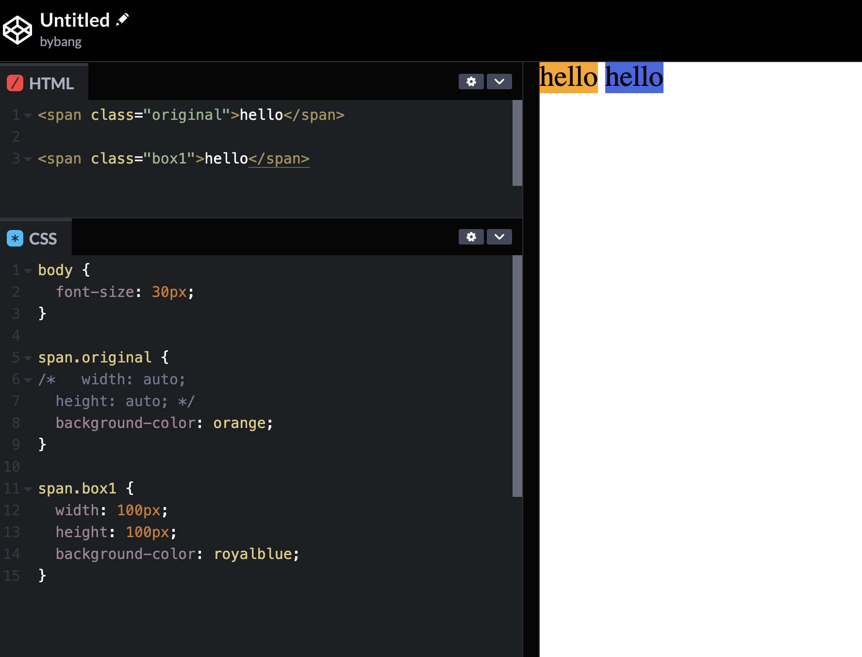
If we change the above example to the span, the two elements will have automatically calculated values. Notice if we deliberately put the values in the second box. It doesn’t display even though it has a width and height of 100px because two elements are inline-element.
max-width and max-height
The max-width and max-height properties set an element’s maximum width and height. They prevent the used value of the width and height property from becoming larger than the values specified by max-width or max-height.
They have the initial value of none, which we normally wouldn’t limit an element’s maximum width and height.
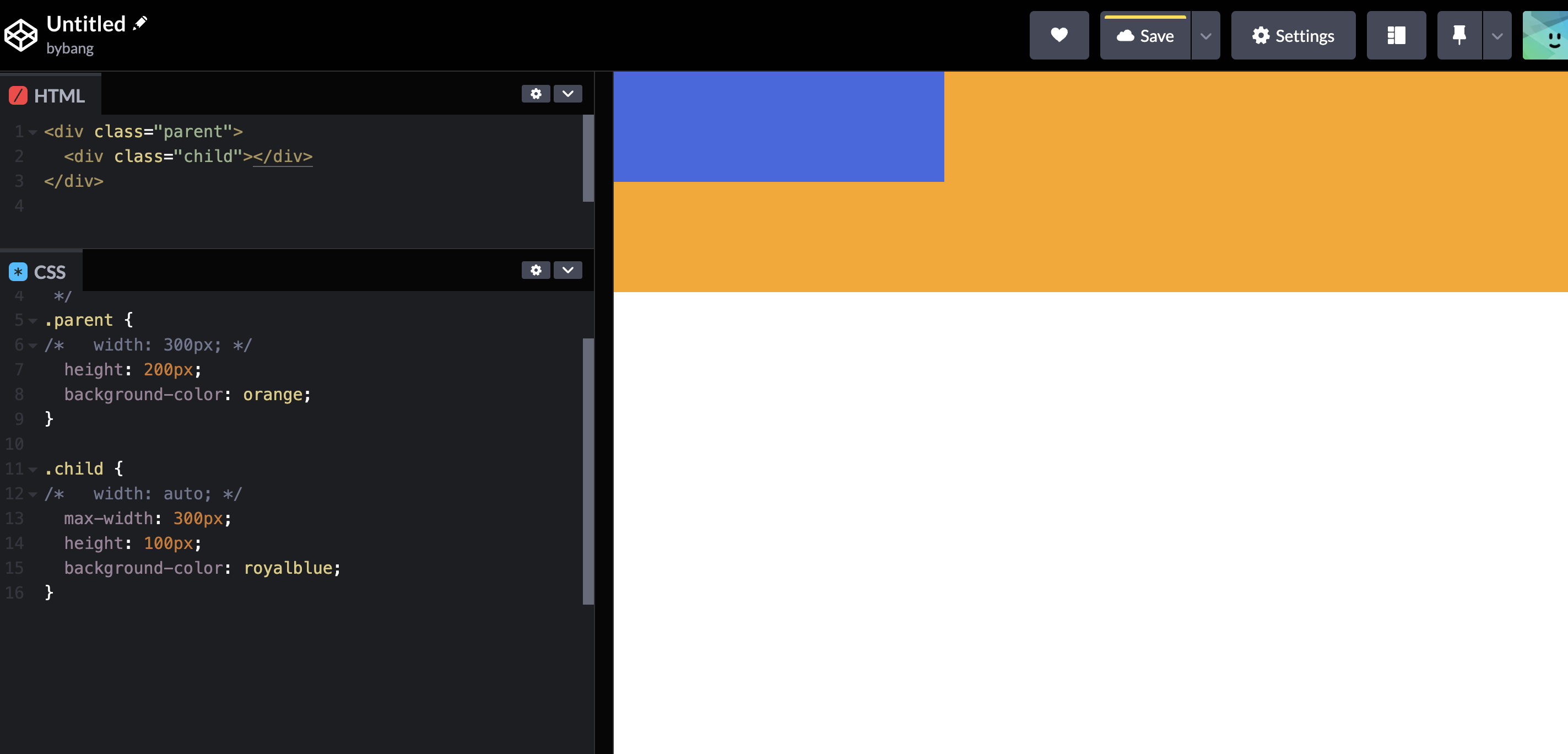
We have another structure of div elements: the parent and child elements. The parent element’s width will be auto, which is expanded to fit the body.
The child element’s width will be 300px because of the max-width property. If the max-width doesn’t exist, it will be expanded to its parent, the .parent element or the orange box.
min-width and min-height
The min-width and min-height CSS properties set an element’s minimum width and height. The element’s width or height is set to the value of min-width or min-height whenever minimum values are larger than maximum and regular width or height.
The initial value is 0, which means the width and height have to be an integer by default, and the smallest possible value is 0.
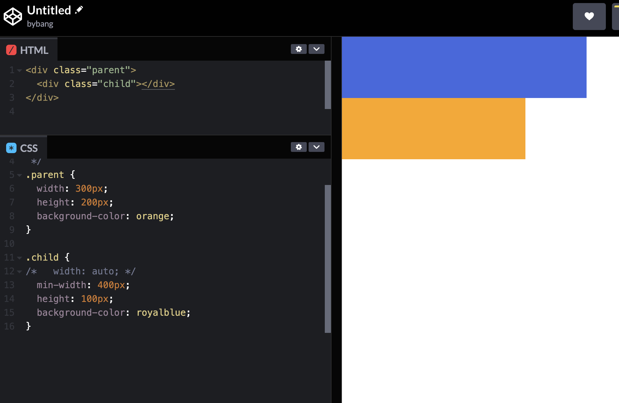
The .parent element has a width of 300px, and the .child element’s width might be the same as the default. However, we deliberately set the min-width to 400px. Therefore, the blue box overflowed the parent box and has a width of 400px;
CSS Units
Units overview
Pixel
A pixel is the smallest building block of a graphical display, like the computer screen.
Display resolution is expressed in the unit of pixels. For instance, a computer monitor with 1920x1080 indicates the monitor can display 1920 pixels in width and 1080 pixels in height.
Percentage (%)
The percentage CSS data type represents a percentage value. It is often used to define a size relative to an element’s parent object.
em and rem
The em unit is relative to the element’s font size, and the rem unit is relative to the font size of the root element. The root element means the top of the document, which indicates the HTML element.
vw and vh
The vw and vh units are relative to the viewport width and height. The viewport means the area of the browser that users see, which is currently visible in its window.
Suffice it to say that we divide the viewport into 100 pieces and assign a single piece to 1vw or 1vh. It means they are the 1% of the viewport width and height.
Units example
Let’s modify the units and see how the units work on the website.
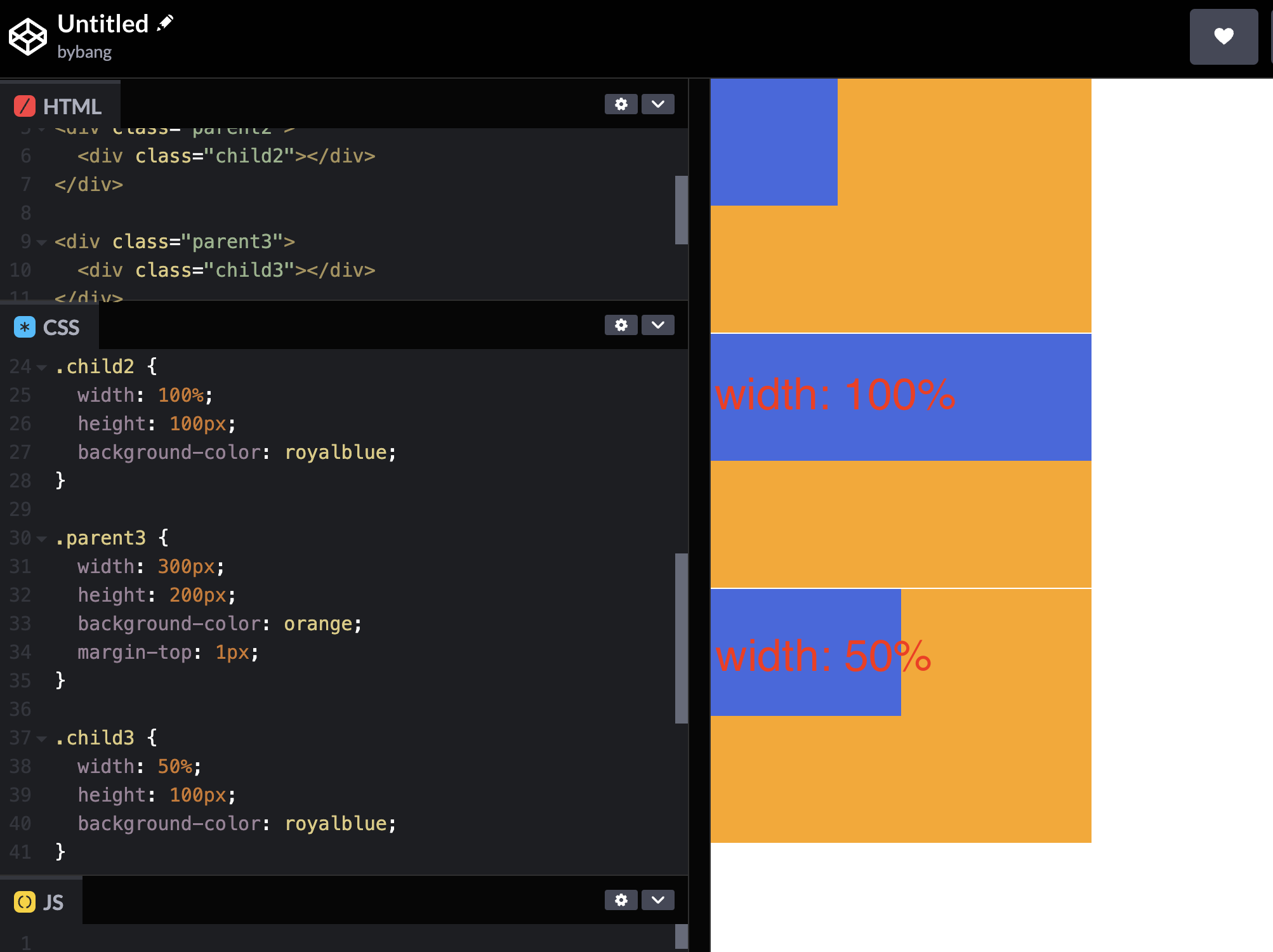
The above three elements indicate three different styles using pixels. The first box is the original, and the blue box has width: 100px; height: 100px; properties. The other two boxes use percentages, calculating the size proportionally depending on the parent box(orange box) value.
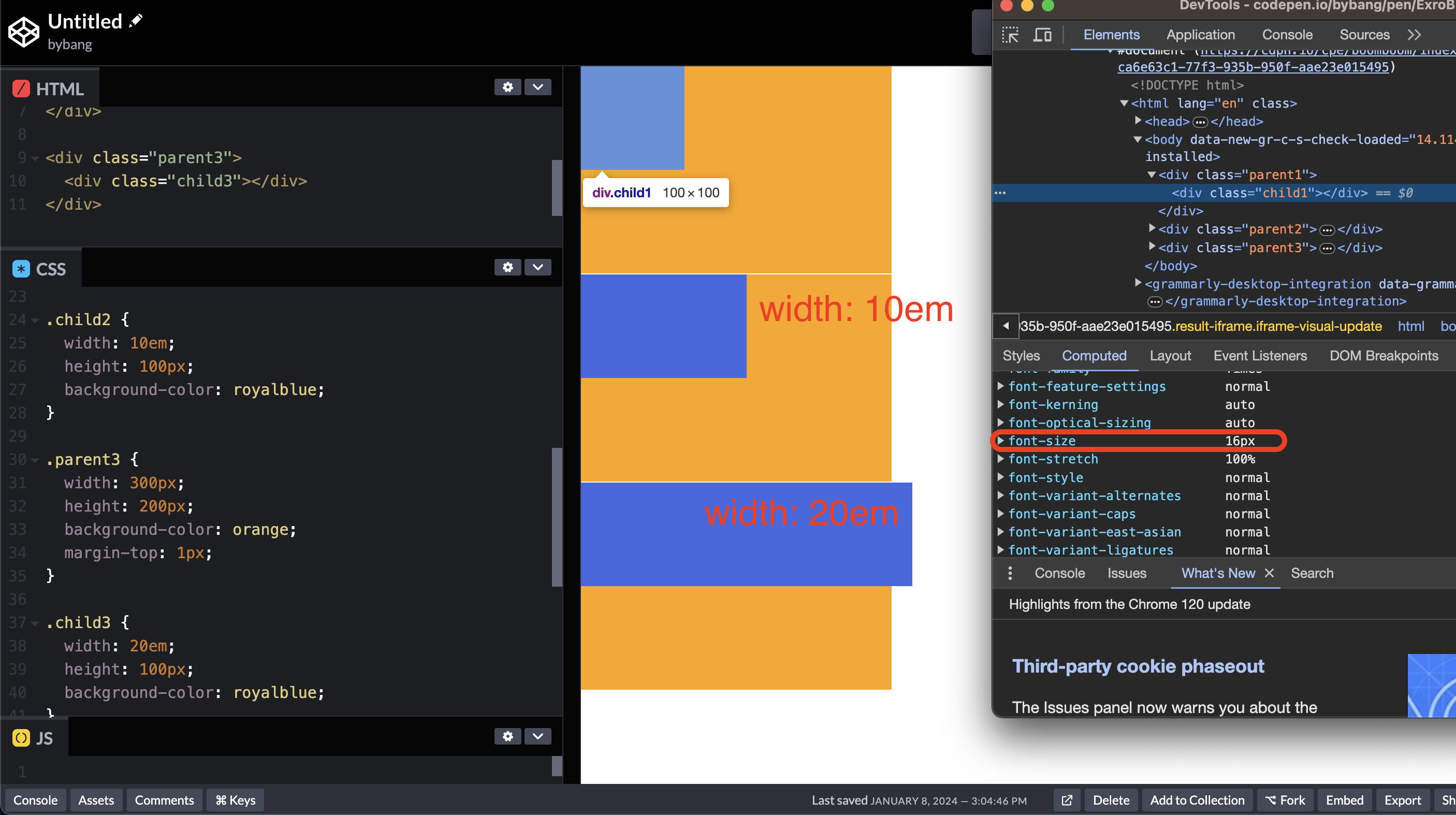
Originally, the root element or the HTML element had a font size of 16px by default. This font size is the convention or web browser standard, so even if we didn’t set the font size property, it is calculated as 16px.
Notice the second box used 10em as its width. This property indicates that the second blue box’s width will be 160px because the em unit is relative to the element’s font size. The calculation will be 10em = 16px / 1em * 10em = 160px
The third box has a width of 320px because of the width: 20em; property. Therefore, it overflows the parent box because its width is 300px.
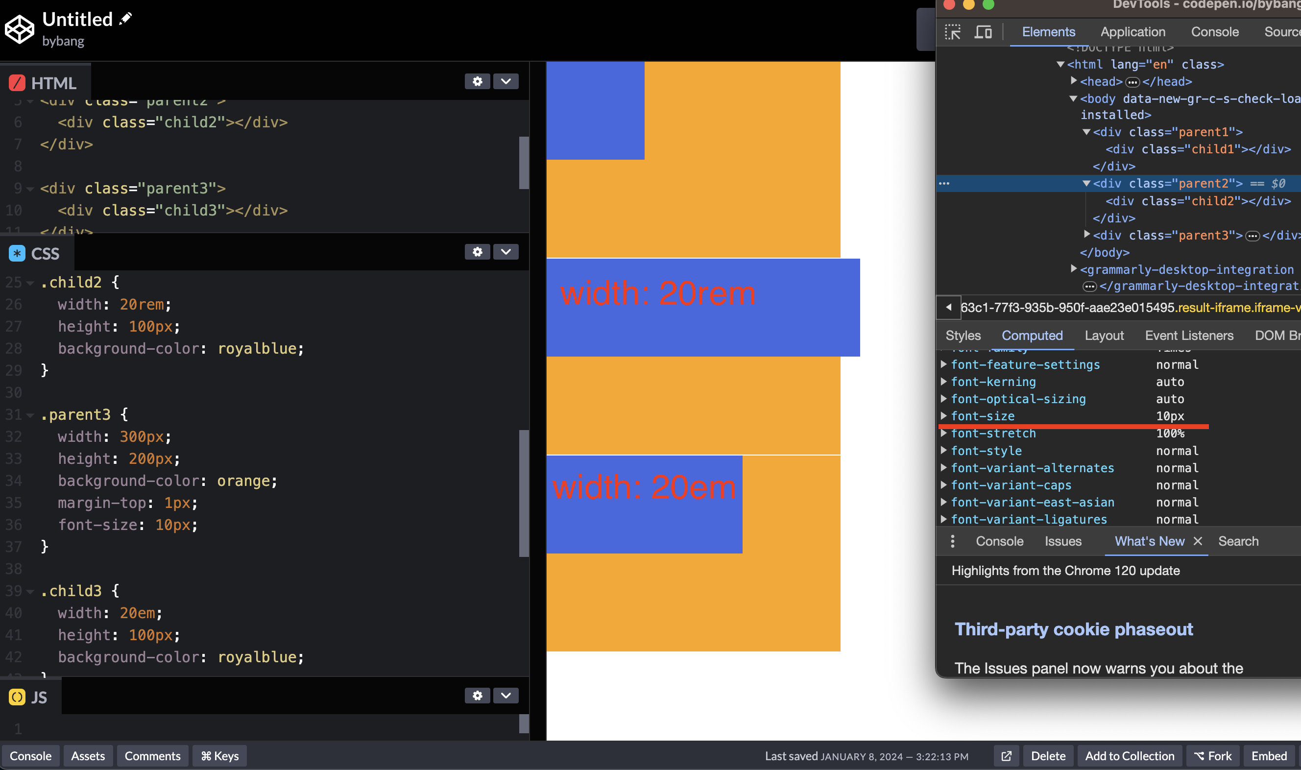
The above example shows that all the parent elements have a font size of 10px. The font or text-related properties will inherited by its child, as we learned in CSS inheritance. When we use the em, the last blue box has a width of 200px. (10px / 1em * 20em = 200px)
However, the second blue box uses the rem relative to the font size of the root element, which is 16px. Therefore, the second blue box’s width is 320px and overflows the orange box.
With this characteristic, we can use the rem unit to make the content size flexible. Changing the root element’s font size can modify the size of all the content that uses rem.
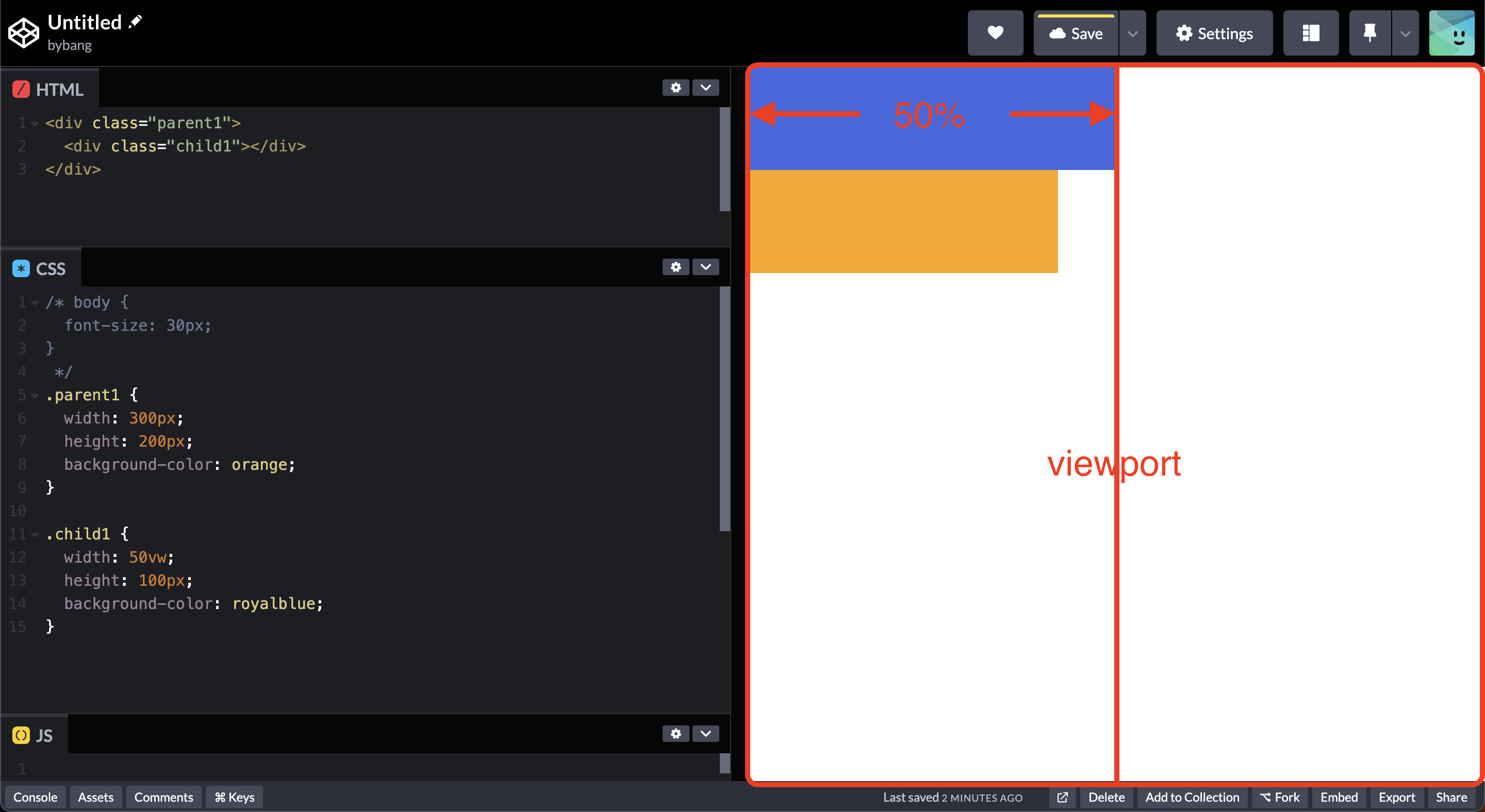
Lastly, if we use the vw, the browser calculates the viewport size, and since the blue box has the width: 50vw, it uses 50% of the viewport.
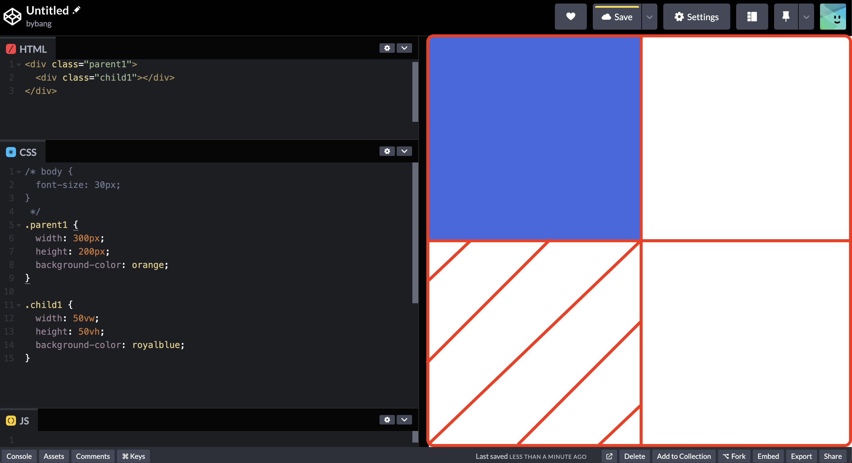
Notice the blue box has the width: 50vw; height: 50vh; properties, and it uses the quarter of the viewport. If we increase the height to 100vh, it will use the area filled with red lines below. No matter the viewport size, the vw and vh calculate the area proportional to the current viewport size.
CSS Margin
Margin definition
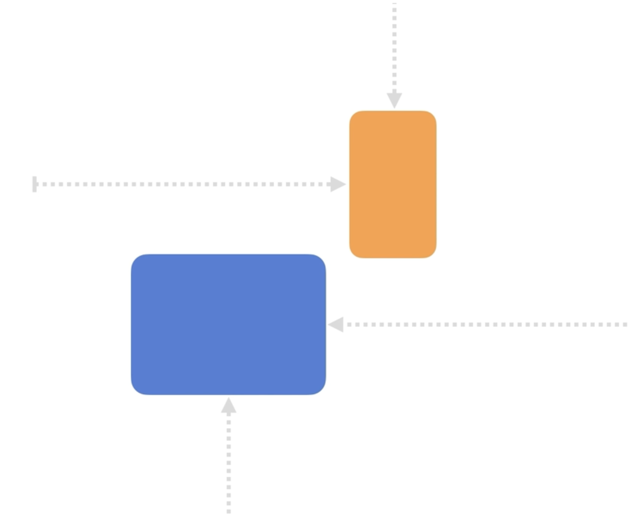
The margin CSS shorthand property sets the margin area on all four sides of an element. The margin area extends the border area to include an empty area that separates the element from its neighbours - simply, the element’s outer space by the CSS box model.
The initial value of margin is 0, and it uses the length, percentage and the auto for its value. The auto value means the browser selects a suitable margin to use. Normally, the margin: auto; centers an element.
Margin examples
The margin adds spaces on four sides like this:
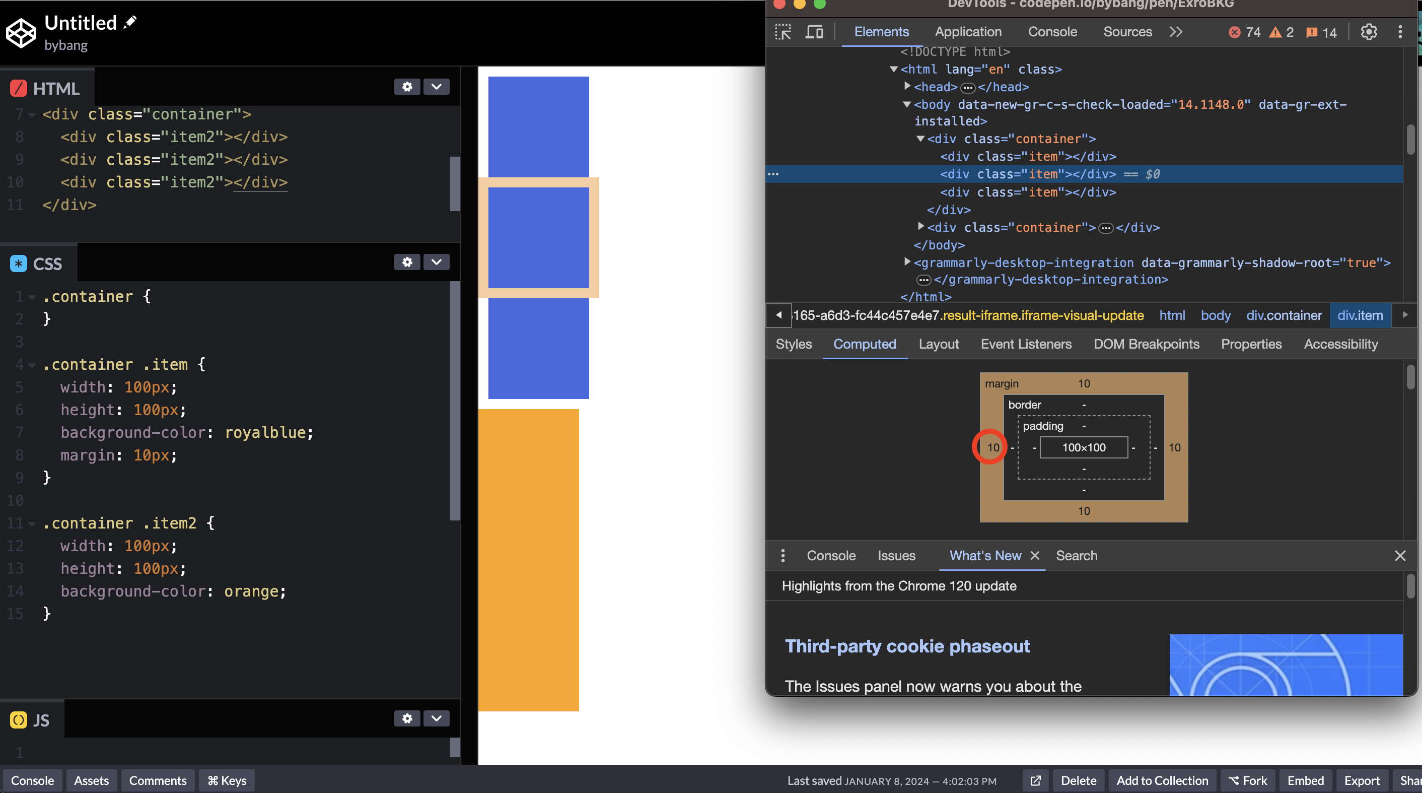
Notice that each box has a margin of 10px on each side. If we made the boxes without the margin, it would look like the orange box.
Additionally, if we use the negative values, the negative values draw the element closer to its neighbours than it would by default.
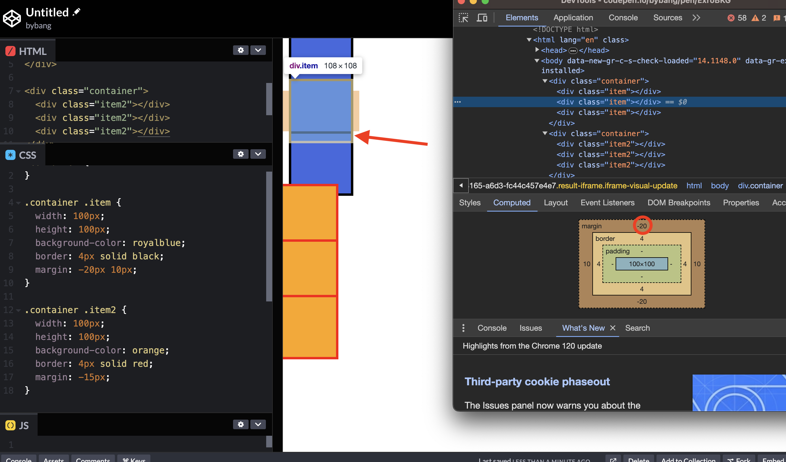
If we look closer, the blue box’s border-line area is overlapped by the following box. It means that the area is shrunk to the given value.
Shorthand property
Shorthand properties are CSS properties that let us simultaneously set the values of multiple other CSS properties.
The margin has four properties on each side.
margin-top: 10px;
margin-right: 20px;
margin-bottom: 10px;
margin-left: 20px;
They are the same as the following declaration using the four values shorthanded. Note that the values are in clockwise order, beginning at the top.
margin: 10px 20px 10px 20px;
Margin shorthand rules for one, two, three and four values declarations are the following:
- When one value is specified, it applies the same margin to all four sides.
- When
twovalues are specified, the first margin applies to the top and bottom, the second to the left and right. - When
threevalues are specified, the first margin applies to the top, the second to the left and right, and the third to the bottom. - When
fourvalues are specified, the margins apply clockwise: top, right, bottom and left.
More detailed explanations like the above picture are available on the MDN documentation.
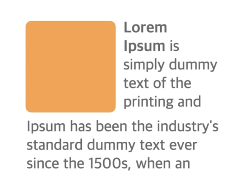
CSS Padding
Padding definition
The padding CSS shorthand property sets the padding area on all four sides of an element at once. The padding area extends the content area to include the element’s padding - simply, it expands the inner space of the element.
The initial value of padding is 0, and it uses the length and percentage as a value. Negative values are invalid.
Padding examples
The padding expands the inner area like this:
Notice that the light blue area is the original box (100px x 100px), and the box added the inner area.
We can see the border if we select the original box or in normal status. The border proves that it indeed expanded the inner area.
The padding is a shorthand property, and it shares the same values as the margin’s shorthand property values.
Note that the padding creates extra space within the element. In contrast, the margin creates extra space around the element.
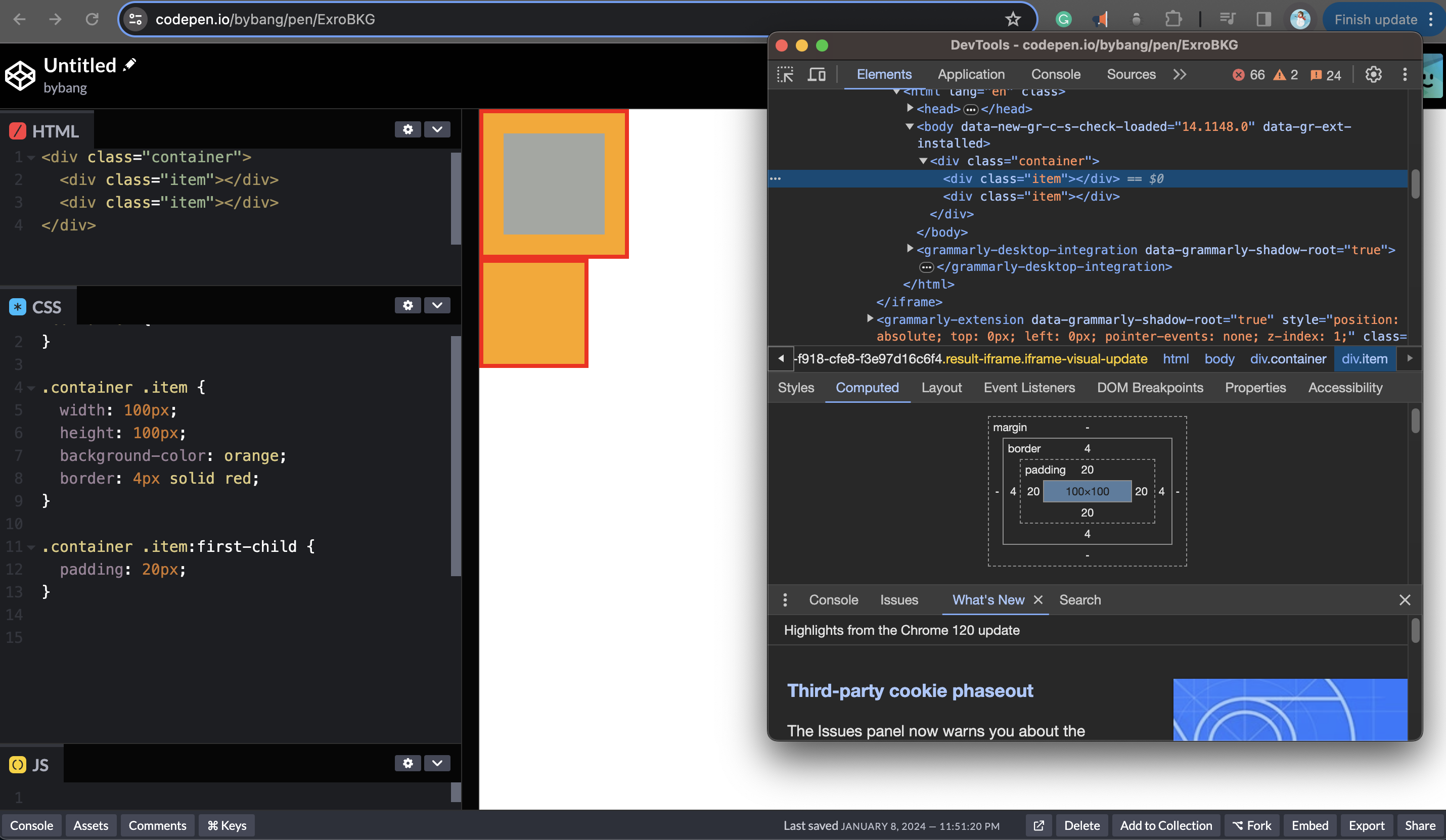
Border and Color Representation
CSS Border
The border shorthand CSS property sets an element’s border. It sets the values of border-width, border-style, and border-color.
As with all shorthand properties, any omitted sub-values will be set to their initial value.
As the above picture shows, the border-color is black, which follows the color property. By default, the color is black. Therefore, the border color is black.
The last box indicates that if we don’t differentiate the border color, it just expands the element.
Border shorthand
The border shorthand is especially useful when we want all four borders to be the same. To make them different from each other, we use the longhand border-width, border-style, and border-color properties, which accept different values for each side.
border-width
The border-width shorthand CSS property sets the width of an element’s border.
It uses the line-width values, which define the width of the border, either as an explicit nonnegative length or a keyword. If it’s a keyword, it uses thin, medium, and thick values.
We normally use explicit length values because the keyword values are not clear to use.
The initial value of border-width is medium, and shorthand properties using border- (top, right, bottom, left), same as the padding and margin.
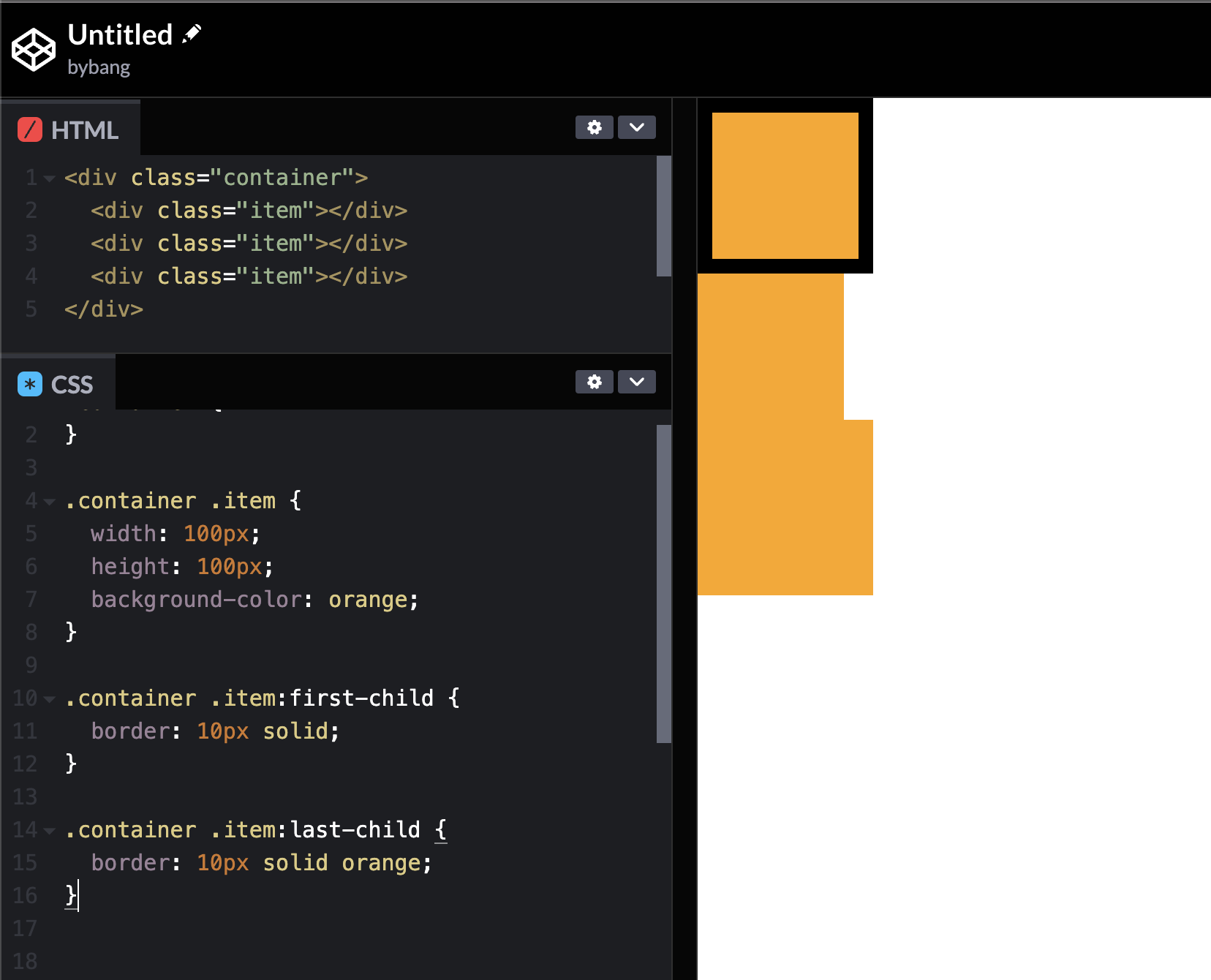
border-style
The border-style shorthand CSS property sets the line style for all four sides of an element’s border.
It uses many style values, such as dotted, dashed, solid, and the like. Feel free to check out more values on the MDN official document.
The initial value is none, which displays no border. The none value makes border-width to be 0, even if there is a specified value. The none value has lowest priority, which means that if any other conflicting border is set, it will be displayed. In contrast, a hidden value with the highest priority means that the border won’t be displayed in any condition.
The most used value is solid, which displays a single, straight, solid line.
We can see from the above picture that each box has different styles, and by the third box, we can check the initial border-style is set to none.
Also, the border increased the element size compared to the third box without the border with different boxes.
border-color
The border-color shorthand CSS property sets the color of an element’s border.
The initial value of border-color is currentcolor, which means that if the color property is set to the element, it follows the element’s color. The element’s color property’s initial value is black. Therefore, the currentcolor is black by default.
As the border-color is a shorthand property, it uses all four sides, like the margin or padding.
Color representation
By far, we used the name of the color when we declare a color property’s value. In fact, many color values represent the color along with the color name.
A color value can be specified using one of the methods listed below:
- By keywords:
<named-color>(such as red or blue),<system-color>, andcurrentcolor. - By hexadecimal notation:
<hexa-color>(such as #ffffff, #000000). - By parameters in a color space using functional notations:
- sRGB color space:
hsl(),rgb(),rbga()
- sRGB color space:
The hexadecimal notation is commonly used when we build a website. Because it declares concise color by hexadecimal code, the keyword method color (orange, green) can differ on each browser. The rgb() functional notations were used in the past, but they are complex to use. Therefore, the hexa-color method is the most popular on modern websites.
div.comma-separated {
  background-color: rgb(255, 0, 0, 0.5);
}
The rgb() or rgba() functional notation uses a number between 0 and 255 or a percentage value. Each value represents the red, green, and blue channels.
The last value, a, which stands for alpha-value, is optional. It represents the opacity of an element, where the number 1 corresponds to 100%.
The legacy syntax rgba() syntax is an alias for rgb(), accepting the same parameters and behaving in the same way.
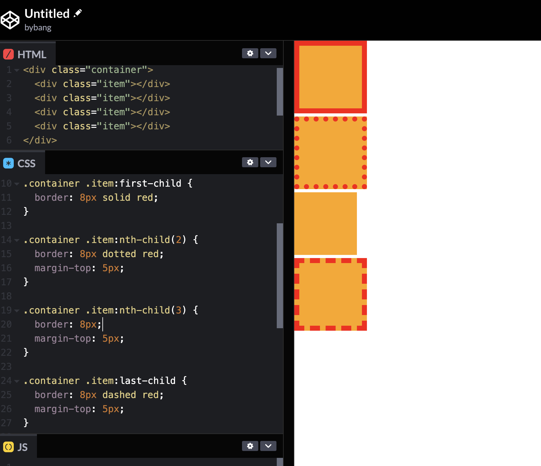
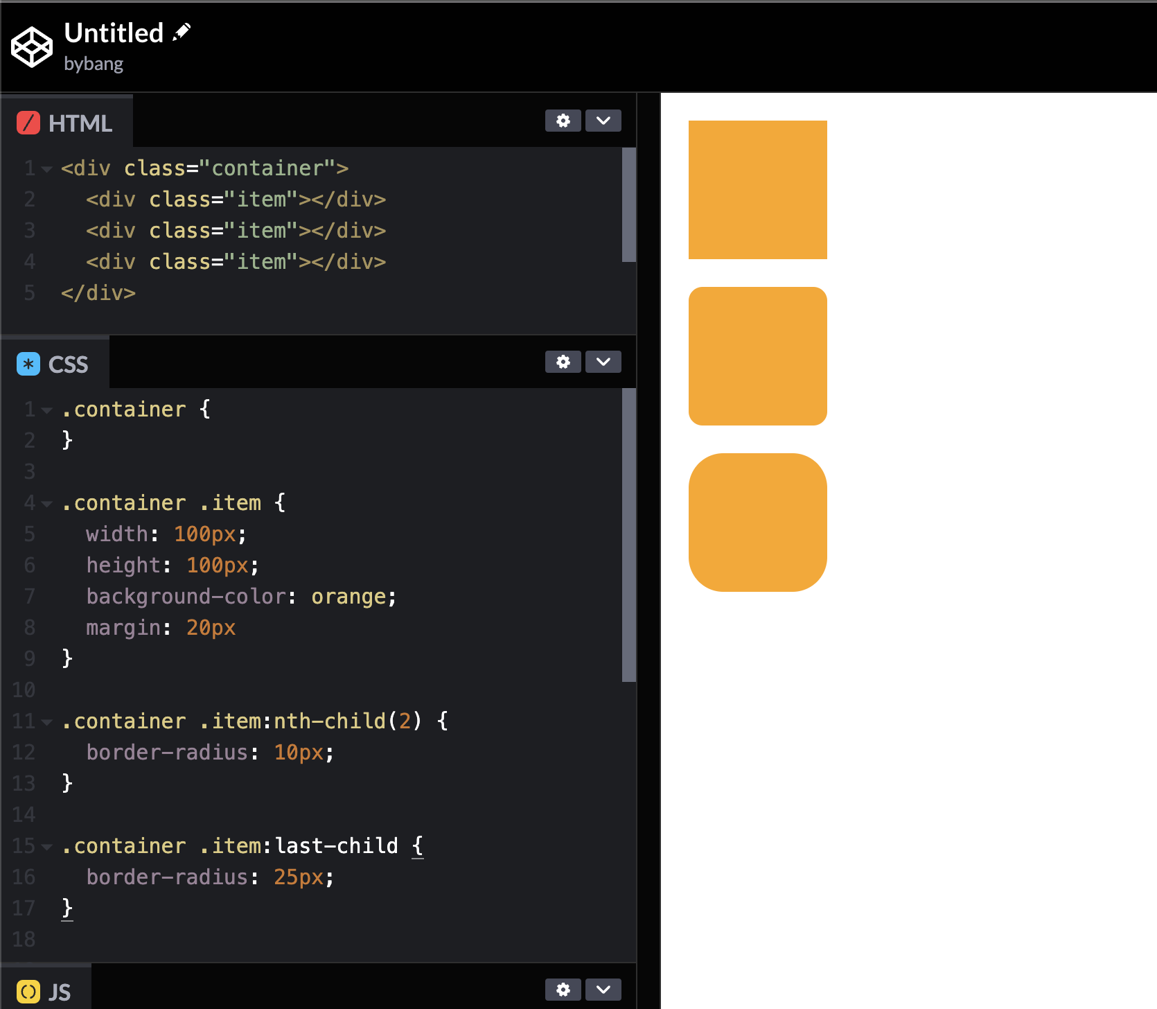
Border radius
CSS border-radius
The border-radius CSS property rounds the corners of an element’s outer border edge. We can set a single radius to make circular corners or two radii to make elliptical corners.
The initial value of border-radius is 0, using one to four length or percentage values. Start from the element’s top-left corner, and the values are applied in a clockwise direction.
More detailed explanations about the border-radius values are available in the MDN document.
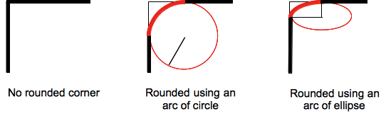
The rounding can be a circle or an ellipse, or if one of the values is 0, the corner is square, like in the first example above.
Box sizing
CSS box-sizing
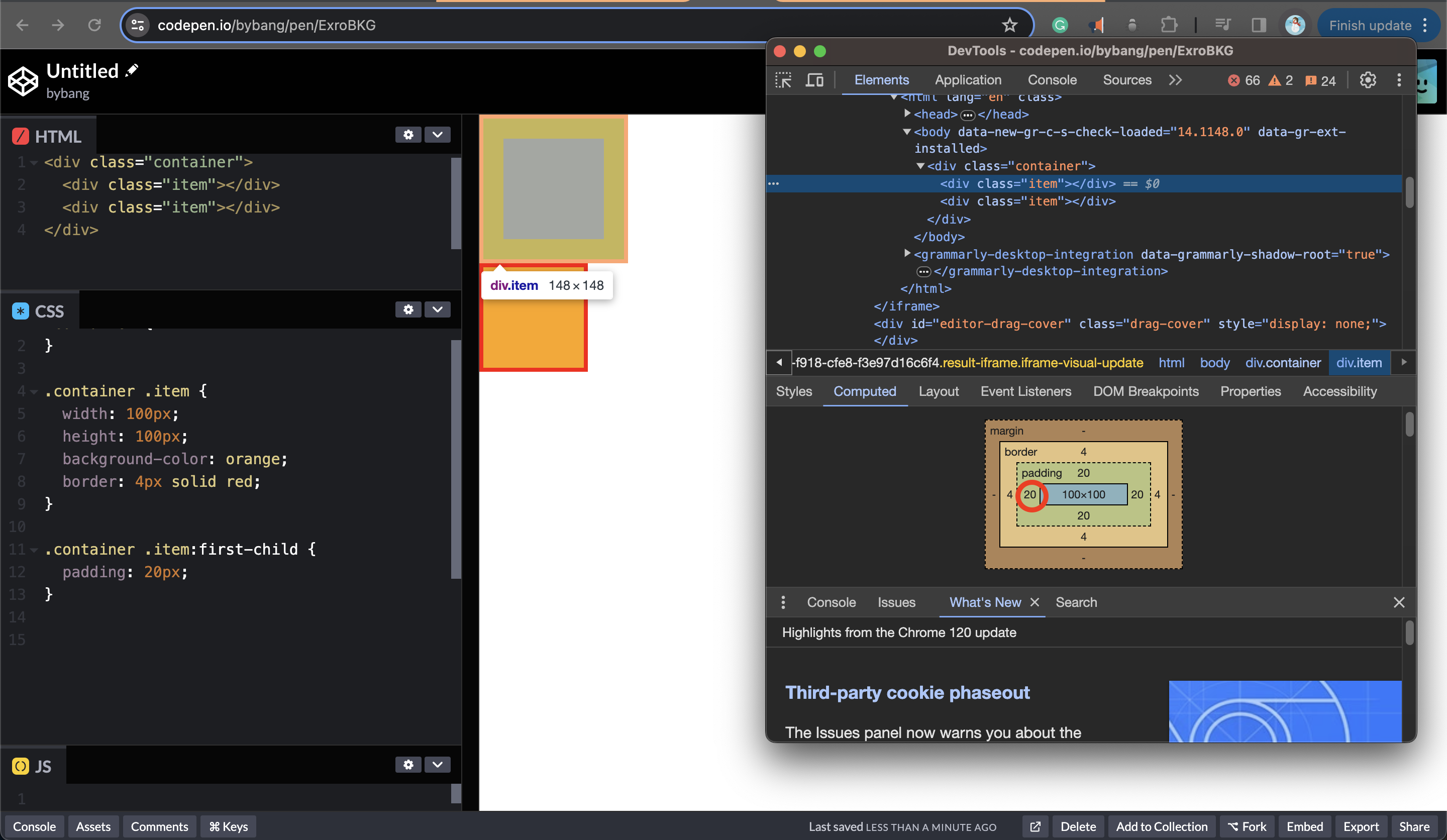
The box-sizing CSS property sets how an element’s total width and height are calculated.
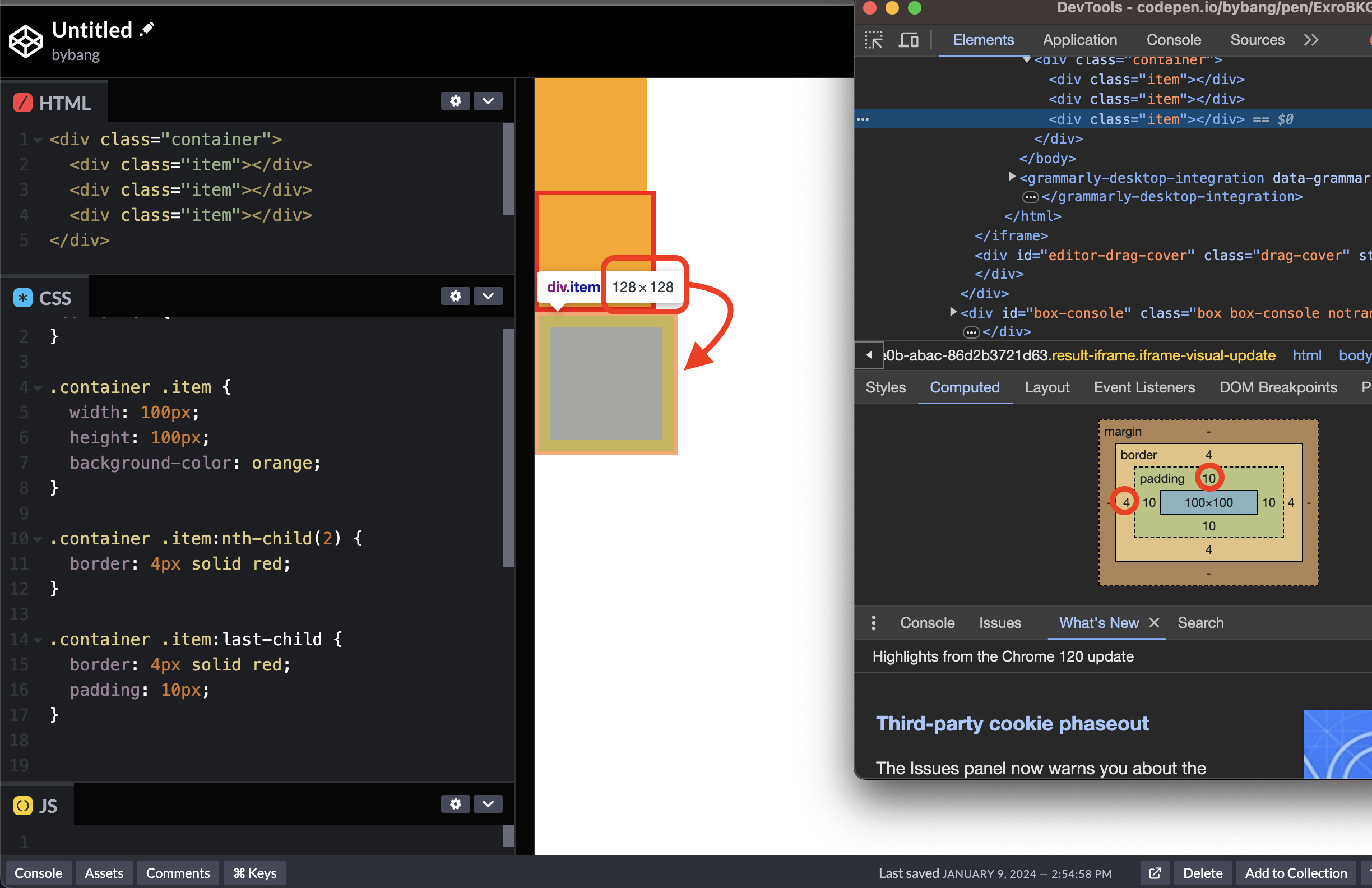
Notice we set the width and height to 100px, but the element’s computed size is 128 x 128. That’s because the padding added 10px on each side, and the border added 4px on each side. Hence, the element’s width and height becomes 128px (10px + 10px + 4px + 4px + 100px).
However, what if we want the box size to keep the original size 100px? Since we use the padding and border properties, the element’s size increases by default.
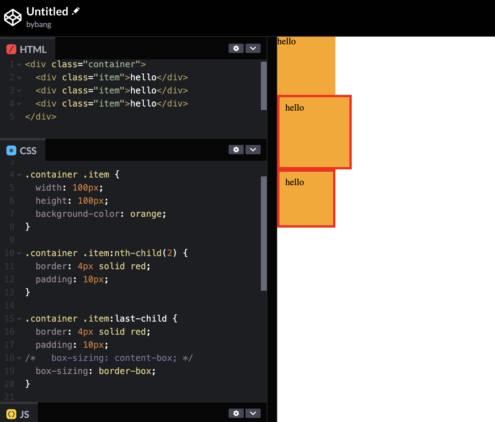
That’s when we need the box-sizing property. Notice the last box has a padding of 10px and a border of 4px, and it still has the same size as the original box.
The initial value of box-sizing is content-box, which gives the default CSS box-sizing behavior.
If we set an element’s width to 100px, then the element’s content box will be 100px wide, and the width of any border or padding will be added to the final rendered width, making the element wider than 100px.
Meanwhile, the border-box value tells the browser to account for any border and padding in the values we specify for an element’s width and height.
If we set an element’s width to 100px, that 100px will include any border or padding we added, and the content box will shrink to absorb that extra width.
We can manually calculate the width and height of the content like this:
.container .item:last-child {
  border: 4px solid red;
  padding: 10px;
  width: 72px;
  height: 72px;
}
We subtracted 8px on each side for the border and 20px for the padding. Therefore, the width and height of the content is 100px - 20px - 8px = 72px.
However, the manual calculation in coding is treated as a bad practice. Hence, it is recommended to use the box-sizing if we want the element to be the same size as the content, with the border or padding.
CSS overflow
Overflow definition
The overflow CSS shorthand property sets the desired behavior when content does not fit in the parent box in the horizontal and/or vertical direction.
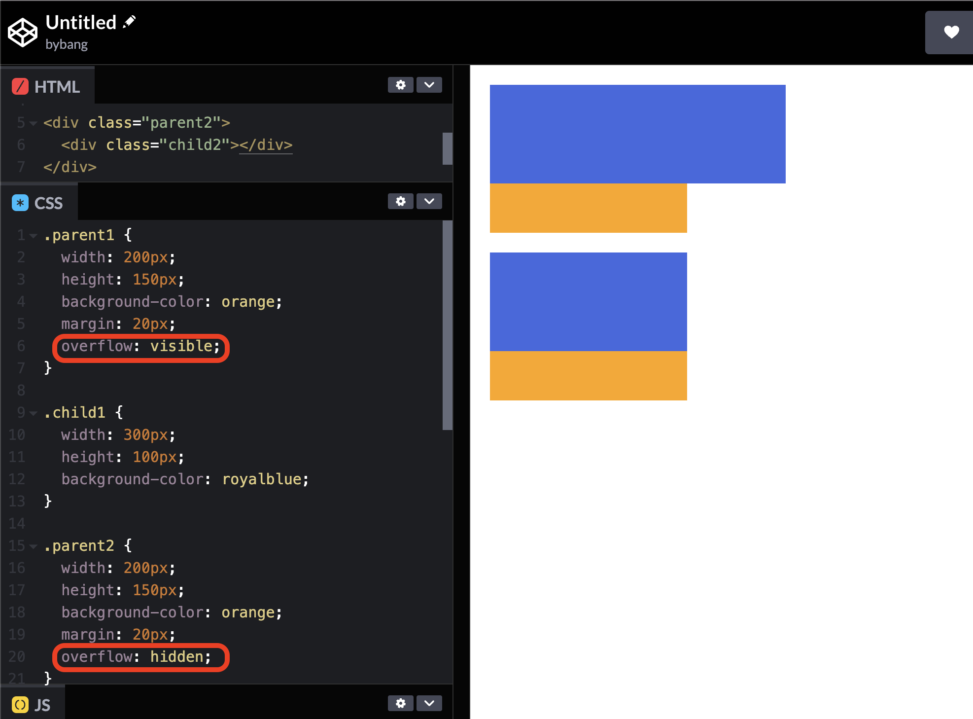
The overflow property is specified as one or two keyword values. As we can see, the initial value is visible, which means overflow content is not clipped and may be visible outside the element’s padding box.
It uses overflow-x and overflow-y properties in longhand. If only one keyword is specified, both overflow-x and overflow-y are set to the same value.
If two keywords are specified, the first value applies to overflow-x in the horizontal direction, and the second applies to overflow-y in the vertical direction.
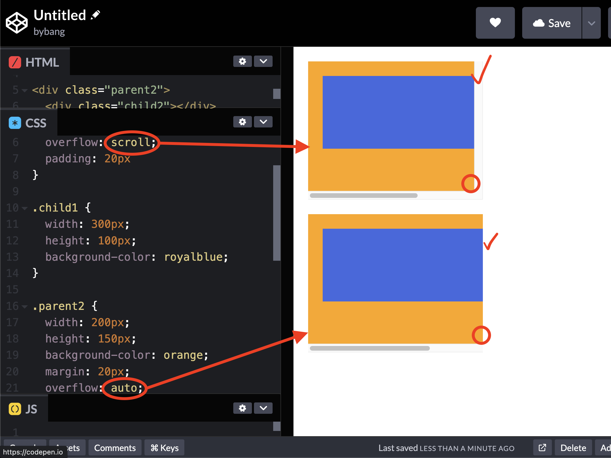
Additionally, keywords like scroll or auto make the scroll bar to the element.
The scroll value displays scroll bard in horizontal and vertical directions if only one value is set, regardless of whether the content overflows.
Unlike scroll, the auto value displays scroll bars only if the content is overflowing and hides scroll bars by default.
Overflow options include hiding overflowing content, enabling scroll bars to overflow, or displaying content flowing from an element box into the surrounding area and combinations thereof.
CSS display
display
The display CSS property sets whether an element is treated as a block or inline box and the layout used for its children, such as flow layout, grid or flex.
The display has many keyword values and can be grouped into six value categories.
We will cover a few keyword values in this section, and grid and flex values will be covered in each part.
The block and inline values are in the Outside category, and the flex and grid values are in the Inside category.
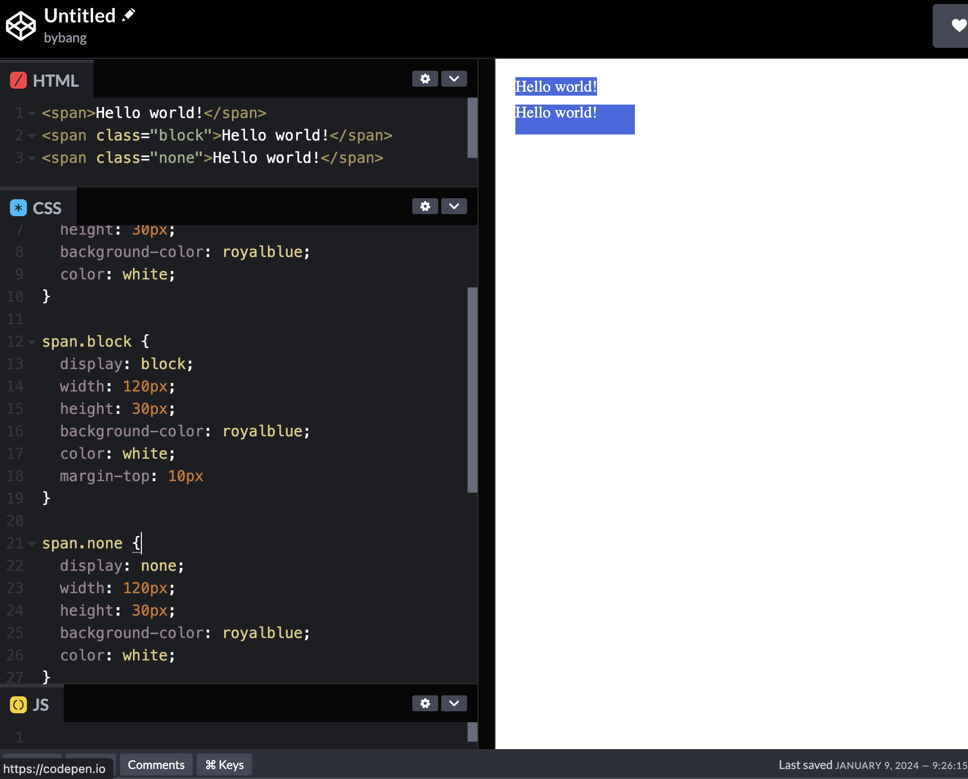
The block element generates a block box, generating line breaks both before and after the element when in the normal flow.
The inline element generates one or more inline boxes that do not generate line breaks. In normal flow, the next element will be on the same line if there is space.
When we make the website, we will face the fact that we have to set the width and height to the inline element. In that case, we can change the element to block and then use the width and height properties.
Notice the above picture’s second span element has the display: block; property, which uses the width and height properties. While the first element is not the block element, the span element is inline by default, and the element can’t use the width and height properties.
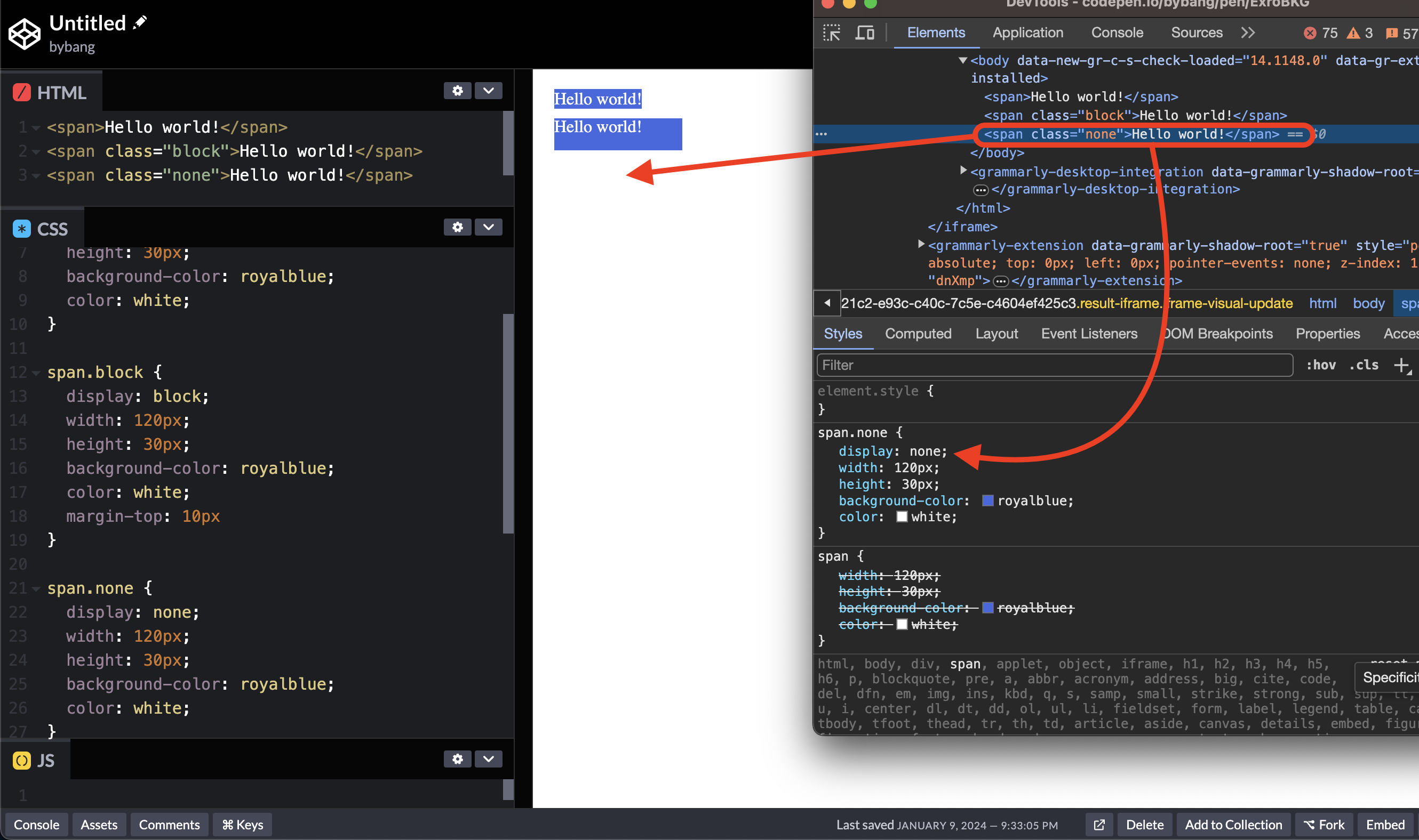
The none value is in the Box category, and the inline-block value is in the Precomposed category.
The none turns off the display of an element so that it does not affect the layout. As we can see in the above picture, the element exists in the DOM tree or the Devtool, but the styles are not displayed on the screen.
The inline-block element generates a block box that will flow with surrounding content as if it were a single inline box.
📌 Takeaway
- The initial value means the default value of the property.
- The
widthandheightproperties’ initial value isauto, automatically calculating an element’s value. - A pixel is the smallest building block of a graphical display.
- The
emandremunits are relative to the element’s font size. Theremis more concisely relative to the root element’s font size. - The root or
HTMLelement has a font size of 16px by default. - The margin area extends the border area to include an empty area that separates the element from its neighbours.
- The margin value
automeans the browser selects the suitable margin to use. - The shorthand property is a CSS property that simultaneously sets the values without individual properties.
- When shorthand property values are specified, apply the values in a certain order. If two values are set, the values are set for the top and the bottom, three values for the top, middle and bottom, and four values for the top, right, bottom, and left in clockwise.
- The padding area extends the content area to include the element’s padding.
- The
border-style: noneproperty value sets theborder-widthto0and ignores the existingborder-widthvalue. - The
border-style: hiddenproperty value doesn’t display the border as thenonevalue, but it has the highest priority. Thenonevalue has the lowest priority, which means that if the conflicting border value exists, the border will be displayed. - The
rgba()is a legacy syntax and an alias forrgb(), accepting and behaving in the same way. - The
box-sizingproperty determines an element’s total width and height. - If any value increases the element size, the
box-sizing: border-boxproperty value shrinks the element to match the element’s originalwidthorheightvalue. - The
overflow: scrollproperty value displays the scroll, whether the content overflows or not. Theautovalue displays the scroll only if the content overflows. - The
displayCSS property has many values, and the most common values areinline,block,grid, andflex. - The
inlineandblockvalues are in theOutsidecategory, and theflexandgridvalues are in theInsidecategory. - The
display: noneproperty value turns off the display of an element. The element exists in the DOM tree but is not visible on the screen. - The element with the
display: inline-blockproperty value generates a block box that will flow with surrounding content as a single inline box.
💻 Solution
- None
🔖 Review
- The
widthproperty sets the width of the content area, but ifbox-sizing: border-boxis set, thewidthsets the width of the border area. - The
max-widthandmax-heightproperties prevent the used value of the width and height property from becoming larger than the values specified. - The
min-widthandmin-heightproperties fix the width and height values to their minimum values if the width and height values are larger than the minimum values. - The unit
1vwor1vhmeans1%of the viewport width and height. - Suffice it to say one element has a font size of 10px, width of
10em, and height of10rem. If we calculate the element’s size, the width is 100px, and the height is 160px. - The
borderproperty is a shorthand property which sets the value ofborder-width,border-style, andborder-color. - It is recommended to use the
box-sizing: border-boxproperty value if we want the element to be the same size as the content with the border or padding.
Comments