
[Frontend] TIL Frontend project - CSS Properties part 2

FASTCAMPUS Frontend Project
CSS Properties part 2
패스트캠퍼스 - 프론트엔드 웹 개발의 모든 것 초격차 패키지 Online 과정
🧩 What I Should Learn?
- CSS Opacity
- CSS Font
- CSS Text
- CSS Background
- CSS Layout - part 1
🎯 What I learned today
CSS Opacity
opacity
The opacity CSS property sets the opacity of an element. Opacity is the degree to which the content behind an element is hidden and is the opposite of transparency.
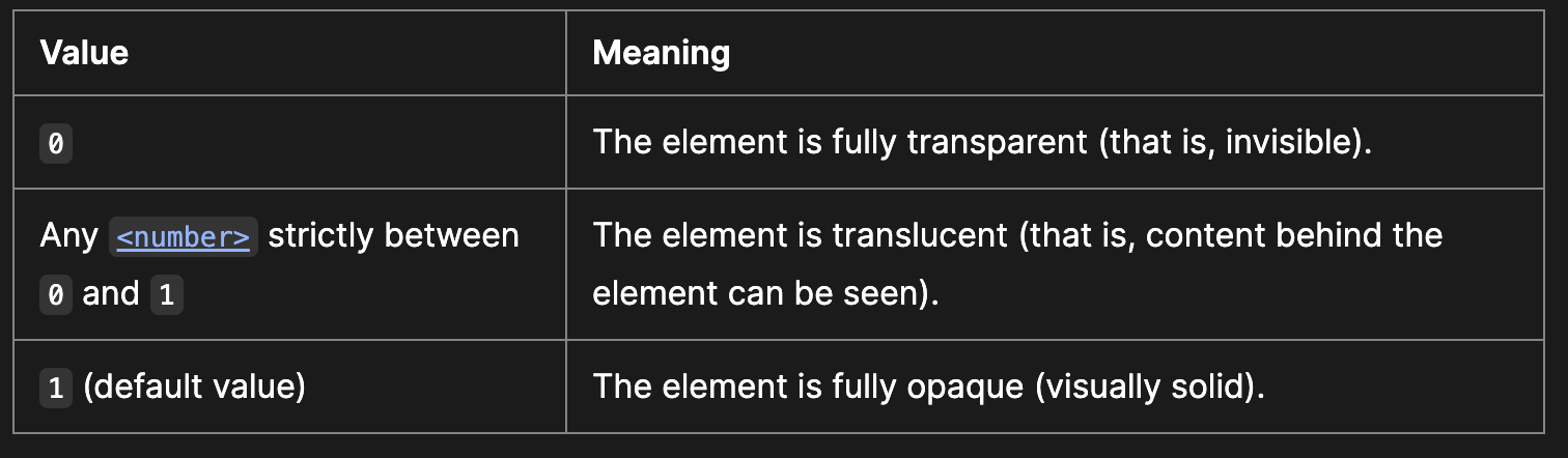
It uses a number in the range 0.0 to 1.0 or a percentage in the range 0% to 100%, representing the opacity of the channel.
The initial value of opacity is 1, and we can see from the picture above that in 0.5, the zero part can be omitted.
CSS Font
Font example
Let’s look at the following example of the usage of font properties.
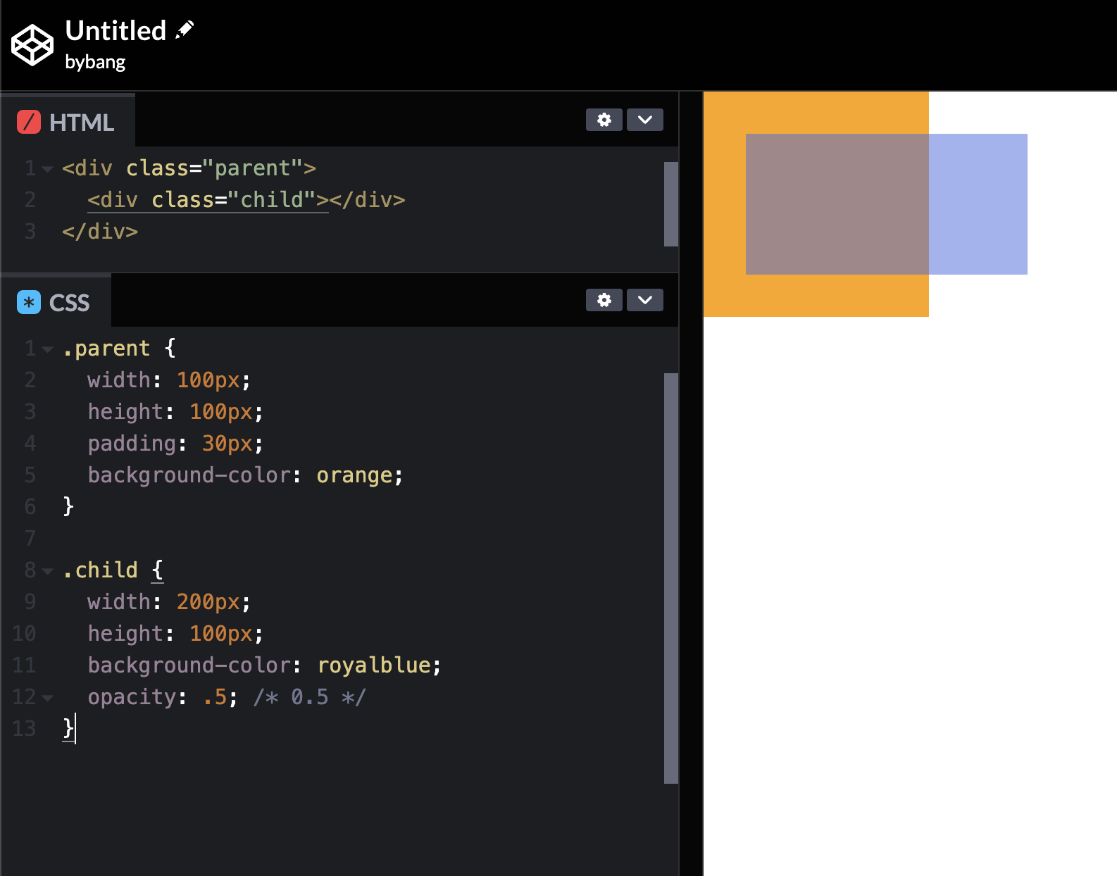
Notice we reset the browser style, and the h1 has the font size we set in the CSS. The font-weight bolded the text, and the font-style changed the text to italics. The font-family is serif, and it seems like the browser default is serif here.
The p element has a font size of 16px, and the font size didn’t change. That means that the font-size initial value is 16px; if we remember the HTML font size, it was 16px by default.
Also, the p element is a block-level element, so we don’t need to set the display property to use the width. The width sets the paragraph area, and the padding and border will expand the element. However, we put the box-sizing property to border-box, and the box keeps the width: 350px property.
Finally, the line-height created spaces between the lines for better readability.
font and font-style
The font CSS shorthand property sets all the different properties of an element’s font.
The font property may be specified as a single keyword, which will select a system font, or as a shorthand for various font-related properties.
If font is specified as a shorthand for several font-related properties, it must include values for font-size and font-family.
The font-style and font-weight must precede font-size. And the line-height must immediately follow font-size, preceded by / like 16px/3. The font-family must be the last value specified.
font-style
The font-style CSS property sets whether a font should be styled with a normal, italic, or oblique face from its font-family.
The initial value of font-style is normal, and usually, we use italic for the angle of the text content.
font-weight
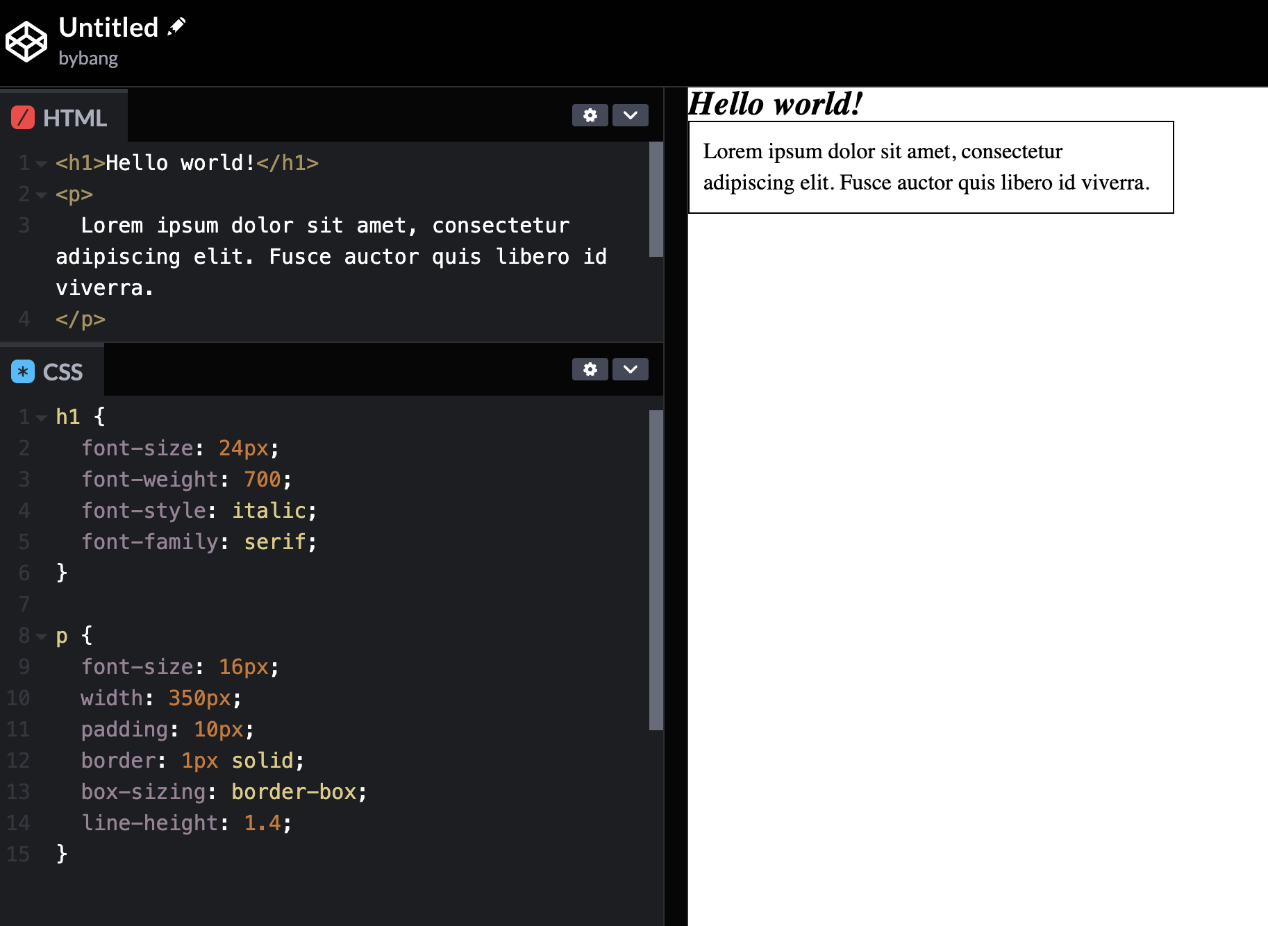
The font-weight CSS property sets the weight (or boldness) of the font. The weights available depend on the font-family that is currently set.
The initial value of font-weight is normal, and the common weight name mapping is generally used.
As we can see from the above picture, the normal value is 400, and the bold value is 700. Those two values are the most used cases.
font-size
The font-size CSS property sets the size of the font. Changing the font size also updates the size of the font size-relative length units, such as em, ex and so forth.
The initial value of font-size is medium, and by the web standard, the browser’s default font-size is usually 16px.
We prefer to use the length value when developing the website because it affects many units such as em, rem, and the like.
line-height
The line-height CSS property sets the height of a line box. It’s commonly used to set the distance between the lines of text.
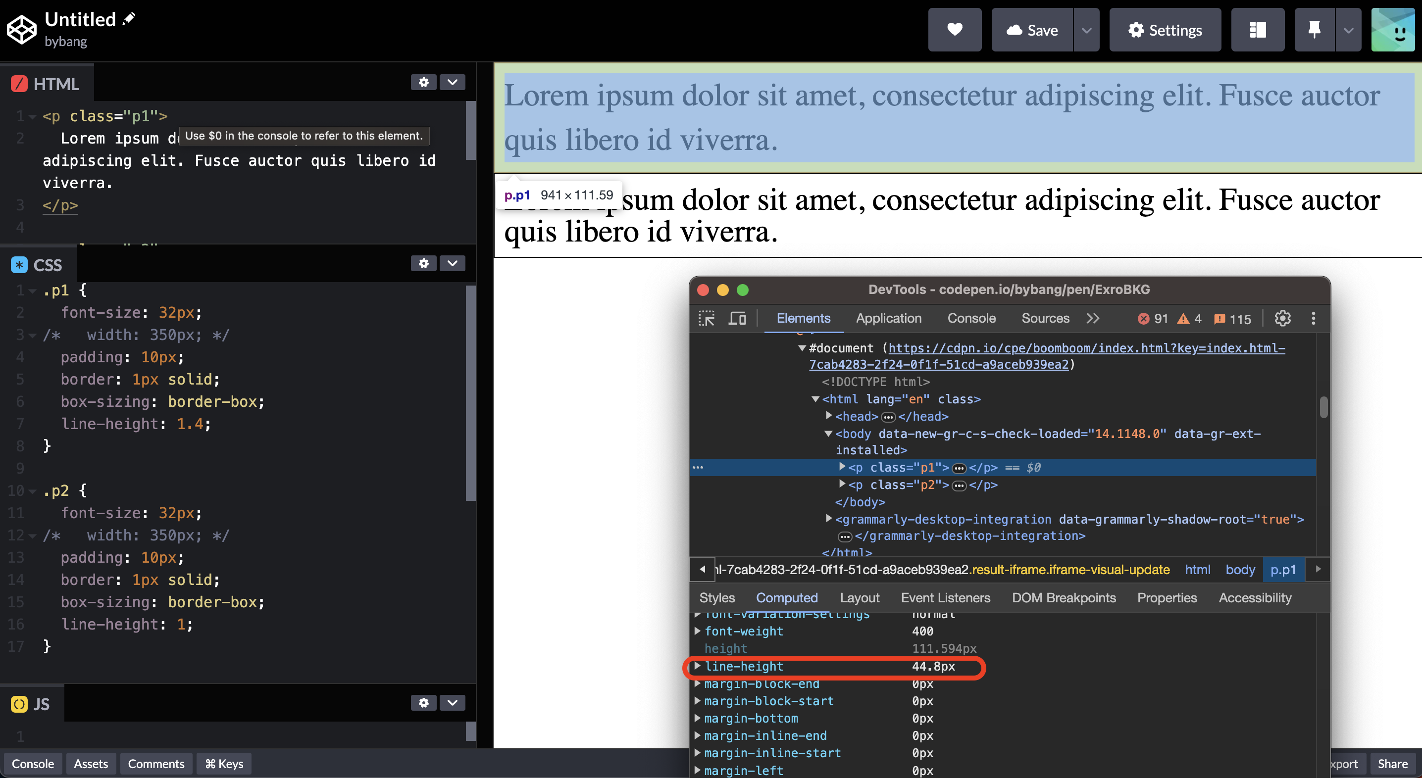
Notice we use font-size of 32px on each paragraph block for better visibility. The first paragraph block has a line-height of 44.8px, and this result came out because of the number value.
The font size 32px multiplied by line-height 1.4 is 44.8px (32px * 1.4 = 44.8px). The second paragraph block has a line-height of 1, and it is 32px.
The line-height uses many values, but the unitless number value is preferred way to set line-height because other values may produce unexpected results.
The initial value of line-height is normal, and this is roughly 1.2 for desktop browsers like Chrome or Firefox. But, a default value of roughly 1.2 depends on the element’s font-family.
font-family
The font-family CSS property specifies a prioritized list of one or more font family names and/or generic family names for the selected element.
Commas separate values to indicate that they are alternatives. The browser will select the first font in the list that is installed, or that can be downloaded using a @font-face at-rule.
We should always include at least one generic family name in a font-family list since there’s no guarantee that any given font will be available.
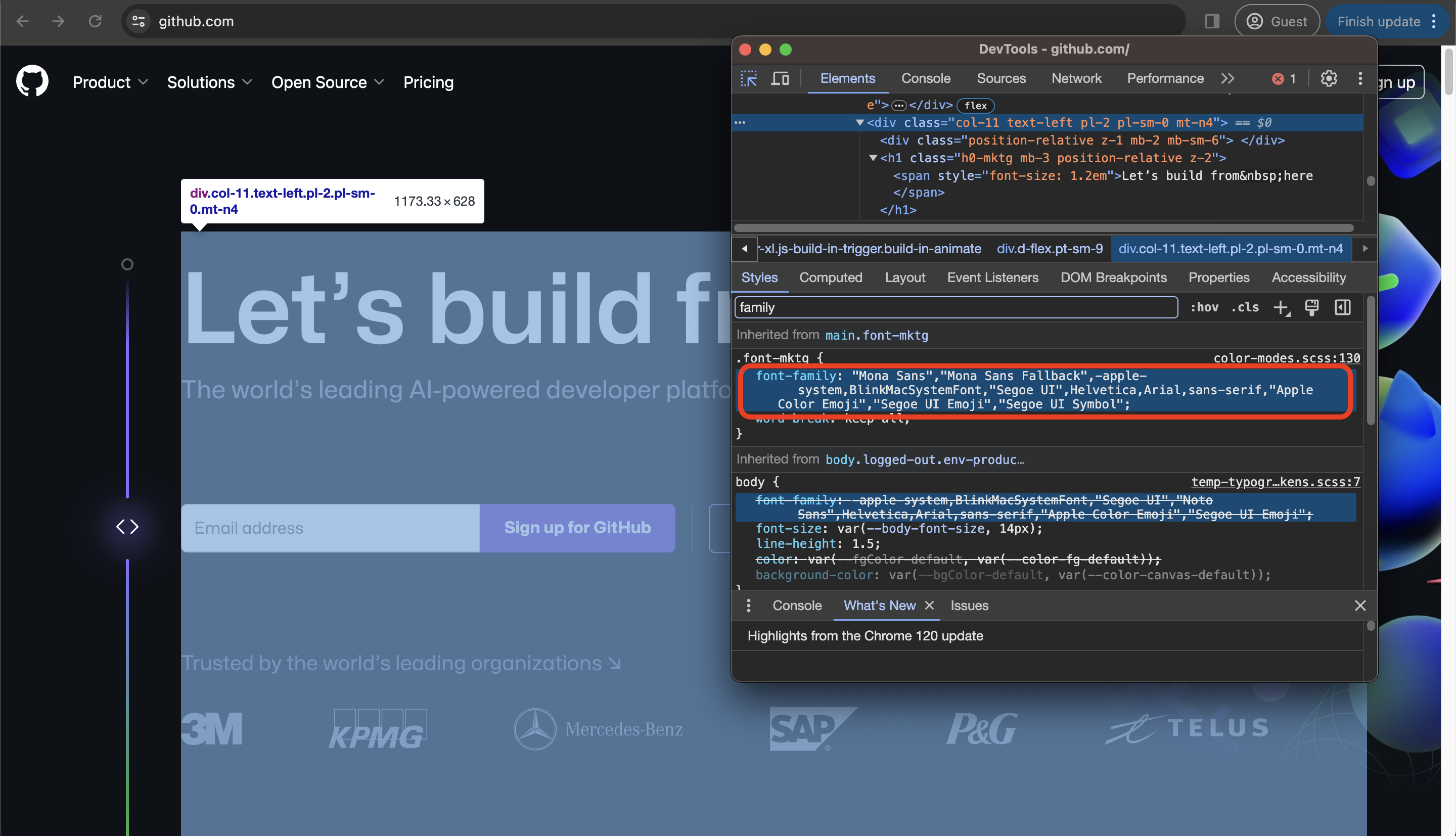
If we go to the github website and select the element, we can check what font-family is applied to the element.
Notice some font-family has the quotation mark (""). That’s because the browser doesn’t understand the white space between the strings. Therefore, if the font has space, we use quotation marks or without space.
Check out a valid family names section on the MDN document for more details.
The initial value of font-family depends on the user agent, but each font family should be specified as either a family name or a generic name value.
Generic font families are a fallback mechanism, preserving some of the style sheet author’s intent when none of the specified fonts are available.
Generic family names are keywords and must not be quoted. The following keywords are commonly used:
serifsans-serifmonospacecursivefantasy
There are other options available, such as emoji and math. Check out the MDN documentation for more values here.
CSS Text
color
The color CSS property sets the foreground color value of an element’s text, text decorations, and the currentcolor value.
The initial value of color is typically black, and we can use the values like keyword, named-color, hex-color, and rgb().
The currentcolor sets the color to the element’s color property value. However, if set as the value of color, the currentcolor is treated as inherit.
div {
  color: red;
  border: 5px solid currentcolor;
  box-shadow: 0 0 5px solid currentcolor;
}
The above example might be the best to explain how the currentcolor value works. For more details, check out the CSS-tricks website here.
text-align
The text-align CSS property sets the horizontal alignment of the inline-level content inside a block element or table-cell box.
In most cases, the initial value of text-align is start, or a nameless value that acts as left.
Think of it as the alignments in Microsoft Word, which we use the little icons in the toolbar.
text-decoration
The text-decoration shorthand CSS property sets the appearance of decorative lines on text. Text decorations are drawn across descendant text elements.
That means that if an element specifies a text decoration, a child element can’t remove that decoration.
The text-decoration property is shorthand for text-decoration-color, text-decoration-line, text-decoration-style and text-decoration-thickness.
The initial value of text-decoration is none, as the normal text content has no line decorations. The underline and line-through are the most commonly used text-decoration values.
text styles example
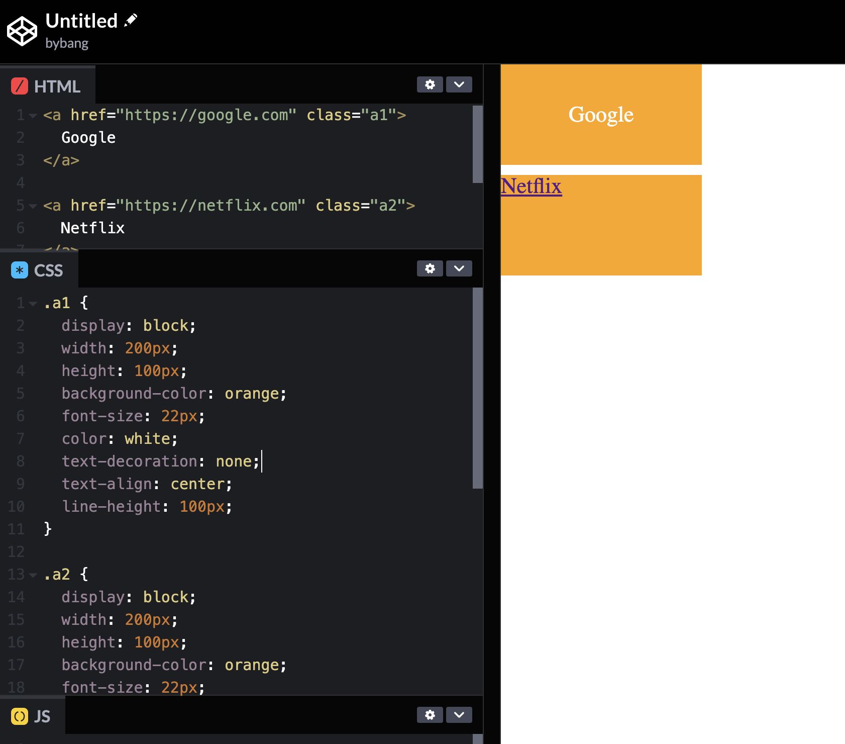
Notice the first element has text properties like color, text-decoration, and text-align. Meanwhile, the Netflix element or the original anchor tag below has the default value text-decoration: underline. The anchor element’s text color is blue or purple.
text-indent
The text-indent CSS property sets the length of empty space (indentation) that is put before lines of text in a block.
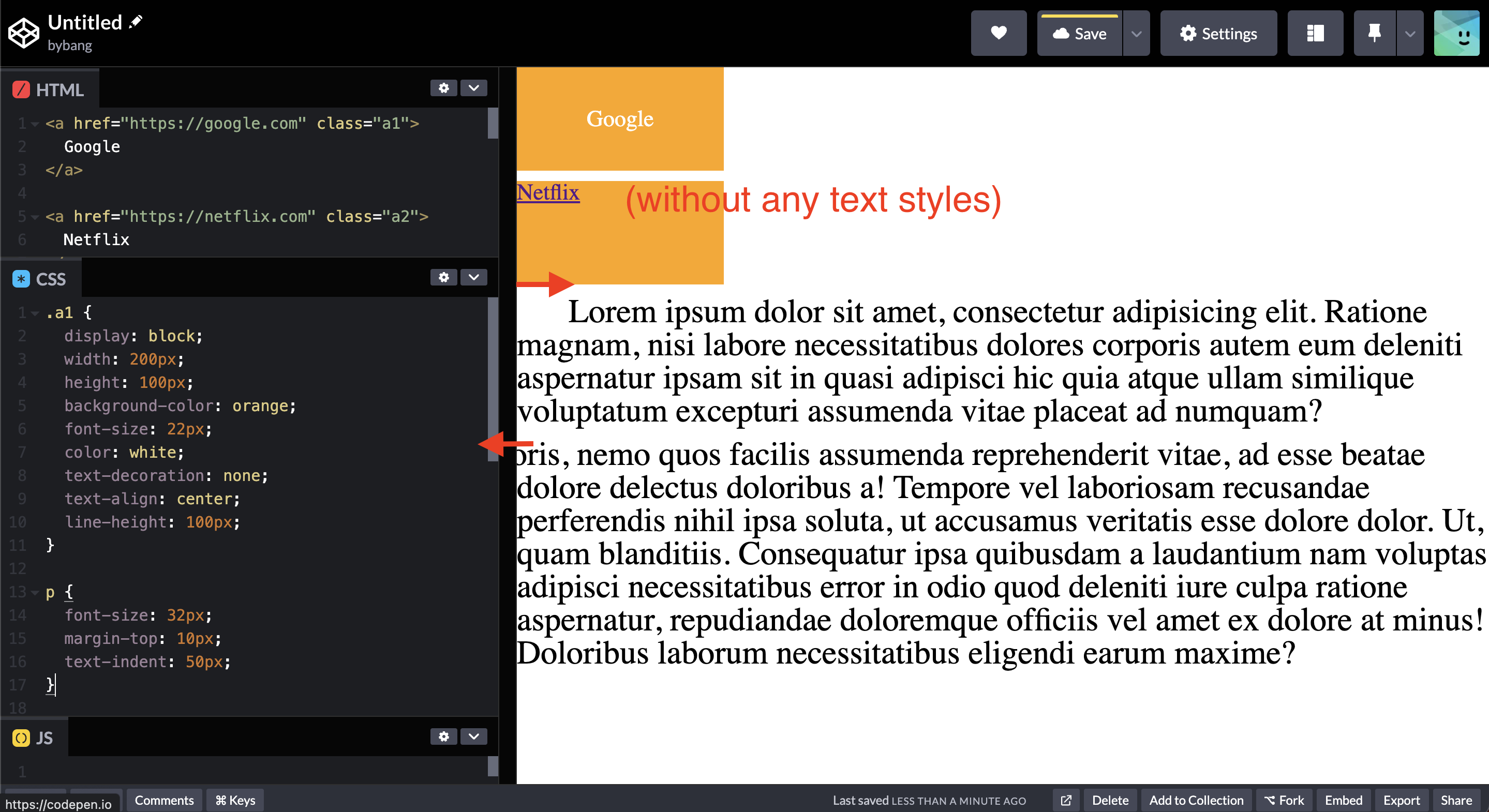
The two paragraphs of the above picture indicate the positive and negative values of the text-indent. Notice we can handle the outdent in the same text-indent property with the negative value.
The initial value of text-indent is 0, which we don’t see the indentation in the normal paragraph block.
CSS Background
background example
Let’s see how the background properties work before we define each property.
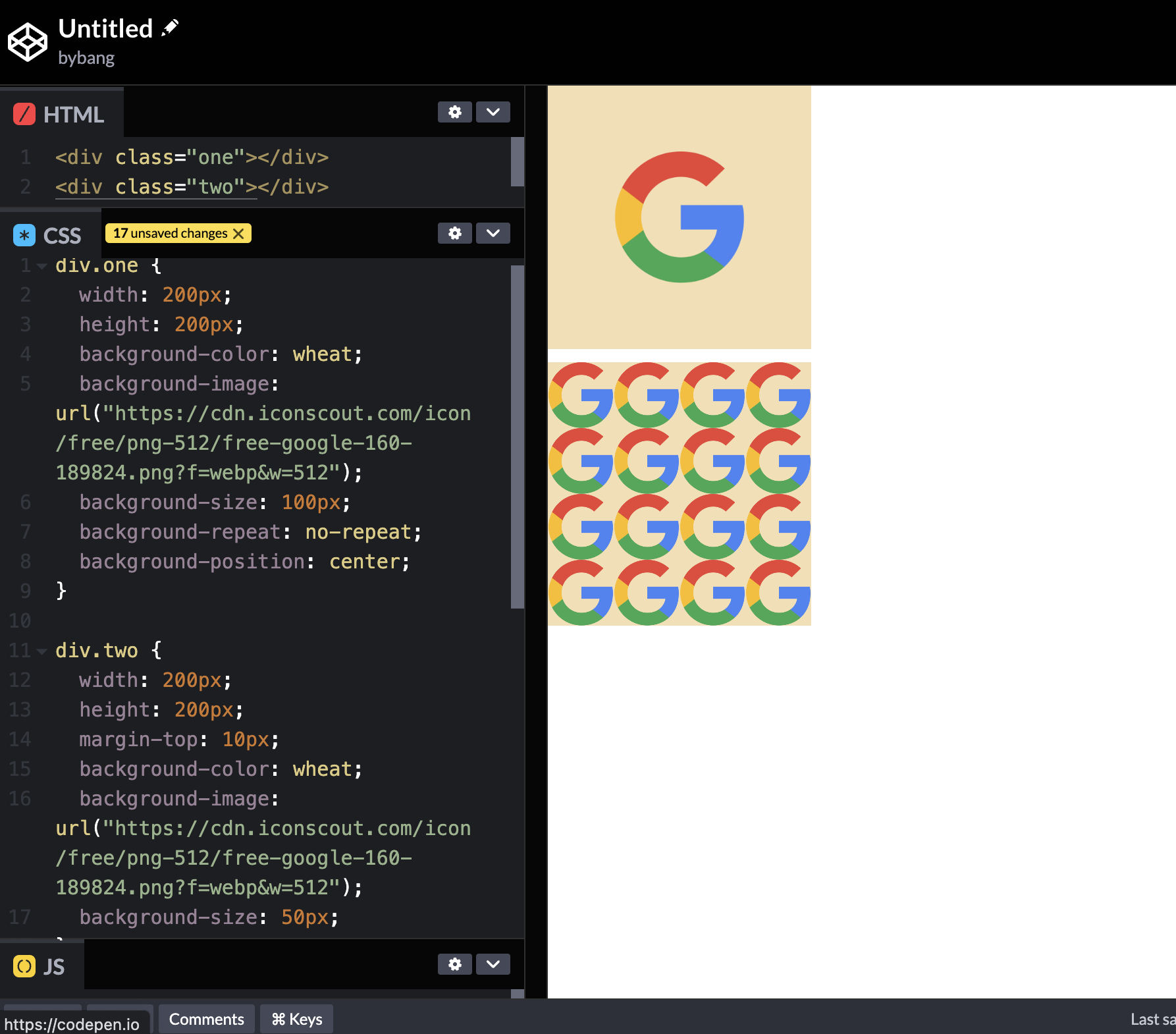
Notice two boxes have the same image, but the second one only has the background-color, background-image, and background-size. The box is filled with many Google logos.
On the other hand, the first box has more background properties, such as background-repeat, and background-position.
In the following sections, we are going to reference the above image and discuss the property behavior.
background-color
The background-color CSS property sets the background color of an element.
The initial value is transparent and uses the color values we learned above.
The above two boxes have the same color value, the named-color, wheat.
background-image
The background-image CSS property sets one or more background images on an element.
The initial value is none; generally, we use the <image> values.
The <image> data type represents a two-dimensional image and can be represented with the following:
- An image denoted by the
url()data type - A
gradientdata type - Functions like
image(),element(),cross-fade(), andimage_set()
The most used case is the url() data type. The url() CSS function is used to include a file. The parameter is an absolute URL, a relative URL, a blob URL, or a data URL.
Depending on the property for which it is a value, the resource sought can be an image, font, or a stylesheet.
As we can see in the image, the url() has the absolute path to a particular website from CDN.
background-repeat
The background-repeat CSS property sets how background images are repeated. A background image can be repeated along the horizontal and vertical axes or not repeated at all.
The initial value of background-repeat is repeat, and we use the no-repeat keyword to fit the image to a specific box.
Additionally, the background-repeat’s one-value syntax is a shorthand for the full two-value syntax.
In the two-value syntax, the first value represents horizontal repetition behavior, and the second represents vertical behavior.
If we see the second box, it has no background-repeat property, which means the background is repeated by default. Even if the size is big enough to cover the whole box, it still repeats if there is a room.
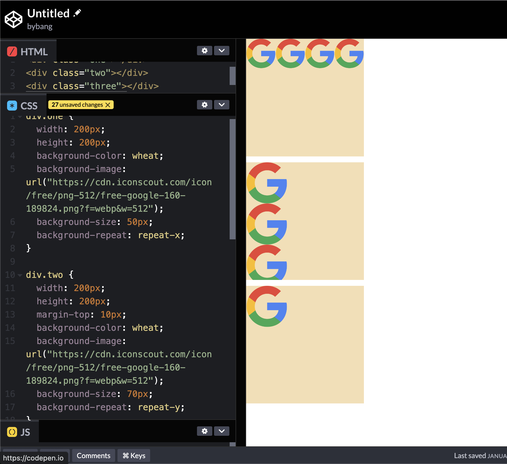
The above example shows that each repeat-x and repeat-y value results and the last box has a no-repeat value.
background-position
The background-position CSS property sets the initial position for each background image. The position is relative to the positioning layer set by background-origin.
The initial value of background-position is 0% 0%, but we don’t use this often. The most common case is the keywords top, right, bottom, left, and center.
/* Keyword values */
background-position: top;
background-position: bottom;
background-position: center;

/* <percentage> values */
background-position: 25% 75%;

/* <length> values */
background-position: 0 0;
background-position: 1cm 2cm;
background-position: 10em 8em;

/* Multiple images */
background-position: 0 0, center;

/* Edge offsets values */
background-position: bottom 10px right 20px;
background-position: right 3em bottom 10px;
background-position: bottom 10px right;
background-position: top right 10px;
The one-value syntax might have one of the keywords above or the length value. Sometimes, we use the percentage values, but this is not the major.
The two-value syntax defines x-y axes; the first value is x, and the other represents y.
If you are interested in the position values, check out the other values above in the local IDE.
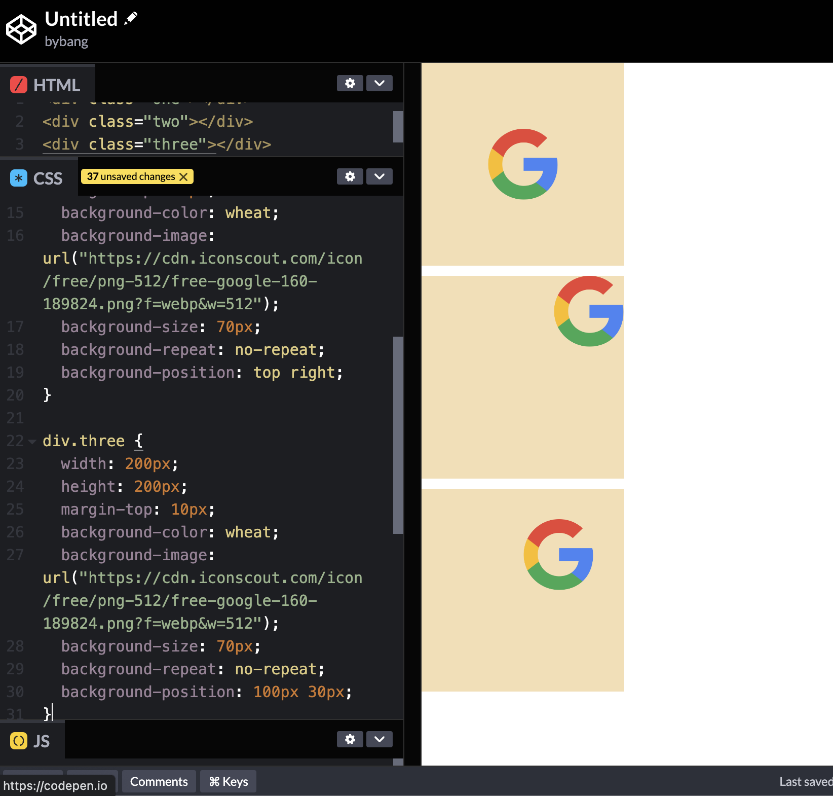
The image above shows that the first box logo is centered because of the background-position: center property value. The second box has a background-position: top right, and the third box has a background-position: 100px 30px.
background-size
The background-size CSS property sets the size of the element’s background image. The image can be left to its natural size, stretched, or constrained to fit the available space.
The initial value of background-size is auto auto, and the auto value scales the background image in the corresponding direction to maintain its intrinsic proportions.
The other most used values are cover and contain.
The cover value scales the image to the smallest possible size to fill the container, leaving no empty space. If the proportions of the background differ from the element, the image is cropped vertically or horizontally.
The contain value scales the image as large as possible within its container without cropping or stretching the image.
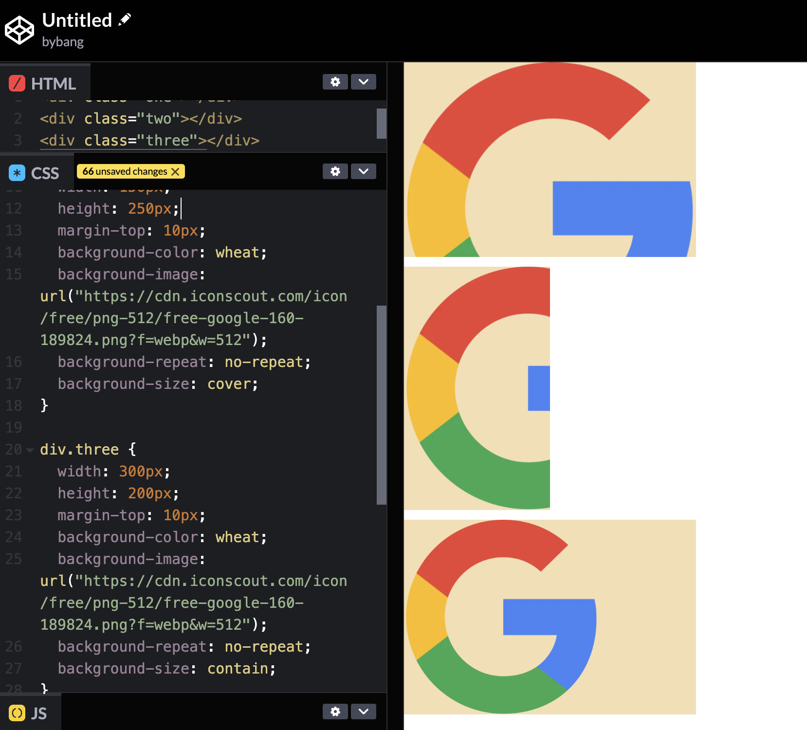
Notice the first two boxes use background-size: cover; property value, and the last box uses background-size: contain; value.
The first box scaled the image to fit the width because the width is longer than the height, and the second box scaled the image to fit the height because the height is longer than the width.
We can realize here that the cover value indeed scales the image to cover the whole element, and it doesn’t care if the image is cropped or not.
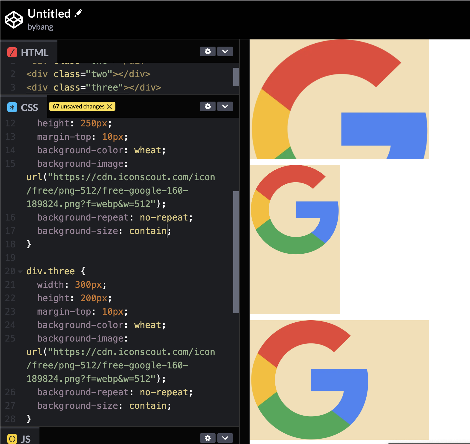
Meanwhile, if we change the second box’s background-size value to contain, we can see that the image is not cropped or stretched.
The contain value scales the image to fit the container without cropping. In other words, it follows the smallest width or height value to contain the image in the container.
Additionally, we only use one-value syntax when we set the background-size to the length value like the above picture.
If one value is set, the other value will be the auto, which scales the image proportionally.
background-attachment
The background-attachment CSS property sets whether a background image’s position is fixed within the viewport or scrolls within its containing block.
By the definition, it is hard to explain what this property does. Let’s see the example below:
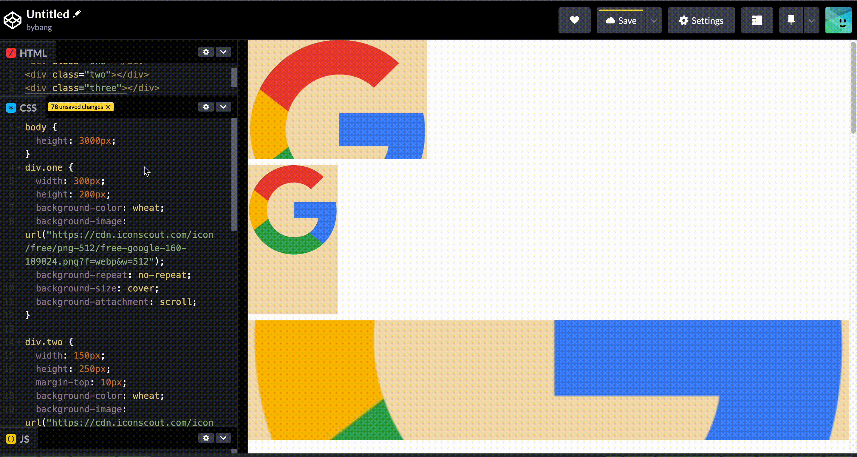
Notice we set the height to 3000px to increase the body size. The first box has the background-attachment: scroll property value.
The background is fixed relative to the element itself and does not scroll with its contents. The initial value of background-attachment is scroll.
We can check the gif that the first box has the background, and if we scroll it, the background is fixed to the element. Therefore, the element and the background go up when we scroll down - the background is attached to the element.
On the other hand, the last box has no width property to distinguish the logo clearly. It has a fixed value, and the value fixes the background image to the viewport. The background-size: cover property value expands the logo to fit the viewport, and background-attachment: fixed fixes the background image.
Hence, the huge background image is not moving while we scroll up and down in the viewport.
CSS Layout - part 1
position
The position CSS property sets how an element is positioned in a document. The top, right, bottom, and left properties determine the final location of positioned elements.
position preview
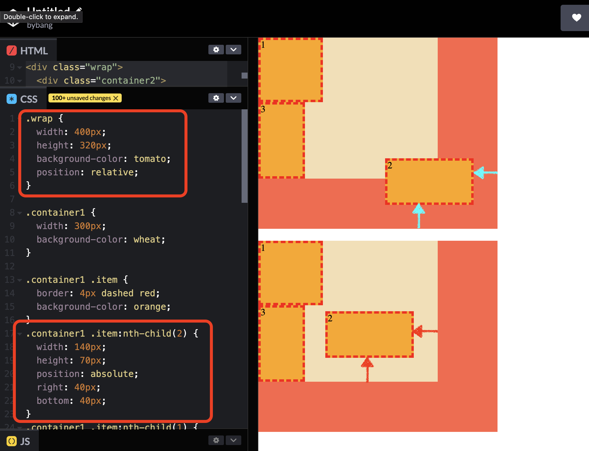
Let’s see the example below to get the gist of the positioning of the elements.
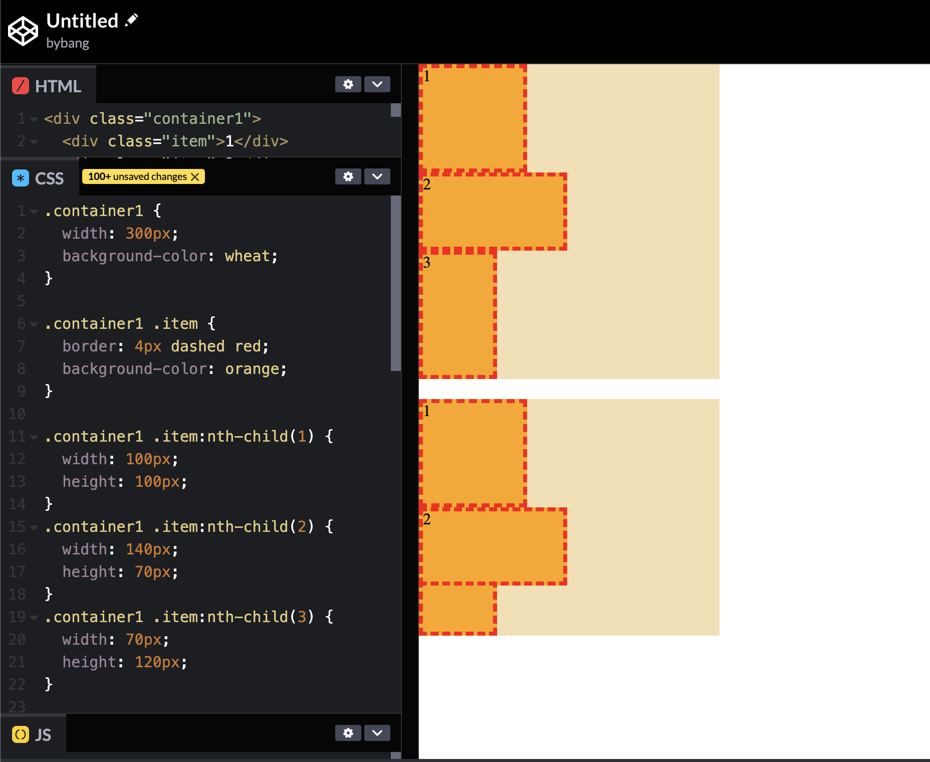
The first box is the original; remember this box shape because we will modify it to another.
The second box’s box number 3 is under box number 2. That’s because we set position: absolute to the box 2.
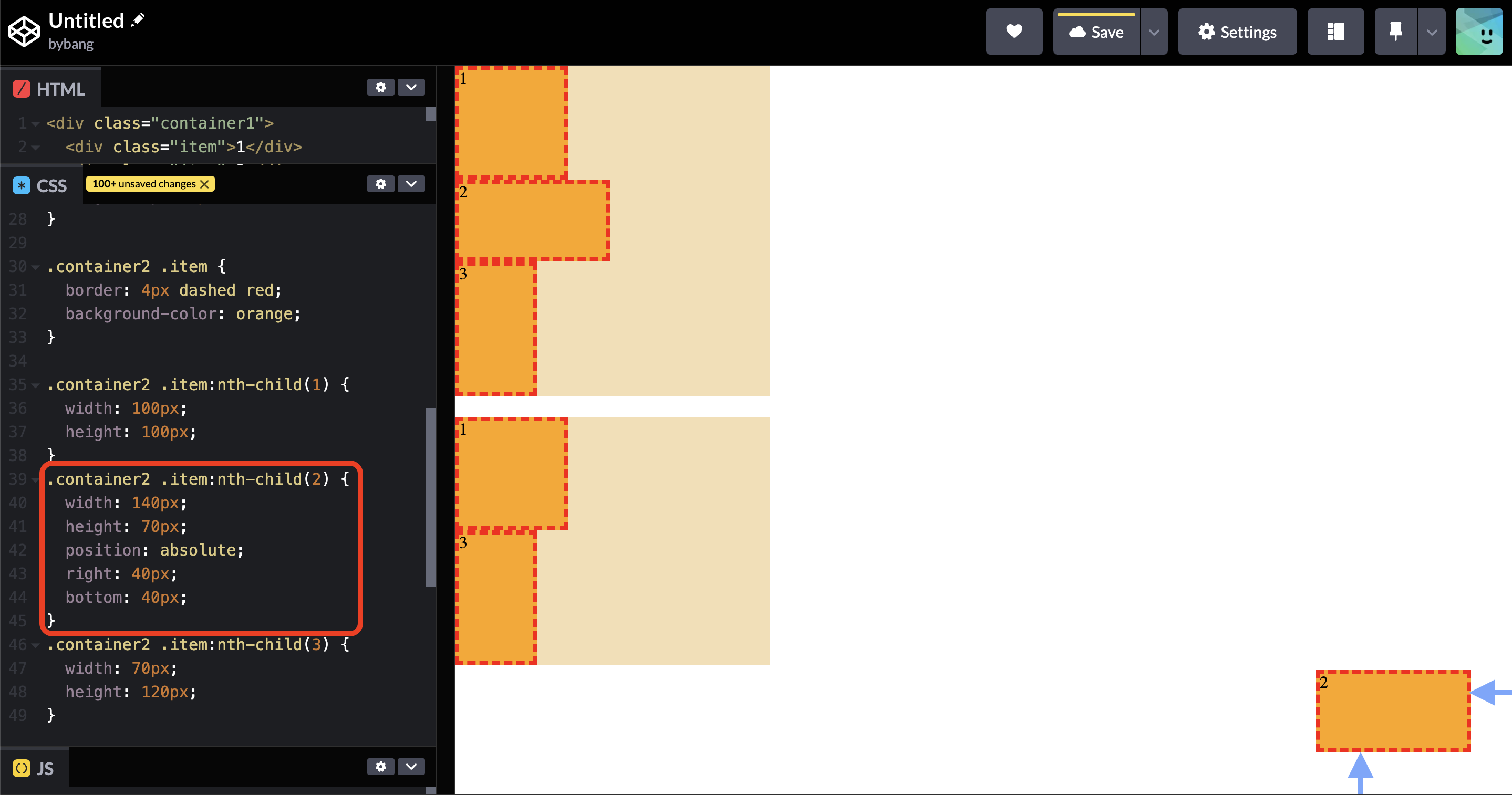
When we set the right and bottom values, we can see that it popped out from the parent box and placed in the viewport area.
That’s not the expected behavior, so we set the position: relative to the second container to bring the box 2.
position values
static
The initial value of the position property is static, which is the normal elements’ default value. Or, more simply, we can think there is no position value.
The element is positioned according to the normal flow of the document. The top, right, bottom and left properties have no effect. The z-index has no effect, and we will learn this property in part 2.
relative
The element is positioned according to the document’s normal flow and then offset relative to itself based on the values of top, right, bottom, and left.
The offset does not affect the position of any element. Let’s see the example below:
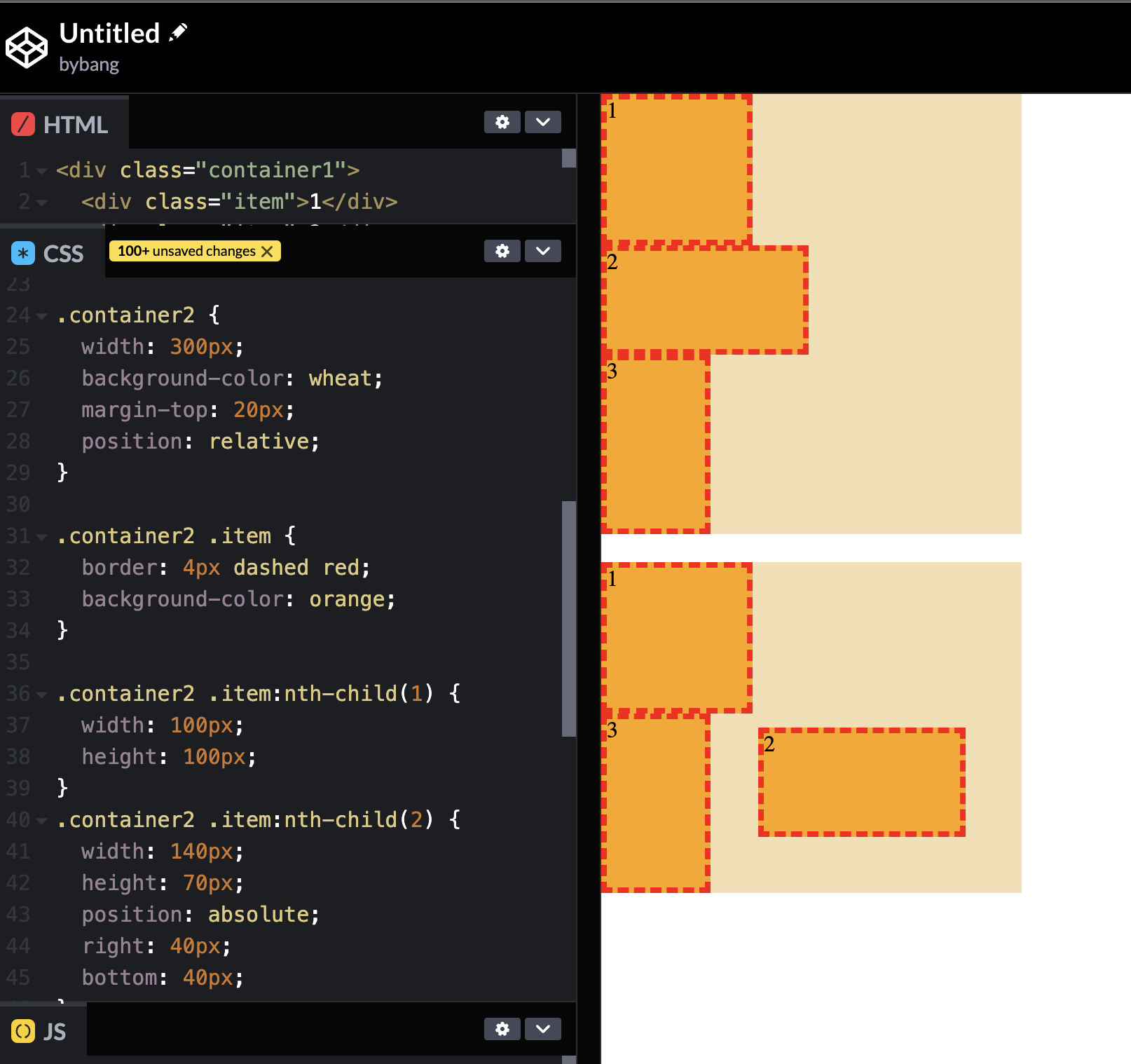
Notice the blue box area in the last box. It is the same size as the box 2 because the browser thinks as if the box 2 exists the space before.
Thus, the space given for the element in the page layout is the same as if the position were static.
More concisely, this is not a typical structure in HTML. Stacked blocks or elements are not arranged correctly in HTML, which might cause misunderstanding or misinterpretation of HTML or CSS.
Let’s say we placed the box 2 to left:2000px;. The box will disappear from the screen, but we don’t know why there is a space between the box 1 and 3.
Due to this issue, the position: relative property value is not commonly used to position the element.
This value creates a new stacking context when the value of z-index is not auto. We will cover the stacking context shortly.
top, right, bottom, left
These CSS properties participate in specifying the vertical position of a positioned element. The properties do not affect non-positioned elements.
Their initial value is auto, and the <length> or percentage values are used for the properties.
The length value is commonly used; we can use a negative, null or positive value.
For absolutely positioned elements, the value represents the distance to the direction edge of the containing block.
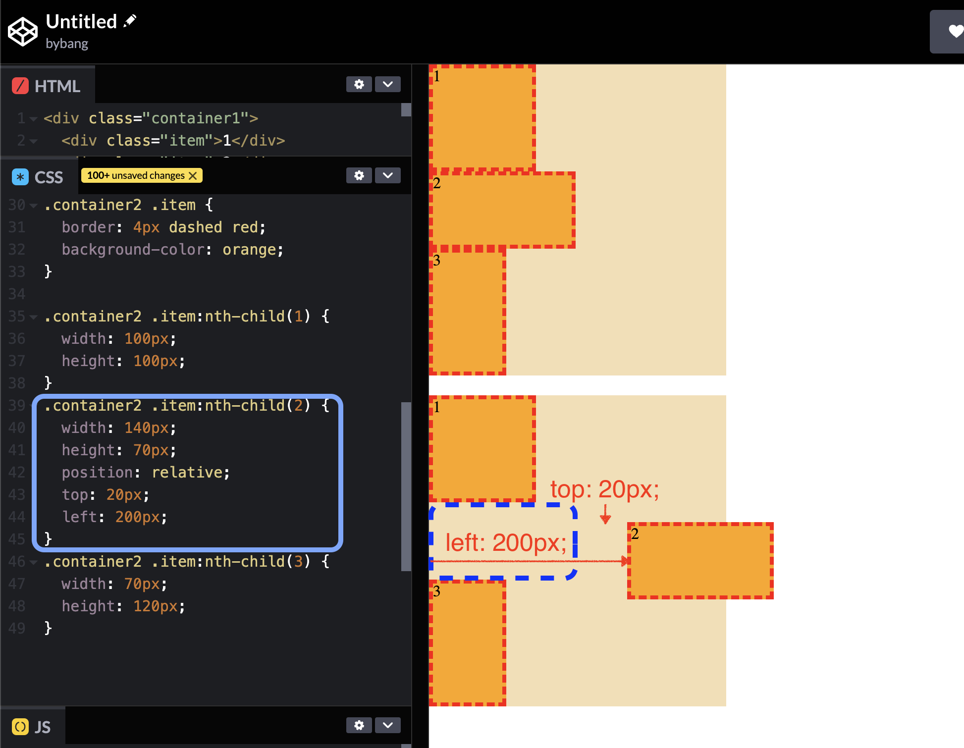
Notice the box 2 is in the container2 and the <length> value represents the distance from the parent element. The box 2` is absolutely positioned 40px from the right side and 40px from the bottom side of its parent element or containing block, if you will.
For relatively positioned elements, the value represents the distance the element moves below its normal position.
Simply, the top: 20px; left: 200px; for example, 20px means the element moved 20px down and 200px right from the offset’s position or the element is 20px to the top and 200px to the left from the origin.
absolute
The element is removed from the normal document flow, and no space is created for the element in the page layout.
The element is positioned relative to its closest positioned ancestor or the initial containing block. Its final position is determined by the top, right, bottom, and left values.
Let’s look at the example to visualize the above definition.
If you remember this picture from above, we saw the box pop out from the container and place a certain area in the viewport.
The HTML structure in the Codepen is like the following:
<div class="container1">
  <div class="item">1</div>
  <div class="item">2</div>
  <div class="item">3</div>
</div>

<div class="container2">
  <div class="item">1</div>
  <div class="item">2</div>
  <div class="item">3</div>
</div>
Notice the container wraps the items, or boxes 1, 2, and 3, or it is the parent element of the boxes inside.
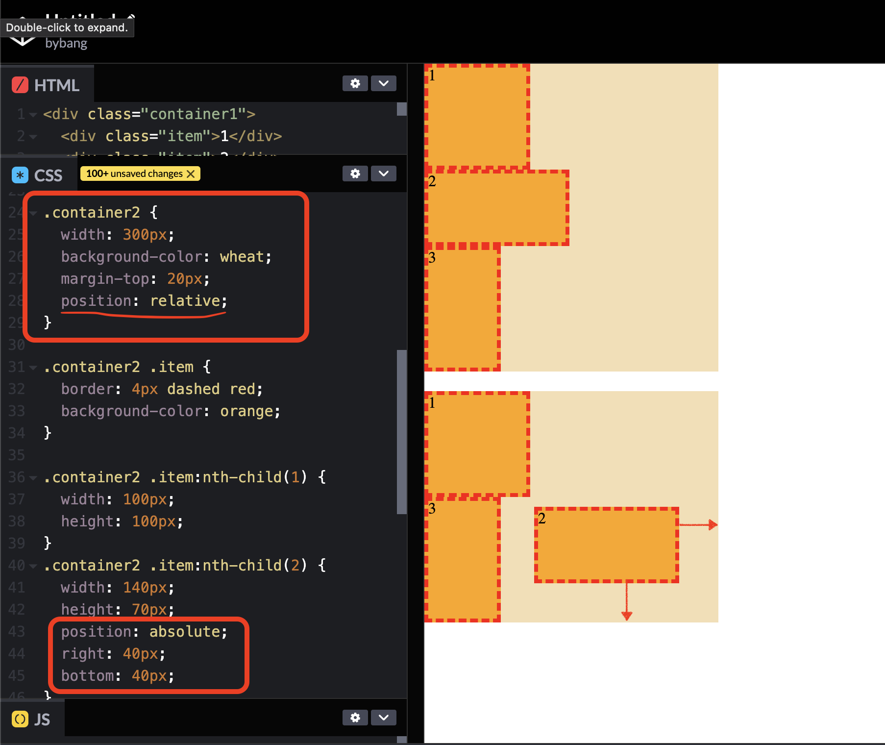
The box 2 popped out from the box because it positions relative to its closest positioned ancestor or the initial containing block.
In other words, it finds the parent element container2, but the container2 is not positioned. It has no position property or has the position: static value, so to speak.
Hence, it finds the ancestor and the box 2 positioned relative to the body element with the right and bottom properties.
If we want to place the box 2 inside the container2, we have to make the container2 to the positioned ancestor.
The positioned element is an element whose computed position value is either relative, absolute, fixed, or sticky. (It’s anything except static)
Now, we will modify the HTML structure to wrap the containers.
<div class="wrap">
  <div class="container1">
    <div class="item">1</div>
    <div class="item">2</div>
    <div class="item">3</div>
  </div>
</div>

<div class="wrap">
  <div class="container2">
    <div class="item">1</div>
    <div class="item">2</div>
    <div class="item">3</div>
  </div>
</div>
We already saw the effect of absolute without setting the positioned ancestor element like this:
This time, we will set the position: relative to the wrap element and see the result between the two boxes below:
Notice the wrap has the relative value, and the box 2 has the absolute value. The important difference is that container1 has no position value or is not the positioned element. Therefore, box 2 finds the positioned ancestor and positions relative to the wrap element.
The last box has the same value as before, which means the container2 has the position: relative value. Therefore, the box 2 is positioned inside the container2.
📌 Takeaway
- If
fontis specified as a shorthand for several font-related properties, it must include values forfont-sizeandfont-family. - The
line-heightuses thenumbervalue among many values because it is the preferred way to set the property. - Some
font-familyvalues have a quotation mark, which includes a white space between the letters. - Putting the quotation mark to every
font-familyvalue is recommended to prevent unexpected errors. - Generic family names like
sans-seriforserifare keywords and must not be quoted. - The
text-indentproperty sets the indentation of the text blocks. - The
background-imageproperty has the initial value ofnoneand generally uses the<image>values. - The
<image>data type represents a two-dimensional image typically represented with theurl()function. - The
url()function includes a file and takes the absolute URL, a relative URL, and the like for its parameter. - With the
background-repeatproperty, a background image can be repeated or not repeated along the horizontal and vertical axes. - The
background-positionsets the initial position of each background image. - The
background-size: coverproperty value scales the image to the smallest possible size to fill the container, leaving no spaces. It crops the image if the proportions of the background differ from the element. - The
background-size: containproperty value scales the image as large as possible within its container without cropping or stretching. - The one-value syntax is preferred when the
background-sizeuses a<length>value. - If the one value is set, the other value will be
auto, which scales the image proportionally. - The
background-attachmentproperty attaches the background image to the parent element by default. When set to afixedvalue, the property fixes the background image to the viewport. - The initial value of the
positionproperty isstatic, which means there is no position value. - When the element has no
positionproperty or has aposition: staticproperty value, thetop,right,bottom,left, andz-indexproperties have no effect. - The
position: relativeproperty value is not used to position the element because it makes an imaginary block to its original position. This imaginary block, oroffset, can cause misinterpretation of HTML structure for developers. - The properties
top,right,bottom, andleftparticipate in specifying a positioned element. These properties do not affect when the element is anon-positionedelement. - When the
position: absoluteproperty value is set, the element will removed from the normal document flow. The element will be positioned relative to its closestpositionedancestor. - If an absolutely positioned element can’t find the positioned ancestor, it will position relative to the initial containing block or the viewport.
💻 Solution
- None
🔖 Review
- The
opacityCSS property uses a number in the range of 0.0 to 1.0 or a percentage in the range of 0% to 100% to represent the opacity of the channel. - The
font-styleandfont-weightmust precedefont-size, and theline-heightmust immediately followfont-size, preceded by/. - When we use the
font-weightproperty, the value400is for normal and700is for bold text. - We should always include at least one generic font family name in a
font-familylist since there is no guarantee that any given font will be available. - The color values vary; we can use keywords like
named-color,hex-color, andrgb()for its value.
Comments